This beer emphasises branding over flavour
New craft ale Super Jay bucks the trend of beer branding by prioritising identity over taste.

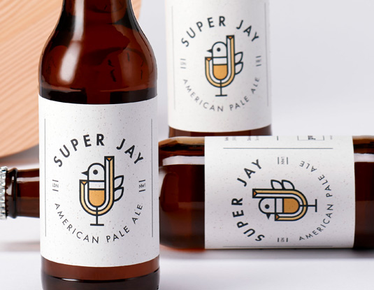
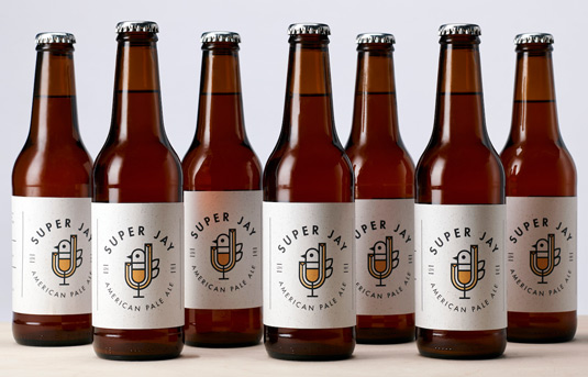
Creating identities for food and drink packaging is a great way for designers to get started in the industry, with this illustrative packaging style for Super Jay demonstrating the possibilities branding offers.
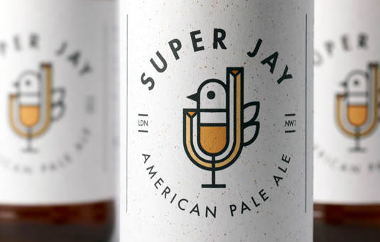
Made by strategic design firm PWW, the branding for American Pale Ale Super Jay is lead by identity rather than flavour. Based around migrating Jaybirds, the packaging reflects PWW's London and Seattle based offices.
The Super Jay story is all about combining beers from different times and places, which is reflected in the branding. The packaging's typography blends into the graphics, as shown in the capital 'J' which blends into the Jaybird symbol.
With a second batch of French ale on the way, whose label will incorporate French, avant-garde style typography, the message of PWW's packaging looks set to spread all around the world.
Get a taste of Super Jay's amazing packaging with the images below.


Liked this? Read these!
- When whisky packaging meets album artwork
- McDonald's launches cycle-friendly packaging
- Artisan packaging goes back to beautiful basics
Sign up to Creative Bloq's daily newsletter, which brings you the latest news and inspiration from the worlds of art, design and technology.

Dom Carter is a freelance writer who specialises in art and design. Formerly a staff writer for Creative Bloq, his work has also appeared on Creative Boom and in the pages of ImagineFX, Computer Arts, 3D World, and .net. He has been a D&AD New Blood judge, and has a particular interest in picture books.
