New 'male' and 'female' designs for Coca-Cola bottles
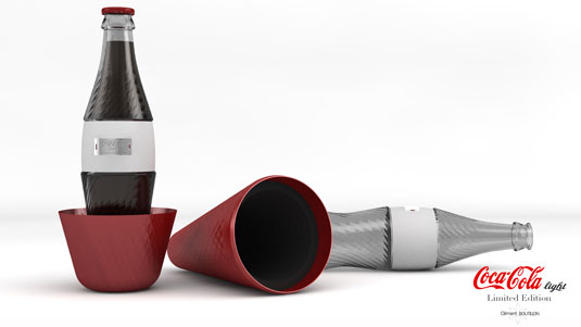
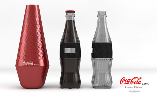
French industrial designer Clément Boutillon has created two limited edition bottle concepts, based on the classic 'Couture' shape of the Coke bottle. What do you make of his designs?

Coca-Cola hasn't become one of the world's top brands without a keen attention to design detail, particularly its logo design and clever use of colour in branding. But possibly even more iconic than these is the iconic 'couture' shape of the classic Coke bottle.
So why mess with it? Well, as far as we know Coke isn't - but that's not going to stop other designers coming up with interesting new design concepts for the world's most popular soda brand. And one that's especially caught our eye is the 'male' and 'female' concept created by French industrial designer Clément Boutillon.
Boutillon's designs were inspired by the shape and the differences between Coca-Cola Zero and Coca-Cola Light, he says, and describes them as 'giving femininity back to the Light bottle' and producing a 'Zero bottle with masculine lines'.
Article continues belowIt's an intriguing take on an iconic product design, and Boutillon has also created a striking red, conical design concept for packaging that would encase the bottles. Do you think it works?


See more the designs in more detail on Clément Boutillon's website.
Like this? Read these!
- The ultimate guide to designing the best logos
- The best free web fonts for designers
- Useful and inspiring flyer templates
What do you make of this design concept? Let us know in the comments box below!
Sign up to Creative Bloq's daily newsletter, which brings you the latest news and inspiration from the worlds of art, design and technology.

The Creative Bloq team is made up of a group of art and design enthusiasts, and has changed and evolved since Creative Bloq began back in 2012. The current website team consists of eight full-time members of staff: Editor Georgia Coggan, Deputy Editor Rosie Hilder, Ecommerce Editor Beren Neale, Senior News Editor Daniel Piper, Editor, Digital Art and 3D Ian Dean, Tech Reviews Editor Erlingur Einarsson, Ecommerce Writer Beth Nicholls and Staff Writer Natalie Fear, as well as a roster of freelancers from around the world. The ImagineFX magazine team also pitch in, ensuring that content from leading digital art publication ImagineFX is represented on Creative Bloq.
