Trophy design deserves an award of its own
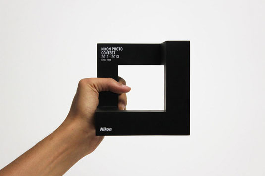
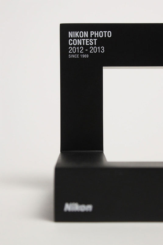
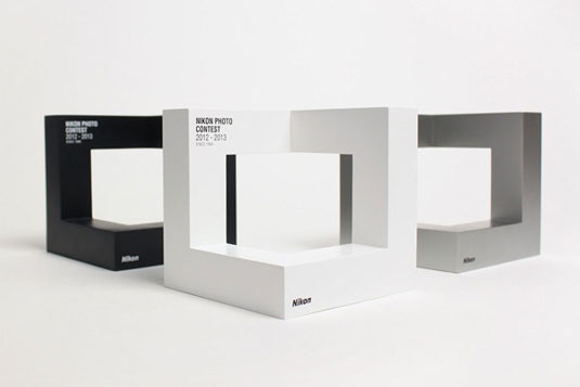
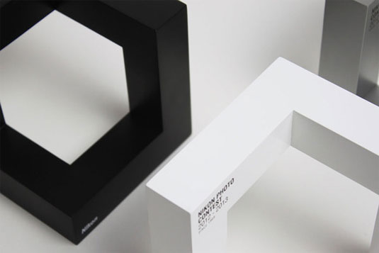
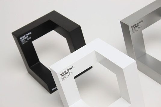
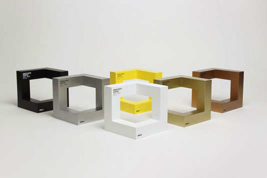
Individually handcrafted, this trophy design for Nikon should bag a design award itself.
Sign up to Creative Bloq's daily newsletter, which brings you the latest news and inspiration from the worlds of art, design and technology.
You are now subscribed
Your newsletter sign-up was successful
Want to add more newsletters?
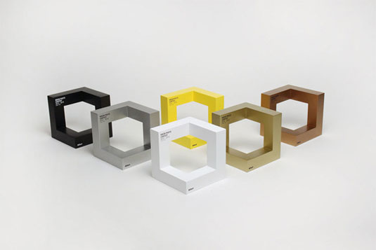
Design awards are given to those of impeccable creativity and experimentation but what if the trophy design itself also fits into that category? This offering for Nikon's photo contest is a design feat in itself and shows us that we should appreciate the awards themselves!
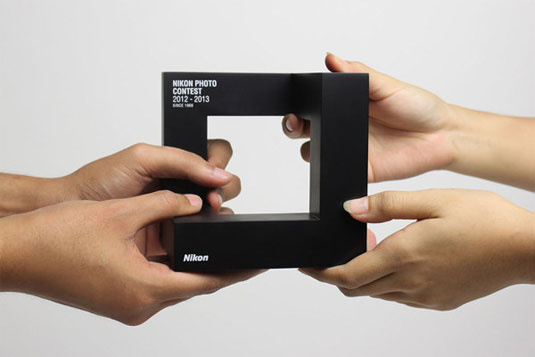
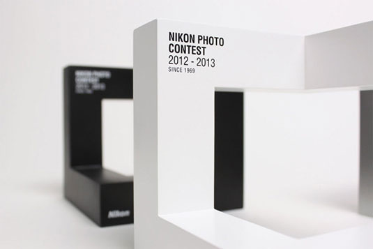
Designed by Singapore based agency Anonymous, it was created to fit into the flexible identity system. The inspiration coming from the new logo for the Nikon Photo Contest - using brackets to symbolize framing a photo, drawing inspiration from the universal act of framing an image with one’s hand.
Each trophy has been individually handcrafted with acrylonitrile butadiene styrene. Transforming the new identity from a two-dimensional graphic to a three-dimensional form, this trophy needs an award!
Article continues below 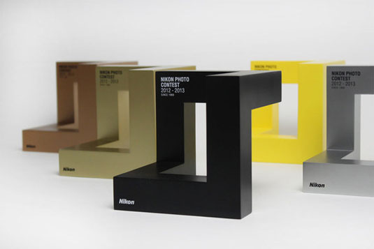
See more work from Anonymous over on their website.
Like this? Read these!
- The ultimate guide to logo design
- Our favourite web fonts - and they don't cost a penny
- Useful and inspiring flyer templates
What do you make of this trophy design? Let us know in the comments box below!
Sign up to Creative Bloq's daily newsletter, which brings you the latest news and inspiration from the worlds of art, design and technology.

The Creative Bloq team is made up of a group of art and design enthusiasts, and has changed and evolved since Creative Bloq began back in 2012. The current website team consists of eight full-time members of staff: Editor Georgia Coggan, Deputy Editor Rosie Hilder, Ecommerce Editor Beren Neale, Senior News Editor Daniel Piper, Editor, Digital Art and 3D Ian Dean, Tech Reviews Editor Erlingur Einarsson, Ecommerce Writer Beth Nicholls and Staff Writer Natalie Fear, as well as a roster of freelancers from around the world. The ImagineFX magazine team also pitch in, ensuring that content from leading digital art publication ImagineFX is represented on Creative Bloq.
