10 great uses of type on book covers
Fantastic typography can encourage readers to reach for a book – here are 10 top book cover designs that use type to tantalise.
When done right, brilliant uses of typography on a book cover can encourage readers to reach for the shelves and get nose deep in a novel. And with so many different type designs to choose from – retro fonts, script fonts and tattoo fonts, for example – designers all over the globe are producing some cracking covers.
They say you should never judge a book by its cover, but these brilliant designs make it very hard not to...
01. Cormac McCarthy – No Country for Old Men

Designer David Pearson has designed the covers for nearly all of Cormac McCarthy's novels, including the infamous titles No Country for Old Men and The Road. Using an old style slab serif typeface, imitating the raw look of letterpress printing, Pearson has created a bold, handcrafted feel.
Article continues below02. Mario Puzo – The Godfather
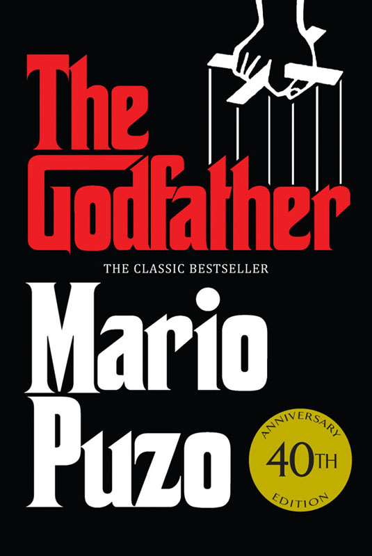
Originally published in 1969, American graphic designer S Neil Fujita created a heavy, Gothic-looking typeface for The Godfather. The design was also used in the opening credits of Coppola's movie trilogy and remains iconic to this day.
03. Chuck Palahniuk – Snuff
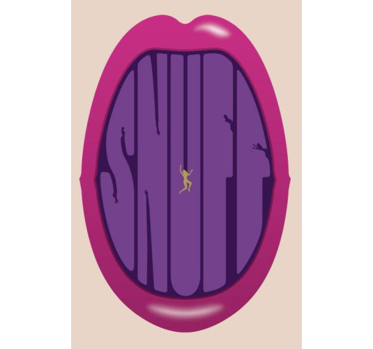
Chuck Palahniuk, famous author of Fight Club, turned to established designer Rodrigo Corral, who's also created covers for authors John Green and Daniel Kahneman, to create the cover for his book Snuff. First published in 2008, Corral has hand-drawn a font to create a provocative cover that fits well with Palahniuk's image.
04. Jonathon Safron Foer – Everything is Illuminated

John Gray, otherwise known as Gray318, is another of the biggest book cover designers out there and has designed for the likes of Joe Dunthorne, AM Holmes, and Zadie Smith. His hand-drawn fonts for the covers of Safran Foer's first two books, Everything is Illuminated and Extremely Loud and Incredibly Close, create an energetic and fluid design.
05. Ian Fleming – The Spy who Loved Me
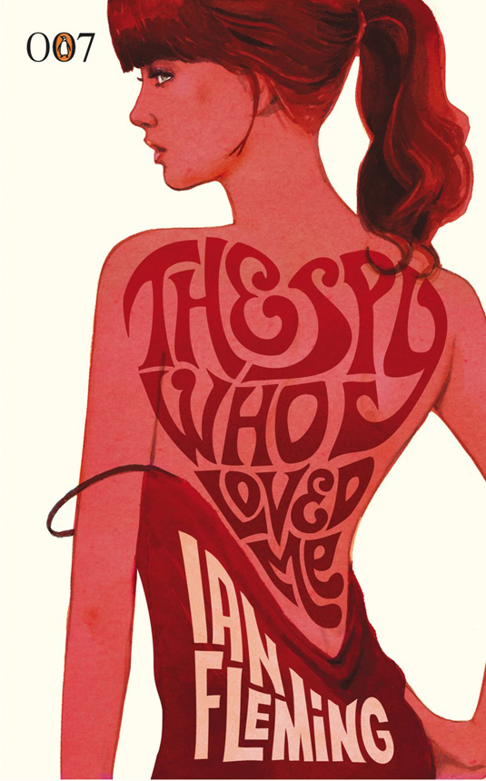
To celebrate Ian Fleming's birthday in 2008, Penguin commissioned designer Michael Gillette to create 14 new covers for the Bond series. Each book uses a different font but the retro-style remains the same, painted alongside forms of the iconic Bond girls.
Sign up to Creative Bloq's daily newsletter, which brings you the latest news and inspiration from the worlds of art, design and technology.
06. Jesse Ball – The Way Through Doors
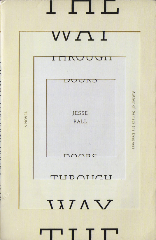
Designed by two of the best cover creators Jason Booher and Helen Yentus, Ball's highly acclaimed novel uses a striking illusion of layered paper and a slab serif typeface to create clean lines and almost clinical feel to reflect the story of a hospital patient's attempt to remember the truth after a car accident.
07. Phillip Pullman – Tales from the Brothers Grimm
Ohio-based designer Cheong-ah Hwang also used an illusion of layered paper to create Pullman's reworking of The Fairy Tales of the Brothers Grimm, and was released alongside a beautifully illustrated trailer.
08. Robert Lowell – For the Union Dead
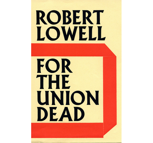
Faber's art director and designer of the Albertus typeface Berthold Wolpe designed a number of covers for the famous publisher, including Lowell's For the Union Dead. His bold cover designs were said to have been created in response to the typical illustrated covers of the time.
09. JK Rowling – The Casual Vacancy
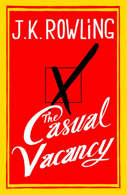
Her first since the Harry Potter series, Rowling's book featured illustration and hand lettering by Joel Holland on the cover. Unsuprisingly given Rowling's fame, the cover design caused some controversy but as Jon Gray told The Telegraph: "As a designer I'm left non-plussed and envious and as a reader I'm left intrigued. That means another copy sold, so: job done."
10. Chad Harbach – The Art of Fielding
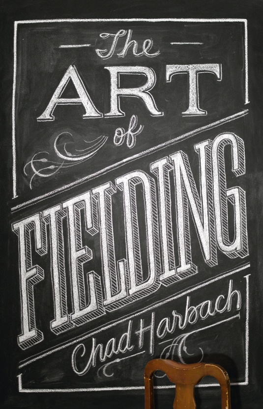
Brooklyn-based artist Dana Tanamachi used her custom chalk lettering style to design the UK version of Harbach's novel, using the chair to create a 3D element to the cover whereas the US version, designed by artist Keith Hayes, has more of a baseball feel for the American audience.
Related articles:
