A brief history of type
Check out this condensed chronicle of typography - plus you can discover the 100 best typefaces ever.
Sign up to Creative Bloq's daily newsletter, which brings you the latest news and inspiration from the worlds of art, design and technology.
You are now subscribed
Your newsletter sign-up was successful
Want to add more newsletters?
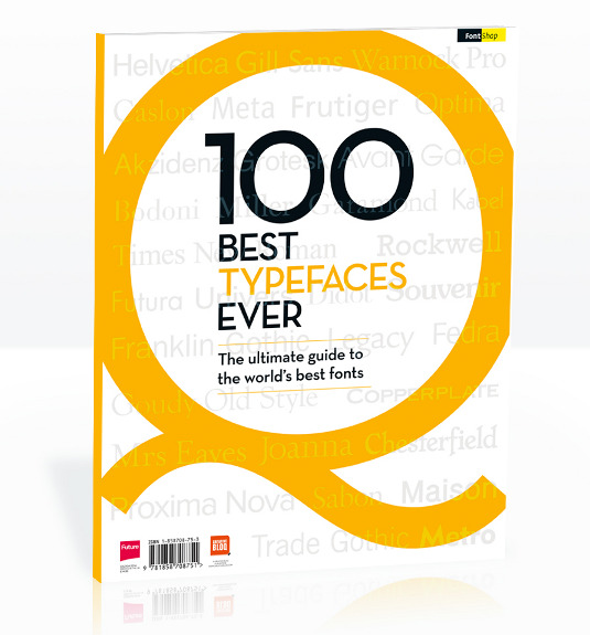
As designers, over time we tend to become experts on typography. We get to know the typefaces we use intimately, learning about the shapes, nuances and character - no pun - of each one. We might fall in love with fonts in certain weights or styles, or even individual letters. Favourites are adored, and equally some fonts are shunned and avoided. And that's why our new book - 100 Best Typefaces Ever - produced in association with FontShop AG and on sale now, is absolutely unmissable. Let us explain a little further why we produced this book…
Buy the 100 Best Typefaces Ever now!
Text is one of the core elements of any design, alongside imagery and negative space. The message you have to communicate will be spelled out here using combinations of our 26 letter alphabet. Most Western languages descend, in part at least, from Latin. Therefore it's no wonder that our alphabet today derives from the 22 characters used in Ancient Rome. Of course, the Romans weren't the first to have a written language. The Sumerians, Egyptians, Mayans and many other ancient cultures used pictograms. Each little carved image was a word, and they used thousands of pictograms to record their scientific and historical achievements, and their beliefs.
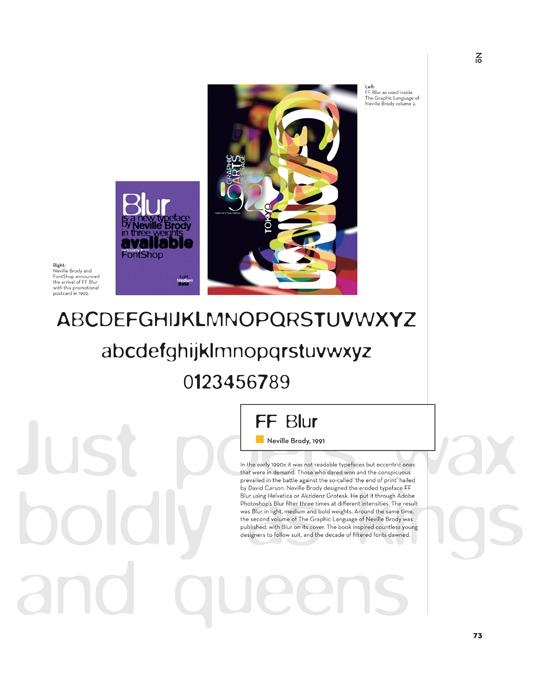
What's special about Latin, and Greek before it, is that each graphic shape - or letter - represents a sound rather than a whole word. The sounds together form the words, and these give our communications meaning. By writing them down we can give the message permanence. They can be written in stone, or on paper. And thanks to Johannes Gutenberg's invention of the printing press in the late 1440s, we can make many copies and distribute the communication far and wide.
Article continues belowCalligraphic handwriting
In Gutenberg's day, books were copied out by scribes - usually in monasteries - in calligraphic handwriting. Carolingian script was being replaced by the more fashionable Gothic hand with all those heavy vertical strokes, and dainty curved, horizontal and diagonal lines. Inevitably, the artisans of Gutenberg's day sought to replicate the Gothic letters in the moveable carved blocks they created to go on the presses.
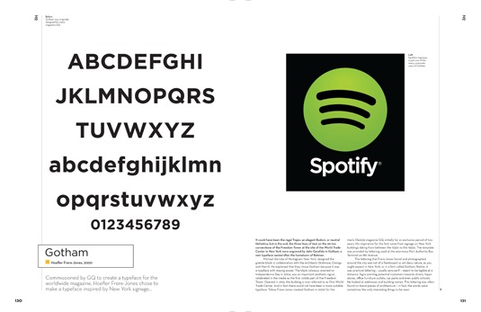
Soon, these type cutters were taking inspiration from other forms of writing. Like the humanist philosophers of the Enlightenment who were rediscovering and classical texts, poetry and history books, these craftsmen looked at everything from Roman inscriptions to illuminated Bibles from the Dark Ages to come up with new letterforms. It was their job to print the texts of antiquity for 15th and 16th century audiences.
Beginning of typography
That, arguably, was the beginning of typography, one of the most obsessively detailed forms of creativity. The question is, why is it important that new and different interpretations of letters, numbers and punctuation were developed? Legibility is one issue. Once we've learned to read our brains no longer look at the individual letters. We see words as shapes, or groups of shapes. As our minds thirstily drink up the information in the text, we don't want to pause to try and mentally swallow a lump of lettering we can't recognise. And that old Gothic text is chunky stuff. So it's a good thing type cutters began rationalising the alphabets they used for legibility.
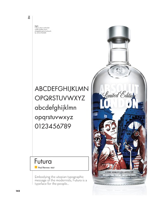
Secondly, a choice of typefaces is desirable for aesthetic reasons. You could compare design to the field of architecture. An architect couldn't and wouldn't build structures using just one type of brick. As typographer and FontShop co-founder Erik Spiekermann has pointed out, the letters are like bricks, and you need more than one type of brick to build with.
Sign up to Creative Bloq's daily newsletter, which brings you the latest news and inspiration from the worlds of art, design and technology.
Letters represent sounds
Similarly, let's not forget that printed letters represent sounds. When we speak, we use all sorts of pitches, tones and inflections. With different typefaces, we can give the written word intonation and fill it with expression. The right font means a billboard can truly shout, a novel can thrill and seduce you with its soft burr, while a favourite website makes brings a giggle with its chirpy reportage.
Yes, the content plays a large role in all of this, but as a designer part of your job is to give the content its full due. The typeface you choose plays a huge roll in that process.
As a designer part of your job is to give the content its full due
It's now over 500 years since the first printed books appeared in Western Europe. Back then, the letters were made by hand, and some of today's most popular fonts still trace those venerable lines. Today, creating a typeface can be equally laborious, involving hours of study and numerous phases of appraisal and refinement. A working digital font may need well over 500 characters too, in order to be sold across Europe, or worldwide.
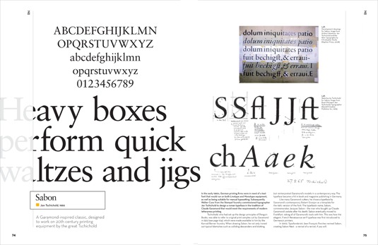
There are so many designers out there looking for fresh ways of expressing things in text, while on the other hand there's been a proliferation of typefaces ever since the 1450s. This has accelerated in the digital age. Some online foundries are selling around 80,000 fonts and then you've got all the free fonts out there too. Software means - theoretically - just about any designer can learn to become a typographer.
100 Best Typefaces Ever
FontShop AG, the renowned type foundry, conducted a survey based on historical relevance, sales at FontShop.com and aesthetic quality. With a few additions from the experts at Creative Bloq and Computer Arts magazine, the best fonts ever were selected for the new book, 100 Best Typefaces Ever. In addition to defining the list, in the book we bring you some insightful background on each one. The story of each typeface can be just as interesting as how it looks, and very often the background and aesthetics are completely entwined. We love examining letterforms, but we think knowing a little more about your type gives it an even richer meaning in use.
You can pick up the high-production value, lavish 180-page 100 best Typefaces Ever book at WH Smith or Barnes & Noble, at My Favourite Magazines or, if you prefer a digital version for iPad or iPhone, in the Computer Arts app on Apple Newsstand.
Words: Garrick Webster and Rob Carney

The Creative Bloq team is made up of a group of art and design enthusiasts, and has changed and evolved since Creative Bloq began back in 2012. The current website team consists of eight full-time members of staff: Editor Georgia Coggan, Deputy Editor Rosie Hilder, Ecommerce Editor Beren Neale, Senior News Editor Daniel Piper, Editor, Digital Art and 3D Ian Dean, Tech Reviews Editor Erlingur Einarsson, Ecommerce Writer Beth Nicholls and Staff Writer Natalie Fear, as well as a roster of freelancers from around the world. The ImagineFX magazine team also pitch in, ensuring that content from leading digital art publication ImagineFX is represented on Creative Bloq.
