Typography takes the strain in Honda's new ad campaign
A new ad campaign for motor giant Honda is basely around clever use of custom-made typography. It's a very different approach - do you think it works?
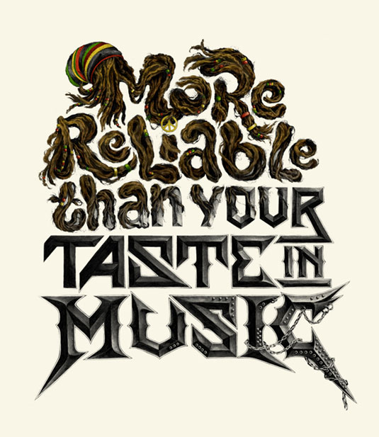
Think of car ads and you think of vehicles whizzing through sweeping, picturesque vistas. To promote its new vehicle, the Brio, Honda wanted to do something a little different.
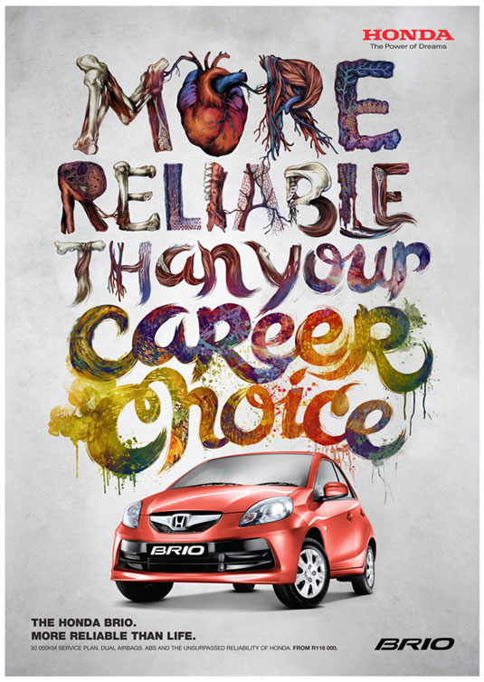
Teagan White, a freelance designer and illustrator from Chicago, was approached to create a different type of campaign. Instead of pictures of the vehicle in action, the campaign uses illustrated typography to highlight the contrast between the reliability of the Brio and the often unpredictable tastes of the young target buyer.
Make or break
Creating custom typography for an advertising campaign is a real make-or-break moment. It needs to be unique in order to catch an audience's eye, but it also needs to be readable enough to sell the advertising message. And that's exactly what's been achieved here. Both fun and original, these designs had us impressed throughout.
Article continues belowArt direction was taken care of by DDB Johannesburg, with Teagan drawing the illustrations in graphite on paper with colour added in Photoshop.
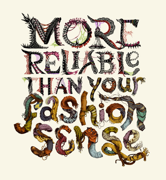
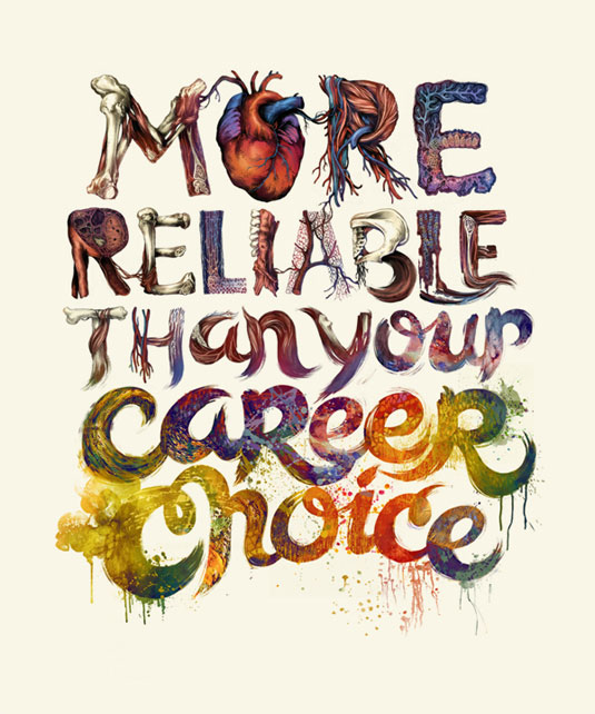
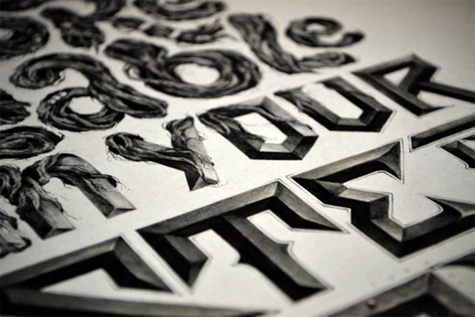
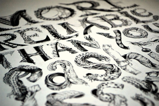
See more examples of this illustrated typography on Behance.
Like this? Read these!
- Create a perfect mood board with these pro tips
- The best Photoshop plugins
- The ultimate guide to designing the best logos
Do you think the typography works in this advert? Let us know in the comments box below!
Sign up to Creative Bloq's daily newsletter, which brings you the latest news and inspiration from the worlds of art, design and technology.

The Creative Bloq team is made up of a group of art and design enthusiasts, and has changed and evolved since Creative Bloq began back in 2012. The current website team consists of eight full-time members of staff: Editor Georgia Coggan, Deputy Editor Rosie Hilder, Ecommerce Editor Beren Neale, Senior News Editor Daniel Piper, Editor, Digital Art and 3D Ian Dean, Tech Reviews Editor Erlingur Einarsson, Ecommerce Writer Beth Nicholls and Staff Writer Natalie Fear, as well as a roster of freelancers from around the world. The ImagineFX magazine team also pitch in, ensuring that content from leading digital art publication ImagineFX is represented on Creative Bloq.
