Make your type look good on any device
Clarissa Peterson shares her tips for ensuring your text is easy to read, no matter what screen it's on.
Typography can often seem like the easiest part of designing a web page – after all, how hard is it to put words on a page?
But on responsive websites you are challenged with using media queries to make sure the type looks good and is easy to read, no matter the size of the user's screen.
Your typography choices should help the website get its message across, not get in the way of the message. In this tutorial, I'll explain how to ensure your type works effectively on devices of all shapes and sizes.
Scale
At any given screen size, the elements on the page need to be displayed in an appropriate scale. For example, on a small mobile phone screen you don't have a lot of space to work with, so it would look strange if everything was very large. That would also force the user to scroll more than necessary.
On the other hand, when your website is being viewed on a large monitor and there's plenty of space on the screen, you can take advantage of that fact by making individual elements larger, and by increasing the white space between them to make sure each element is distinct.
If things are too small, or there isn't enough white space, the page will just look squashed and confusing.
Size, length and height
Font size works together with line height (leading) and line length (measure) to determine how the text fits in with the scale of the site. These qualities also affect the readability of the text.
Sign up to Creative Bloq's daily newsletter, which brings you the latest news and inspiration from the worlds of art, design and technology.
On responsive websites, you should adjust each of these different aspects using media queries to make sure that your text always looks its best.
Font size
Many designers forget to consider the most important thing about font size: the text needs to be large enough for most users to easily read.
Around age 40, people start to develop presbyopia, a condition which makes it hard to focus on things that are close. That means there are a lot of people (including me) that have difficulty reading small text on websites.
You don't have to worry about what font size is large enough, because the browser makers have already figured it out for you. You just need to set your base font size to 100% , and each browser will make that a font size most users will be able to easily read on that particular browser and device.
For most current devices (but not all), that 100% font size is the equivalent of 16 pixels. Future types of devices are likely to have different base font sizes. By using 100% now, you're getting ready for all those future devices.

Ems and rems
Set the base font size to 100% in the body element. After that, all the fonts on your site need to be sized in ems or rems, which are relational units, rather than fixed units like pixels. This will make it easier to adjust the font size for different screen widths.
For example, you can start out with your paragraph text at 1em, which is equal to the base font size. Setting your H1 at 2em would make it twice as big as the base font size.
body { font-size: 100%; } p { font-size: 1em; }
h2 { font-size: 2em; }Until recently, a lot of websites used 10 pixels or 12 pixels as the base size for their paragraph text. If this is what you're used to, 100% text might seem really large. But bigger text on a website shouldn't look wrong.
If you look at the text in your design and it feels too big, that likely just means you need to adjust the scale of everything else to match the size of the text. Larger text means other elements on the page need to be larger, and there needs to be more white space between elements.
Line height
Line height is the distance between lines of text. It affects readability: if lines are too close together or too far apart, it will make it more difficult for your eyes to travel from the end of one line to the beginning of the next, and you'll have to put more effort into reading.
A line height of 1 means the line is as tall as the text, with no extra space between lines. A line height of 2 means the empty space between lines of text is exactly as tall as the text.
On average, the best line height for reading is around 1.4, so this is a good place to start. Keep in mind this applies only to blocks of text such as paragraphs, not to other text elements like headings. On small screens, your line height should be slightly less, and on large screens, slightly more.
Vertical margins, above and below paragraphs, should be in proportion to line height. You can do this by using the same number, but with a unit of em.
p { line-height: 1.4; margin: 1.4em auto; }Line Length
Line length is very important to the readability of text. Very long lines are difficult to read, as your eyes have trouble moving from one line to the next.
Short lines have a different problem of their own: because your eyes are moving back and forth so often, you will tire of reading more quickly.
Text is easiest to read if lines are on average 45-75 characters in length. Since each line will have a different number of characters, you're just shooting for an average.

You can easily find out the if your text falls within that range by using Chris Coyier's handy bookmarklet (netm.ag/coyier-267). While working on a site, you may find it easier to simply add a span around the appropriate characters in your first paragraph and add a class to colour the text red.
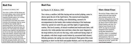
Starting with your design at the narrowest screen size, you'll likely have your text in a single column. At a font size of 100% , your lines will be around 45 characters long, or slightly less.
Looking at your design, slowly increase the width of your browser window and the line length will increase until it eventually hits 75 characters. This is the point at which you want to add a media query, to get your line length back within the 45-75 character range.
Adjusting margins
There are a few things you can do to decrease your line length. First, you can increase your left and right margins. If you're working on a one-column website, this is the easiest option.
Second, you can increase the number of columns, so your paragraph text doesn't go all the way across the screen.
Third, you can increase the font size of your paragraphs, which will mean fewer characters per line.
You can use any combination of these approaches to make sure the line length stays within the 45-75 character range, no matter the width of the screen.
In the example below, I'm using arbitrary viewport widths – you'll want to pick the viewport widths that are appropriate for your design.
article p { font-size: 1em; line-height: 1.3; width: 96%; }
@media only screen and (min-width: 30em) {
article p { width: 80%; }
}

@media only screen and (min-width: 50em) {
article p { font-size: 1.1em; line-height: 1.4em; }
}

@media only screen and (min-width: 60em) {
section { width: 70%; float: left; }
article p { width: 100%; }
}

@media only screen and (min-width: 80em) {
article p { font-size: 1.2em; line-height: 1.5em; }
}

@media only screen and (min-width: 100em) {
section { width: 50%; }
}
Keep in mind you can have as many media queries as you want on a website. It's best to make smaller, incremental changes to typography at several breakpoints, rather than making huge changes all at once, at a couple of major breakpoints.
Adjust the size of your browser window to see where media queries need to go – where the text starts to not look good, that's where you need a media query.
Putting it together
Keep in mind these aren't hard-and-fast rules. One key to making design work well is to test your site on a variety of devices at many different screen widths. Think about whether the font size, white space and line length look appropriate at each screen width.
Making sure your text is easy to read will translate to more users reading more of your content, and more users returning to your site.
Words: Clarissa Peterson
Clarissa is a UX designer and web developer at Peterson/Kandy, and the author of Learning Responsive Web Design. This article was originally published in net magazine issue 267.
Liked this? Read these!

The Creative Bloq team is made up of a group of art and design enthusiasts, and has changed and evolved since Creative Bloq began back in 2012. The current website team consists of eight full-time members of staff: Editor Georgia Coggan, Deputy Editor Rosie Hilder, Ecommerce Editor Beren Neale, Senior News Editor Daniel Piper, Editor, Digital Art and 3D Ian Dean, Tech Reviews Editor Erlingur Einarsson, Ecommerce Writer Beth Nicholls and Staff Writer Natalie Fear, as well as a roster of freelancers from around the world. The ImagineFX magazine team also pitch in, ensuring that content from leading digital art publication ImagineFX is represented on Creative Bloq.
