An A-Z of semantic typography
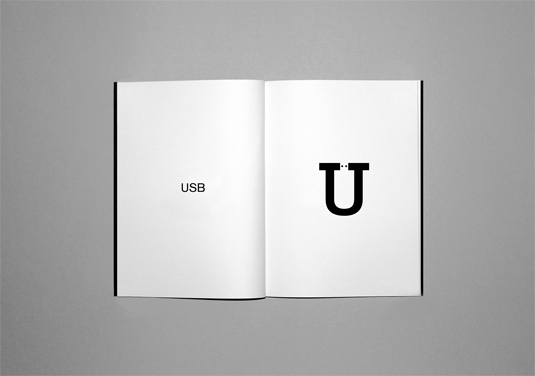
Check out the Idea Alphabet, a series of typographic observations based on each letter of the alphabet.
Sign up to Creative Bloq's daily newsletter, which brings you the latest news and inspiration from the worlds of art, design and technology.
You are now subscribed
Your newsletter sign-up was successful
Want to add more newsletters?
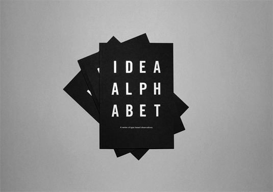
Earlier this month, we introduced the concept of semantic typography - - type pictures that spell out the meaning of words visually - via the witty creations of Ji Lee. That post proved so popular, we decided to seek out some more, and uncovered this brilliantly quirky 'Idea Alphabet' created by Norfolk-based designer Jordan Blyth.
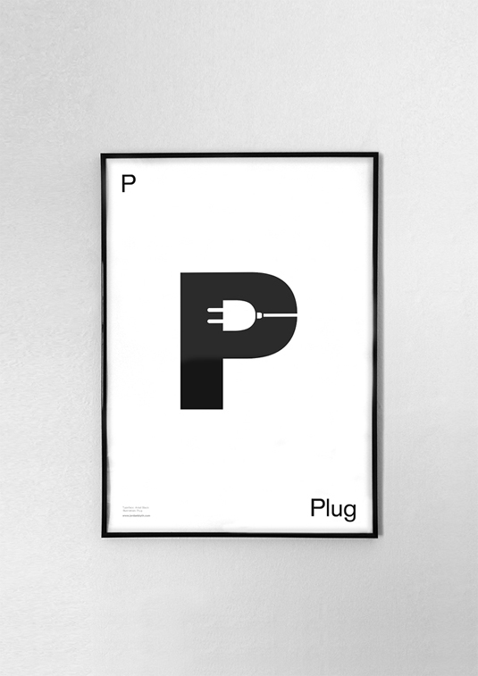
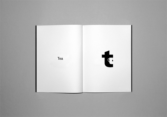
"Each letterform is derived from an existing typeface and is subsequently crafted, using its inherent negative space to visually represent an object or idea in which the letter itself begins with," Blyth explains. You often to look twice to see the letter's subtle semantic form, but that just made us like them more.
Blyth has produced 26 Idea Alphabet books in total, with pages printed onto white uncoated 120gsm olin rough stock. The striking cover type is foiled in white onto 350gsm ebony colorplan.
Article continues below 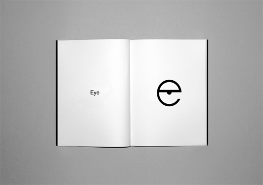
See more of Jordan's work over on his website.
Like this? Read these!
- Free graffiti font selection
- Illustrator tutorials: amazing ideas to try today!
- Great examples of doodle art
Seen some inspiring typography? What do you make of this project? Let us know in the comments box below!
Sign up to Creative Bloq's daily newsletter, which brings you the latest news and inspiration from the worlds of art, design and technology.

The Creative Bloq team is made up of a group of art and design enthusiasts, and has changed and evolved since Creative Bloq began back in 2012. The current website team consists of eight full-time members of staff: Editor Georgia Coggan, Deputy Editor Rosie Hilder, Ecommerce Editor Beren Neale, Senior News Editor Daniel Piper, Editor, Digital Art and 3D Ian Dean, Tech Reviews Editor Erlingur Einarsson, Ecommerce Writer Beth Nicholls and Staff Writer Natalie Fear, as well as a roster of freelancers from around the world. The ImagineFX magazine team also pitch in, ensuring that content from leading digital art publication ImagineFX is represented on Creative Bloq.
