How to incorporate space into your designs
Jerry Cao examines the role played by space in digital design, and how to make best use of it.
Sign up to Creative Bloq's daily newsletter, which brings you the latest news and inspiration from the worlds of art, design and technology.
You are now subscribed
Your newsletter sign-up was successful
Want to add more newsletters?
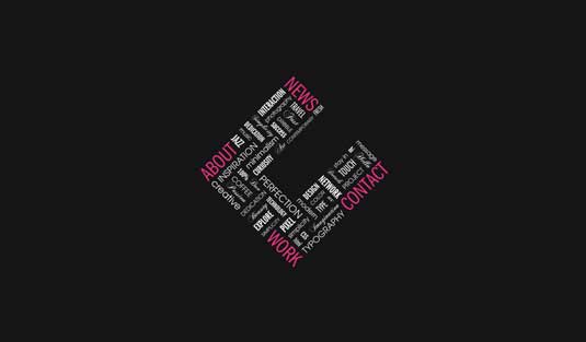
Applying space to your designs is not so easy.
It's as if a painter adds the colour "emptiness" to his palette: like other colours, it has a very distinct usefulness unique to itself, however, the trick is in knowing where and how much to apply.
That's what this article hopes to achieve: explaining how to use the colour "emptiness." In short, we're going to teach you how to apply space to your designs.
Modify for content
Every website uses space differently based on the purpose of the content.

For example, a landing page may leave plenty of space because the focus is mostly on a call-to-action button.
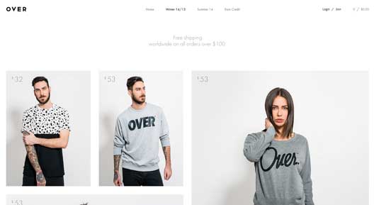
On the contrary, an ecommerce store like Over Clothing has a lot more content which needs to be squeezed into a layout. There will still be a need for space, but it probably won't be as lavishly carefree as you'd find in a simple landing page.
The bottom line the context determines the use of the space, which means there aren't many hard-and-fast rules to apply onto every website. But here are some general tips to keep in mind:
Sign up to Creative Bloq's daily newsletter, which brings you the latest news and inspiration from the worlds of art, design and technology.
- Get a feel for each website and its organization — In fact, designer Paul Boag suggests you limit a page to 15 points of attention. For each item you add to the interface, subtract another.
- Compare your ideas with other similar designs — Consider how other designers put together space in layouts. For example, this gallery from awwwards is a fantastic starting point.
- Understand that content relationships are defined by surrounding space — Passive space creates breathing room, while active space leads users eye's towards relevant content.
Now, let's dive a little deeper into the spatial elements of space and how to apply it practically.
Spatial design features
Composition is the gestalt. It's the whole website that arises from the sum of its parts. To fully understand what works and why, you must study space from a compositional and microscopic level.
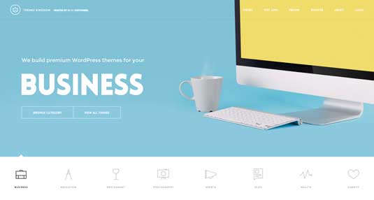
Themes Kingdom is a good example because their layout uses a variety of different spatial elements for different reasons. The space found between top navigation links (shown above) feels more compact than the space between block elements on the bottom of the homepage.
Nav links are crammed into a closely-packed navbar, the text is smaller, and the links feel like a more subtle piece of the header. On the other hand Themes Kingdom uses many big links with extra padding lower on the page. These links feel more spacious and captivating in comparison to the smaller navbar.
Although the navigation links are smaller, they still come across as one large collection of links. White space for grouped elements should be used to convey similarities of links. To forge a close relationship between content, it's a good idea to float elements side-by-side. Take for example the various theme category links found directly underneath the header. These links are quaint yet distinct, featuring thin line icons for aesthetic appeal.
As described in the free ebook Web UI Design for the Human Eye, the laws of Gestalt dictate that objects in closer proximity will appear as one "unit," with the space acting as a visual cue.
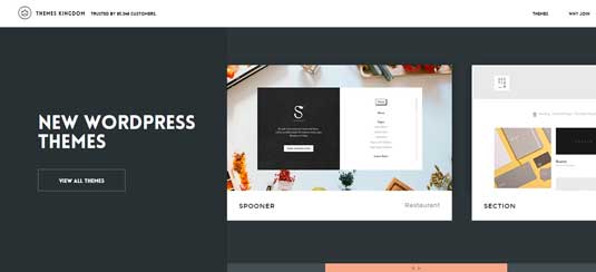
But other items like the theme gallery widget are meant to be spaced out. More space between the text and images (combined with a contrasting colour) forces visitors to draw their attention to that gallery widget since nothing else is distracting. It's a handy little technique for links, buttons, or featured content where you'd like to see more user interactivity.
Portfolio sites are another great source of space inspiration since designers take great care to frame their work with taste and sensibility. A great website design wraps all of this visual information in a spectacular gift box.
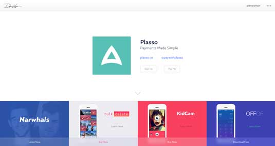
While there are many great examples available, we recommend checking out Drew Wilson's website. The space on his portfolio is based entirely on the content structure to enhance certain blocks of text and imagery.
His layout is also meant to be a single-page design. Without extra pages, all of the content is forced into a small layout that requires a keen sense of space and compositional balance.
You should notice that his website doesn't just rely on typography, colour, space, animation, or any other single design technique. All of these principles are combined together so that they fit quite naturally into the overall layout.
Practical tips
Although each website design is unique, you should always pair space with other design techniques that work well off each other.
Here's some more tips for practically applying space:
- Variety is a good thing — Some areas may need less space, others may need a lot more. Go with the flow and rely on your designer's intuition.
- Prioritize legibility and readability — Before you start designing, create an interface inventory to assess the scope of your content. Once you're done, try creating some rough content wireframes to assess how much space is required for legibility (how well you can discern the letters and words) and readability (how well you can scan the content).
- Break out of the vacuum — Use contrasting colours, disparative font sizes, and asymmetrical space to add extra style into a layout. Understand that space is a reactive design element and affects the perception of all surrounding elements.
Pragmatic space creates a structure around content that is vital to the success of any design. Take a peek at why space matters to learn more about designing space for content.
Takeaway
What is great about all of these examples is that they incorporate space properly. You'll notice that space isn't just used for flashy gimmicks or extra icons (although it can be). Space distinguishes between content areas, or to lump bits of content together. Great web design should look great, but it must also communicate purpose.
As Brad Frost suggests in his responsive redesign of Techcrunch, treat space as subtractive sculpture. White space is not an empty canvas, but a powerful design tool. Use it to carve out all the sections of a website.
How big should the navigation links be? Should they be aligned horizontally or vertically? How much space is required? The answers will be different on each project, but the outcome must be a clearly defined relationship between all navigational objects and content elements.
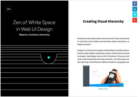
To learn more, check out the free e-book Zen of White Space in Web Design: Balance, Contrast, Hierarchy. The book includes 60 pages of advice with 14 analyzed examples from Google, Wanderlust, Sketchapp, Lever, and others.
Words: Jerry Cao
Jerry Cao is a content strategist at UXPin — the wireframing and prototyping app — where he develops in-app and online content for the wireframing and prototyping platform.
Like this? Read these!
- 20 steps to the perfect website layout
- How to build an app: try these great tutorials
- Free graphic design software available to you right now!

The Creative Bloq team is made up of a group of art and design enthusiasts, and has changed and evolved since Creative Bloq began back in 2012. The current website team consists of eight full-time members of staff: Editor Georgia Coggan, Deputy Editor Rosie Hilder, Ecommerce Editor Beren Neale, Senior News Editor Daniel Piper, Editor, Digital Art and 3D Ian Dean, Tech Reviews Editor Erlingur Einarsson, Ecommerce Writer Beth Nicholls and Staff Writer Natalie Fear, as well as a roster of freelancers from around the world. The ImagineFX magazine team also pitch in, ensuring that content from leading digital art publication ImagineFX is represented on Creative Bloq.
