The UX of typography explained
Sam Kapila runs down what to consider when using typographic hierarchy as a tool for the user experience.
Sign up to Creative Bloq's daily newsletter, which brings you the latest news and inspiration from the worlds of art, design and technology.
You are now subscribed
Your newsletter sign-up was successful
Want to add more newsletters?
Typography isn't only about picking trendy retro fonts and colours. While it's commonly discussed as a part of the interface, typography can also play a part in the user experience and content goals of a site, if we consider a few key concepts.
Start by reading the content, then choose typefaces that fit with it. In The Type Primer, John Kane shares the four key considerations that dictate which families to select: the content, author's voice, audience, and (one of the most overlooked) the historical context of a typeface. After choosing a typeface, consider its placement.
In Thinking With Type, Ellen Lupton advises left-aligning body copy, to create a consistent place for the reader's eye to go to on every line. Justified text can create inconsistent spaces between words, which can be distracting. For headlines or shorter pieces of content, however, centering (along with generous use of white space) can help draw the reader's attention.
Article continues belowOnce contrasting type families and styles are defined, apply them consistently across the whole site. This kind of typographic system affects the reader subconsciously because of Gestalt theory: it creates a visual language that helps the reader understand the importance of that content.
As designers, we're essentially the tour guides of an experience, and typography is the path our users take. Thoughtful consideration of type allows the audience to connect with what they're looking at.
Let's have a look at some stand-out examples of typography that complement UX.
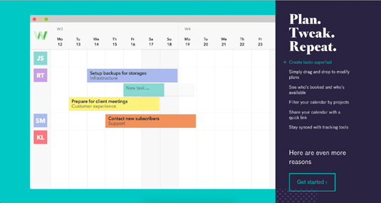
01. TeamWeek

TeamWeek's app walk-through contrasts a bold serif and a tamer sans-serif, and matches the button colour with its corresponding step. This helps direct the viewers eye.
Sign up to Creative Bloq's daily newsletter, which brings you the latest news and inspiration from the worlds of art, design and technology.
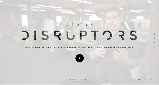
02. Design Disruptors

InVision's Design Disruptors site uses centered typography and ample white space to draw the viewer's attention to the title, which is brought to life with SVG cut-outs.
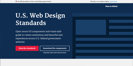
03. Web Standards

On the new US government Web Standards site the typeface choices are both functional and visually appealing, and typography is used consistently to build trust.
Related articles:
- Browse our collection of the best free fonts
- We reveal the best web fonts for your site
- Top Chrome extensions for designers and devs

Sam is a designer living in Austin, Texas, who speaks and writes extensively about web and product design, diversity, inclusion, and equity. In 2011, she wrote the first university course on the topic of Responsive Web Design. She is currently Design Director at thoughtbot, and serves on several design advisory boards in Austin.
