Vine redesign allows easier video search
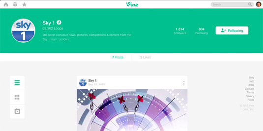
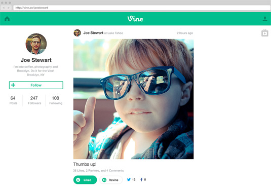
Vine has quietly revamped its profile pages to improve user experience.
Sign up to Creative Bloq's daily newsletter, which brings you the latest news and inspiration from the worlds of art, design and technology.
You are now subscribed
Your newsletter sign-up was successful
Want to add more newsletters?

From short-form comedy to showcasing musical talent, Vine's looping six second videos have created a new way to be entertained, distracted, or even become famous.
Launched in 2012, the site is instantly recognisable with its mint green banner. But with such brief content, the site relies on smooth navigation to keep users clicking on one more video. Thankfully that's exactly what Vine's new profile pages achieve.
Whereas Vine's old profile pages spread buttons across the full width of the screen, the new redesign launched over the weekend consolidates all video icons and options into a left-hand-side column for ease of swiping.
Other changes include grouping the profile information into the banner, and placing likes and shares within thumb's reach in the centre of the screen. Going down the rabbit hole of Vine videos just got a whole lot easier.

Liked this? Read these!
- Stop-motion videos take Vine to the next level
- Top web designs of 2015
- Are 'blocky wocky' sites killing web design?
Sign up to Creative Bloq's daily newsletter, which brings you the latest news and inspiration from the worlds of art, design and technology.

Dom Carter is a freelance writer who specialises in art and design. Formerly a staff writer for Creative Bloq, his work has also appeared on Creative Boom and in the pages of ImagineFX, Computer Arts, 3D World, and .net. He has been a D&AD New Blood judge, and has a particular interest in picture books.
