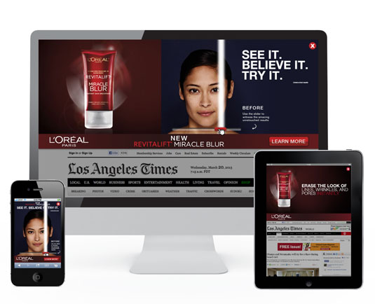
New responsive advertising format launched
Built on HTML5 by Undertone, ScreenShift aims to make mobile ads easier to deliver across multiple platforms. Is this the future of responsive advertising?

The way we advertise is changing rapidly. In order to catch your potential customer's eye, you have to do something truly unique - like these brilliant examples of billboard advertising or IBM's inventive use of street furniture. However, there's no denying that in the main these days, digital reigns supreme.
But with the number of different screen sizes and devices multiplying daily, that can cause headaches for advertisers. So today digital advertising specialists Undertone has launched what it believes to be an industry-changing responsive ad format.
Built on HTML5, ScreenShift can be delivered seamlessly across web environments on smartphone, tablet and desktop, optimising its design and interaction and taking advantage of features and functionality native to individual devices.
Article continues belowSimplified solution
"Single screen creative solutions remain effective, but the process of running cross-screen campaigns across multiple vendors can be technically challenging and complex," says Undertone's EMEA managing director Cameron Hulett. "With ScreenShift, we’ve dramatically simplified the process of delivering high impact advertising across multiple screens and platforms at scale.”
ScreenShift is the first format to be developed through Undertone’s Impact Accelerator and can be optimised across screens as well as coming with full cross-screen reporting and insights.
Watch this! L'Oreal campaign using ScreenShift
Like this? Read these!
- Brilliant Wordpress tutorial selection
- Free tattoo fonts for designers
- Free Photoshop actions to create stunning effects
What do you make of ScreenShift? Let us know in the comments box below!
Sign up to Creative Bloq's daily newsletter, which brings you the latest news and inspiration from the worlds of art, design and technology.

The Creative Bloq team is made up of a group of art and design enthusiasts, and has changed and evolved since Creative Bloq began back in 2012. The current website team consists of eight full-time members of staff: Editor Georgia Coggan, Deputy Editor Rosie Hilder, Ecommerce Editor Beren Neale, Senior News Editor Daniel Piper, Editor, Digital Art and 3D Ian Dean, Tech Reviews Editor Erlingur Einarsson, Ecommerce Writer Beth Nicholls and Staff Writer Natalie Fear, as well as a roster of freelancers from around the world. The ImagineFX magazine team also pitch in, ensuring that content from leading digital art publication ImagineFX is represented on Creative Bloq.
