Studio-sharing website gets dramatic make-under
Known as the Airbnb of the design studio world, Open Studio Club unveils a minimalist new redesign that gets straight to the point.
Sign up to Creative Bloq's daily newsletter, which brings you the latest news and inspiration from the worlds of art, design and technology.
You are now subscribed
Your newsletter sign-up was successful
Want to add more newsletters?

We first told you about Open Studio Club, a service designed to help creatives find and rent studio space around the world, back in November. Since then the service has gone from strength to strength, with over 500 studios listed from all over the world - and now comes the inevitable website refresh.
But rather than falling into the usual trap of increasing complexity, adding extra buttons and generally confusing the heck out of people with all the extra bloat, Open Studio Club has gone in exactly the opposite direction, giving their site a dramatic 'make-under'.

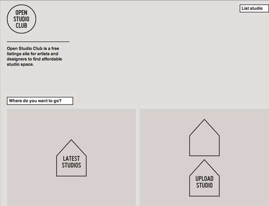
On reaching the homepage the visitor is now met by a starkly minimalist design based on bare-bones, geometric shapes set against a grey and white background.
Article continues belowIt's an unusual approach, and one which certainly conveys the idea of 'space', as well as the 'blank canvas' of opportunities the service (essentially the Airbnb of the design studio world) is offering.
New features
The redesign is not all entirely about stripping back; some new services and design elements have been added.

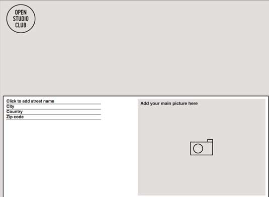
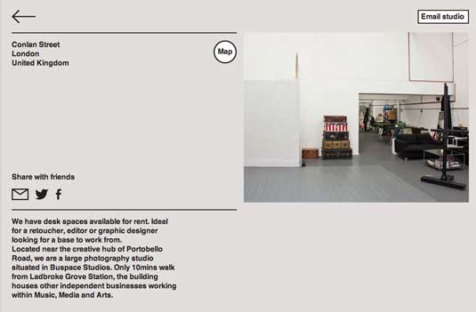
Every studio now gets its own page featuring a large colour photo, for instance, while a new section called 'Work Cafes' is intended to help freelancers find cafes in their local area that welcome them. The redesign also features a range of special designed icons/pictograms to allow studios to highlight the facilities they offer in a clearer way.
Overall, though, the grey, minimal aesthetic is carried across, giving the site a design unity and strikingly unique look throughout. We'd love to hear what you think of this approach to site design - let us know your views in the comments below!
Sign up to Creative Bloq's daily newsletter, which brings you the latest news and inspiration from the worlds of art, design and technology.
Like this? Read these!
- 2013's essential design events
- 101 Photoshop tips, tricks and fixes to try today
- Discover what's next for Augmented Reality

The Creative Bloq team is made up of a group of art and design enthusiasts, and has changed and evolved since Creative Bloq began back in 2012. The current website team consists of eight full-time members of staff: Editor Georgia Coggan, Deputy Editor Rosie Hilder, Ecommerce Editor Beren Neale, Senior News Editor Daniel Piper, Editor, Digital Art and 3D Ian Dean, Tech Reviews Editor Erlingur Einarsson, Ecommerce Writer Beth Nicholls and Staff Writer Natalie Fear, as well as a roster of freelancers from around the world. The ImagineFX magazine team also pitch in, ensuring that content from leading digital art publication ImagineFX is represented on Creative Bloq.
