10 top character design tips for animation
Harald animator Moritz Schneider shares 10 techniques for creating CG characters with depth and personality.
Sign up to Creative Bloq's daily newsletter, which brings you the latest news and inspiration from the worlds of art, design and technology.
You are now subscribed
Your newsletter sign-up was successful
Want to add more newsletters?
Using my experiences of working on Harald – my award-winning graduation film for the Institute for Animation and VFX at the Filmakademie – I aim to share my techniques for creating characters with depth and personality.
While I use Maya, Mudbox and Arnold Renderer, in this training you'll find a collection of tips and insights in the process of designing, modelling and texturing a character for rigging and animation.
If you are planning to make a short, and already have an idea about the story, the next step, on paper, is to structure a working script. Before starting with your design and modelling process, make sure you write down and know the psychology of your characters, and what they will be doing.
Article continues belowIf you want the characters to sell the ideas you have written in the script, you should learn to translate the words in the script into clearly readable shapes, colours and proportions in 3D. The reward you will get from this is an audience that has to spend less time figuring out who or what they see – which creates more screen time for the film to raise empathy and expectations for its characters and script.
01. Reduction
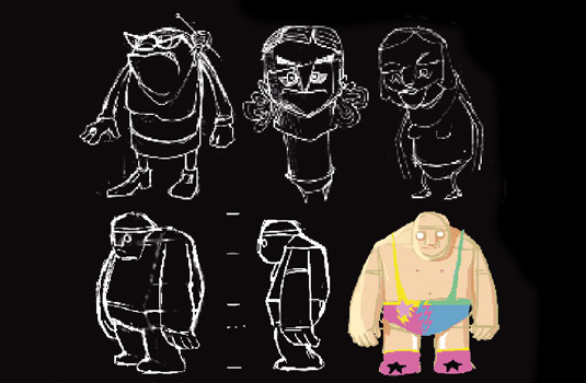
When designing the characters, reduce them to their key features that show the invisible: what they want and fear, and their deviancies. I try to reduce my artistic arsenal to a minimum and suppress my own style preferences and routines as long as possible.
I want the character to be a wrestler, so I will have to think about a suit for him to show his profession. In my research I discovered many wrestlers with long hair who looked more like rock stars. But my script says nothing about him being a rock star, rather the contrary: Harald is supposed to be a gentle giant in love with flowers.
The visible features of my characters should not distract from the invisible ones, so after trying it out I decide against the hair, as there is no narrative purpose in it.
Sign up to Creative Bloq's daily newsletter, which brings you the latest news and inspiration from the worlds of art, design and technology.
02. Overall shape
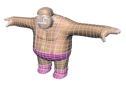
I usually work in Maya using classic box modelling tools. Working this way is great because it helps me design my characters in 2D in a way they will benefit from when created in 3D. I start off with several primitives and then use Extrude, Split Polygon and Insert Edgeloop.
I worked with cubes for Harald and used the same workflow based on cylindrical primitives for the mother character. Keeping the different primitives in mind helps me to give them each a unique overall shape.
03. Work with a low polygon count theory
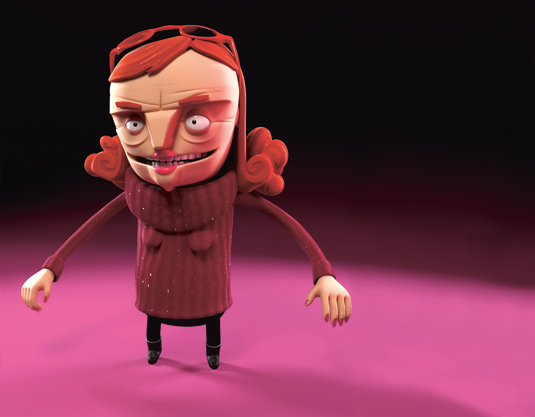
For visual refinement I add in single polygon Edgeloops to define edges and areas that fold, like in the arms. I work with the Viewport mesh tessellation of Maya and avoid mesh smooth operations while modelling. It doesn't nail you down to a higher tessellation of geometry and, with less polygon faces, I don't have to be as careful not to break any of my nice smooth curves.
This is great, especially in the beginning when I still want to be able to experiment with my overall proportions. However, I will use the low polygon version of my characters for rigging and skinning, so it is very important to always make sure that the loops of your meshes have a continuous flow from one polygon to the next.
Breaking the lines may still look good when smoothed out in Smooth Preview mode, but as soon as it comes to rigging deformations later, they can produce strange results. The benefit of using the low poly version in rigging is that you don't have to deal with as many vertices and it is a much faster process to do the skinning.
In my case, I will animate directly with my final geometry inside Maya instead of having a reduced geometry for faster calculations, as there is no need for this with a low polygon count.
04. Technical versus artistic solutions
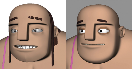
When modelling the eyes, I first try the 'common' way of modelling a sphere with a hole, then adding another shape to form the iris. I also model a shape to give me the wet tear-like look at the corner of the eyelids.
The good thing about having such a simple setup is that you will have total control over the emotion in the character's eyes already in animation (where you only see viewport previews), because you are not so much dependent on textures, refraction, reflection and specular effects. This makes it much easier to go forward and backward in the animation process and tweak viewing directions and the look of the characters without having to make test renders all the time.
I tend to keep all the specular and reflection effects rather low anyway – again, I don't want to create a visual barrier of glossy shapes and effects between my characters and the audience, especially in the face, where most of the deeper emotions will happen.
05. Style of textures
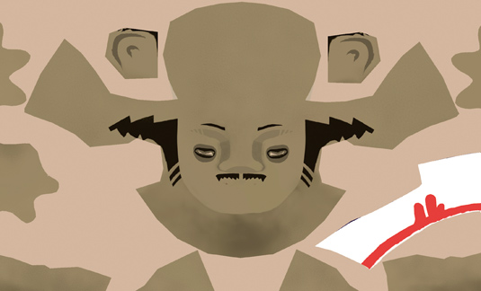
I decide to keep my textures very plain. The style I have chosen for modelling is very much about reduction – so there is no sense in taking it back into a more realistic or detailed world, which would likely reveal the 'cheapness' of my geometry.
Also the audience may lose the focus I have already set up with the reduction. As I have reduced my modelled shapes, I do the same for my painted shapes. I focus on what best communicates the content.
06. Symmetry versus asymmetry
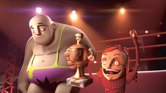
In drawn art, asymmetry will always occur naturally, but in 3D modelling symmetry is what comes out by default. There is a rule of thumb that no living creature is 100 per cent mirrored on both sides.
But let's think about it before just applying it mindlessly to our character models – does it make sense for you and your project? In a robot world, probably everything would be in perfect balance; there is no emotional tension within a robot character. Most people are looking for balance in their lives, but we are all unbalanced somehow; some more, some less.
This is my idea in the character designs in Harald. The hero Harald is a harmony-loving character and therefore not as much in asymmetry as his mother is. She is supposed to look cranky, and the asymmetric shape of her head and eyes will help to show her inner tension.
07. Edges versus curves
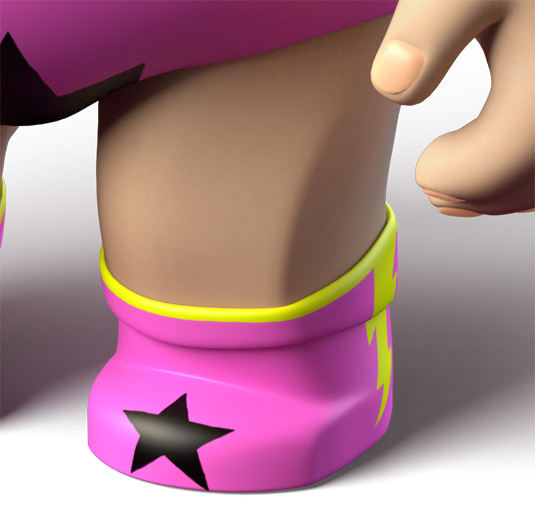
You may notice I have some unnatural edges in my character designs. For example, on the outer side of Harald's legs there is a strong geometric rim. These edges in general serve the purpose to break up the smooth flat and rounded surfaces on my characters, and to build up contrast and tension within the characters.
Without these edges my characters would be very one dimensional in shape and character. For example, although Harald is lacking self-esteem, his edgy legs symbolise his strong standing and add to his earth-grounded personality.
08. Design opposites
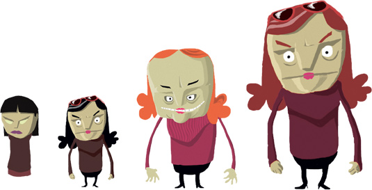
If you have more than one character, make sure that they are designed in the same style, but within that style, design them in an opposite way to each other. Each character will benefit from its difference from the other and it will make them more unique.
For example, 'big' has no meaning in a stylised world unless you give the audience a related counterpart to judge the dimensions. If you compare Harald to his mother, I am exploiting this to its full extent.
09. Internal conflict
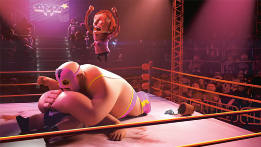
If you have only one character in your film who is in conflict with him/herself or the world around him/her, build up the counterpart by designing parts of the world in an opposite way to your character. Or do it within the character itself.
I have applied this idea to the mother in Harald, who is in conflict with herself – her big head full of ideas on how to be famous and loved is opposed by her small tube-like body. This will contribute to the empathy that the audience builds up for your character, because it raises the question 'How will he or she deal with this?'
10. Environment adds character
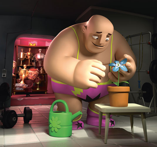
In Harald there are two characters and I try to assign different items to different minds, like, for example, the watering can which is designed to fit in with Harald's proportions, and on the other side the challenge cups, which are more in the group of items that symbolise the mother's character and interests. Try to use everything in a scene in relation to your character; it will make your character stronger and more appealing.
Words: Moritz Schneider
This article first appeared in 3D World issue 186.

The Creative Bloq team is made up of a group of art and design enthusiasts, and has changed and evolved since Creative Bloq began back in 2012. The current website team consists of eight full-time members of staff: Editor Georgia Coggan, Deputy Editor Rosie Hilder, Ecommerce Editor Beren Neale, Senior News Editor Daniel Piper, Editor, Digital Art and 3D Ian Dean, Tech Reviews Editor Erlingur Einarsson, Ecommerce Writer Beth Nicholls and Staff Writer Natalie Fear, as well as a roster of freelancers from around the world. The ImagineFX magazine team also pitch in, ensuring that content from leading digital art publication ImagineFX is represented on Creative Bloq.
