How to draw manga artwork
Create a manga-style character using alcohol-based markers.
Sign up to Creative Bloq's daily newsletter, which brings you the latest news and inspiration from the worlds of art, design and technology.
You are now subscribed
Your newsletter sign-up was successful
Want to add more newsletters?
Alcohol-based markers are a medium that shuns both hassle and mess, and are fairly easy to use once you get the hang of it. The colour choices are abundant, the colours are vibrant, and they’re extremely fast to dry, so there’s no worrying about making any accidental ink smudges or waiting for them to dry.
Because the best markers are alcohol rather than water-based, they rarely damage the paper. However, unlike paints, the ink will bleed through the paper unless you’re using coated sheets. The techniques I use here won’t work well with coated paper, so I’d suggest placing a bit of scrap paper under the drawing to prevent the ink from bleeding through to the next surface. Because the colours are dyes, they don’t do well with sunlight either,
so make sure you don’t expose your drawing to the sunlight after you’re done to prevent it from fading.
I started using alcohol markers about 20 years ago, as I found the vibrant colours and smooth look I could achieve with them matched well with my style. A lot of Japanese manga artists have used them too, because they’re often pressed for time and alcohol markers are quick. Many artists also use some of the best digital art software to map out ideas before they start on paper.
Article continues belowMy art is stylised, so the colouring will be fairly simplified compared to more realistic styles. I don’t add too many details such as shadows when I don’t have to either. My aim isn’t to be realistic, but to keep my image believable enough that the artwork
is still enjoyable to look at.
01. Start with a sketch
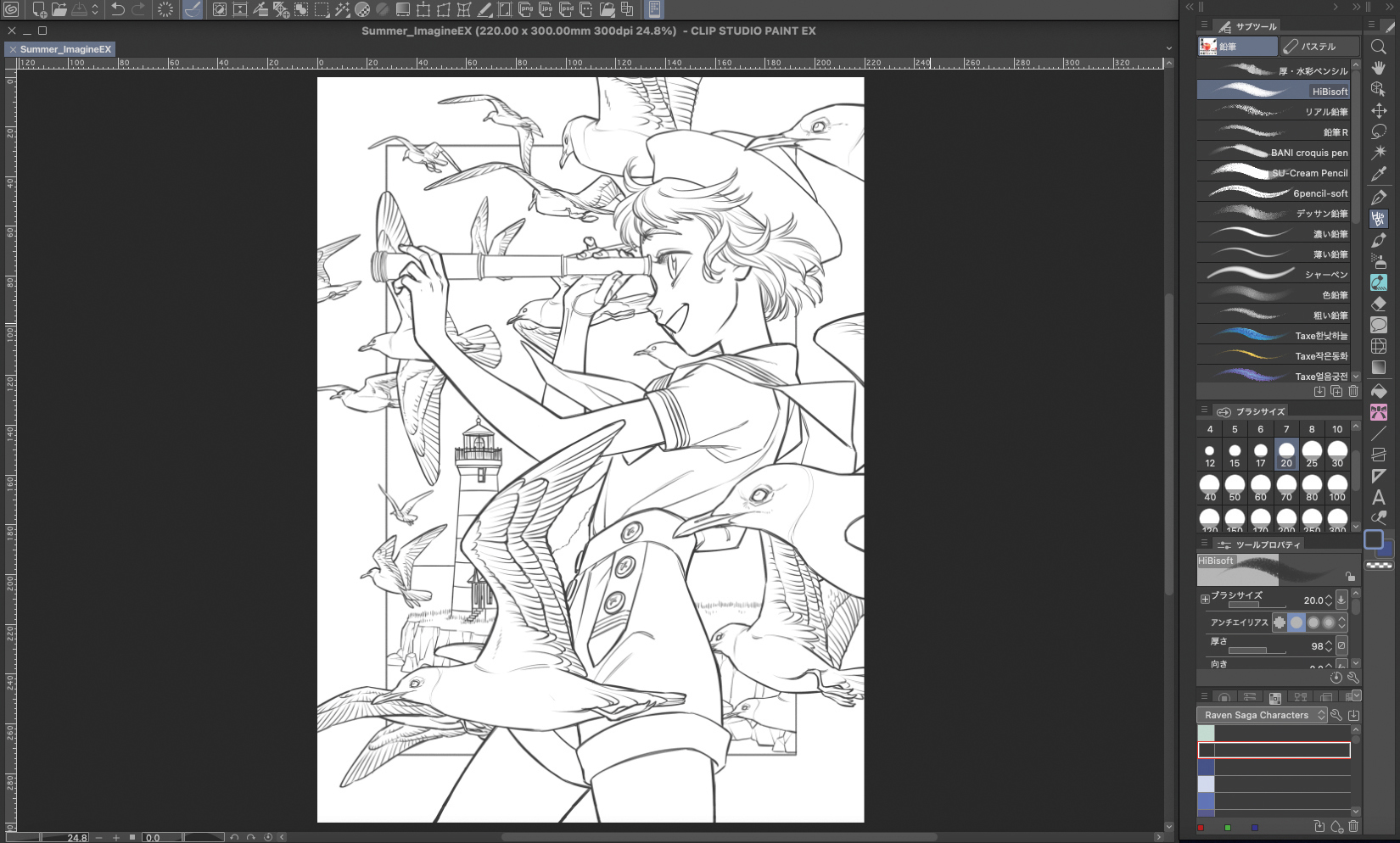
Because it’s easier to fix and make any changes, I usually do the rough sketches digitally using Clip Studio Paint. I wanted to draw something summery and blue for this piece, so I played a word association game to come up with the themes of summer, blue, ocean, lighthouse, seagulls and sailor. I like to keep the background in a box with the character protruding outside of its boundaries to give the effect that they’re coming out of the page.
02. Print and prepare
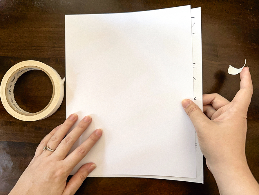
Because we’re working traditionally this time, let’s print out the sketch. The paper for the print doesn’t matter as we’ll be colouring on a different piece of paper. Use some tape with weak adhesive and stick the sketch onto the back of the marker paper. Personally, I like to work on X-Press It blending card.
03. Ink the lines
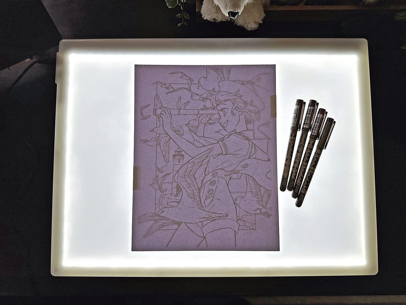
I use one of the best lightboxes for tracing to assist me when inking the drawing onto the marker paper, done with liner pens. Make sure the pen you use doesn’t smudge with the alcohol ink. It’s always good to try it out on some scrap paper first, preferably the same type of paper that you’ll be doing your colouring on. I usually avoid black pen when I ink because they’re too dark and harsh for my taste, so I use browns instead. Because we’re going to outline the background with a coloured pencil later down the line, we’ll trace with a light blue pencil. Keep the sketch paper on the back of the marker paper to prevent the ink from bleeding onto your desk. This also helps to stop the ink from oversaturating the paper when you use a lot of it to blend.
04. Pick the colours
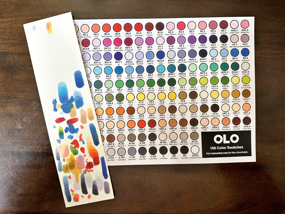
I like to have my colours listed out so I can easily find the right one. The OLO markers I use have the most accurate cap colours I know of, but it’s not always the case with other brands, so making a colour chart can be helpful. No matter how many times you’ve used your markers, always double check how they’ll blend and look together before you get started on your image.
05. Colour the skin
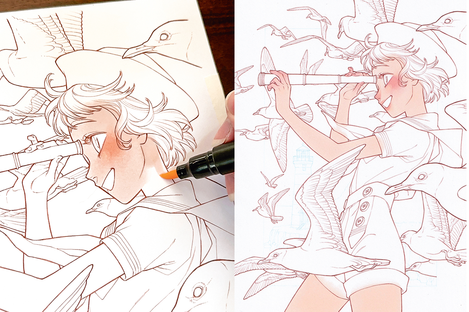
I always start with the lightest colours in the drawing. Let’s begin with the skin so the character doesn’t feel so empty when we’re colouring the other areas. Don’t use just one colour for this, use at least two: one for the blush, and one for the base colour. Unlike with watercolour, using the clear ink to blend will make it blotchy, so in order to get nice, smooth blending, we’ll start with the darker of the two, the blush, and then use the base skin colour to blend it out. I purposely colour over some areas of the hair and the clothes to create a soft look.
06. Create the shadows
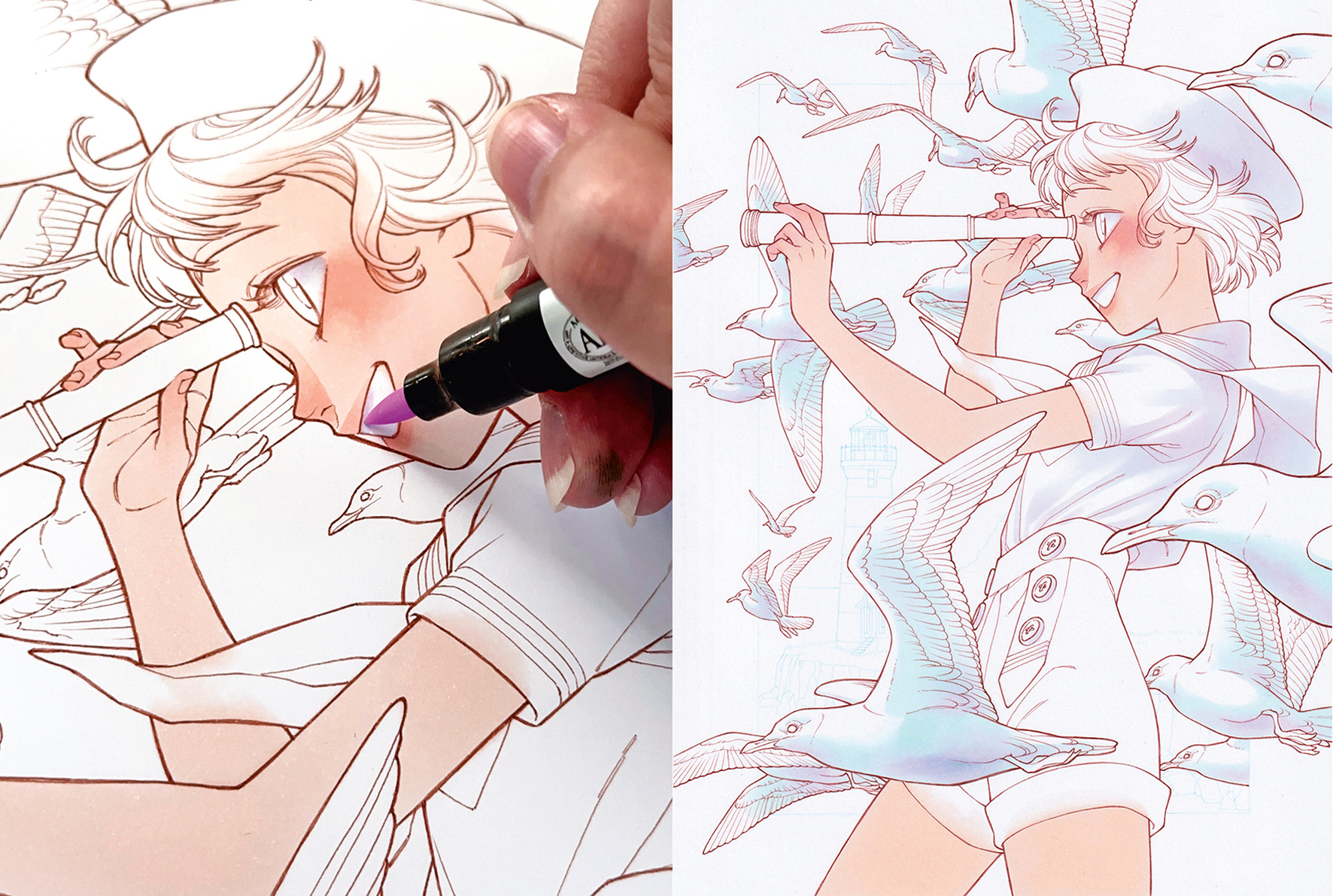
I never use grey for the shadows on the whites as I like vibrant colours, so to keep this drawing from looking dull, we’ll use purples and blues instead. Use a bluish-purple and a bit of pinkish-purple for the girl to match with her pink skin tone, and some light blues and the same pinkish-purple shade from the girl when colouring the seagulls. To show depth, use lighter colours for the seagulls that are deeper in the distance, and to avoid monotony and to enhance the shadows, add some dark areas along the edges here and there.
07. Add shadows on the skin
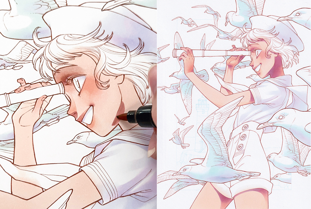
To have crisp lines, wait for a while before colouring in the shadows on the skin. We’ll use a greyish-pink for the shadow, and blend with the blush and the base skin colour. Just like we did with the whites, pull out a slightly darker purple to add in some dark areas that help enhance the shadows.
08. Correct any colour drips
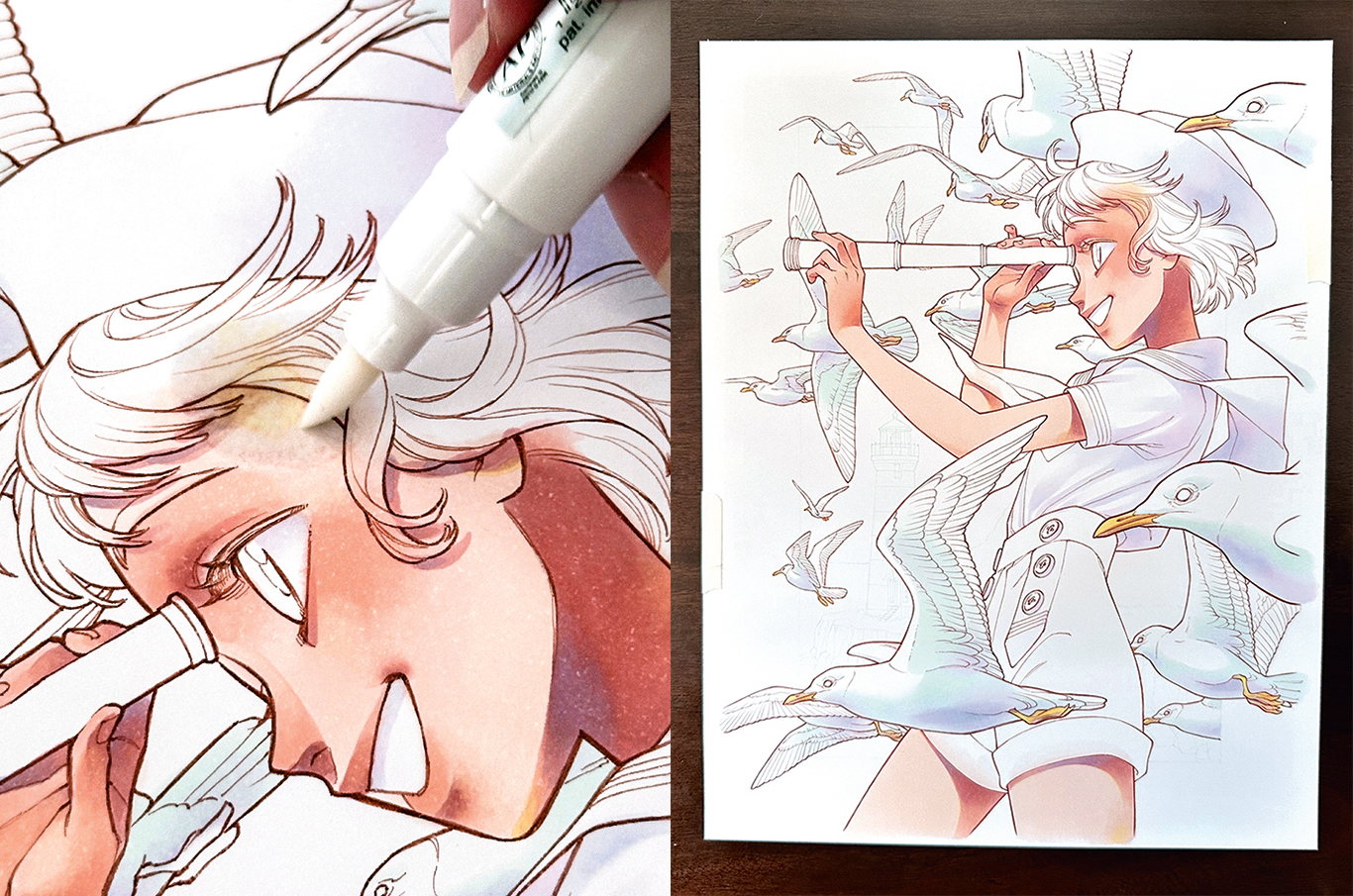
The pink ink from the shadow colour dripped, so here I’ll show you how to fix it. Alcohol ink is unique in that it pushes away other colours, so you want to use a clear ink marker to push away the unwanted colour. Once that unwanted colour fades, go over it again with the base skin colour and the shadow. If the ink bleeds over to the white area, use the clear ink to push away the colour, then a white charcoal pencil to essentially erase the remaining colour.
09. Make a metal surface
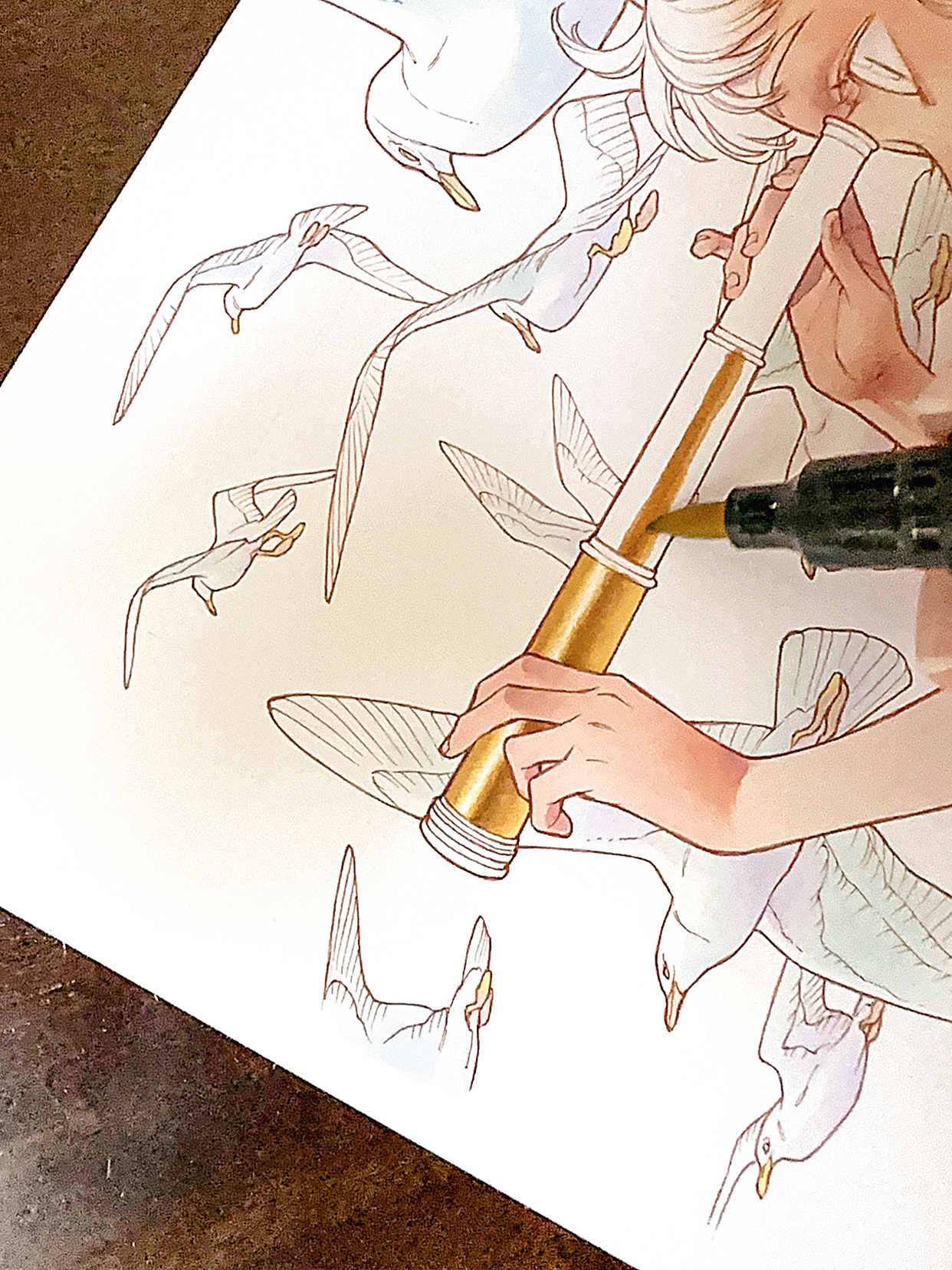
Unlike other materials that are shown here such as the skin, fabric and feathers, metals are reflective and shiny, so their look will be led by the colours and forms of the environment around them. We don’t want to go too realistic here for this image, it’s more like simplifying what a metallic pipe would look like. Colour with highly contrasting colours to achieve the metallic appearance. Instead of a gradual change between the darkest and lightest colours, sharp changes with white highlights in between will make the surface look more accurate.
10. Draw the hair
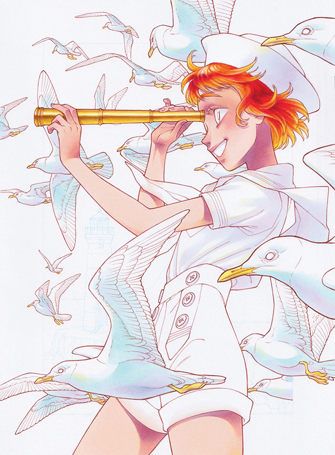
Hair is soft, which can be shown by using four to five colours. Darker colours go on the inside where the head prevents the light from coming through, getting lighter as you move towards the outside and tips of the strands where the light can show through. We’ll also leave the colour of the skin where it touches the hair, as this will create the transparent look that helps it appear soft. To enhance the shine in the hair, use the clear ink to push the colour away.
11. Shade the wings
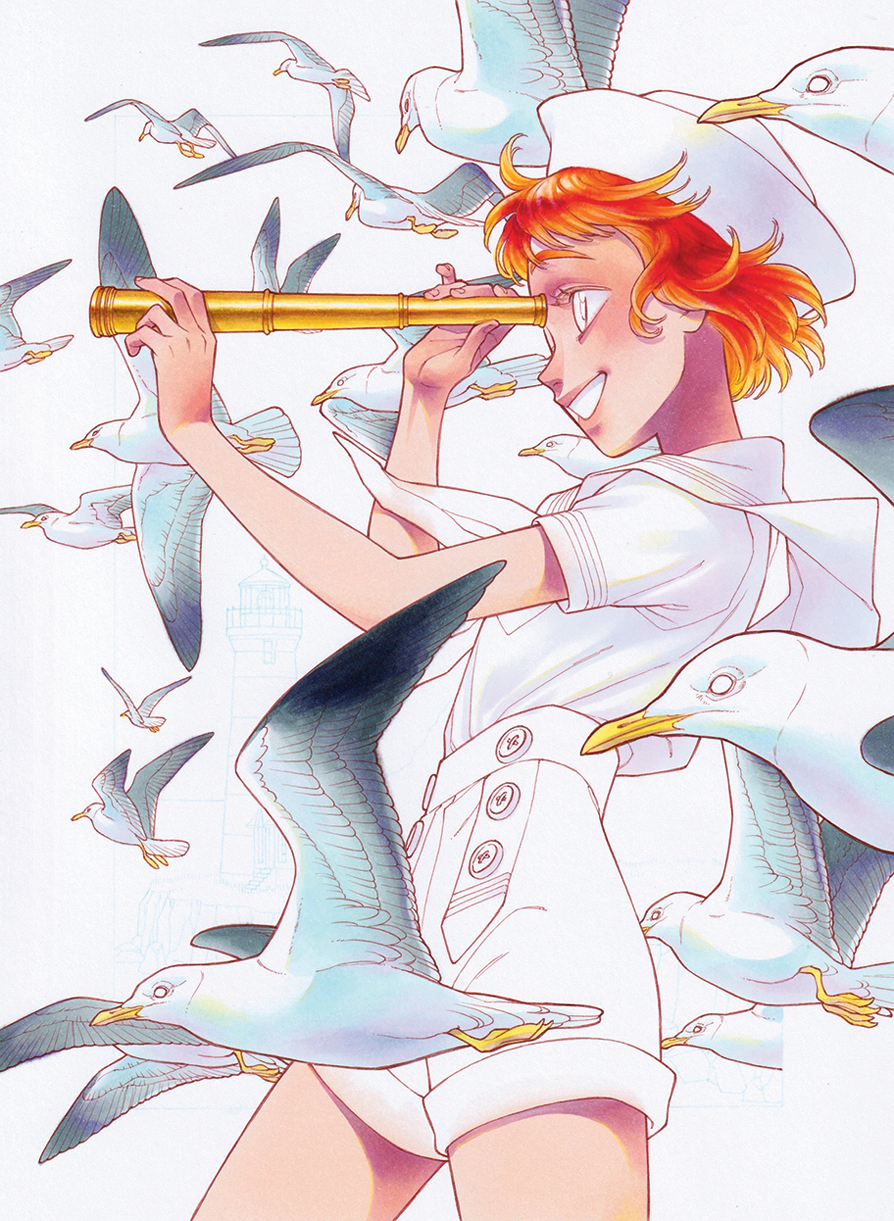
Seagulls have black tips on their wings, but as I said earlier, I try to avoid using black. To make the toned-down black, we’ll use dark grey and greyish-purple to add colour and not leave it too dull. As before, use lighter colours for the seagulls in the back and darker colours for the ones in the foreground to develop depth.
12. Give the eyes some pop
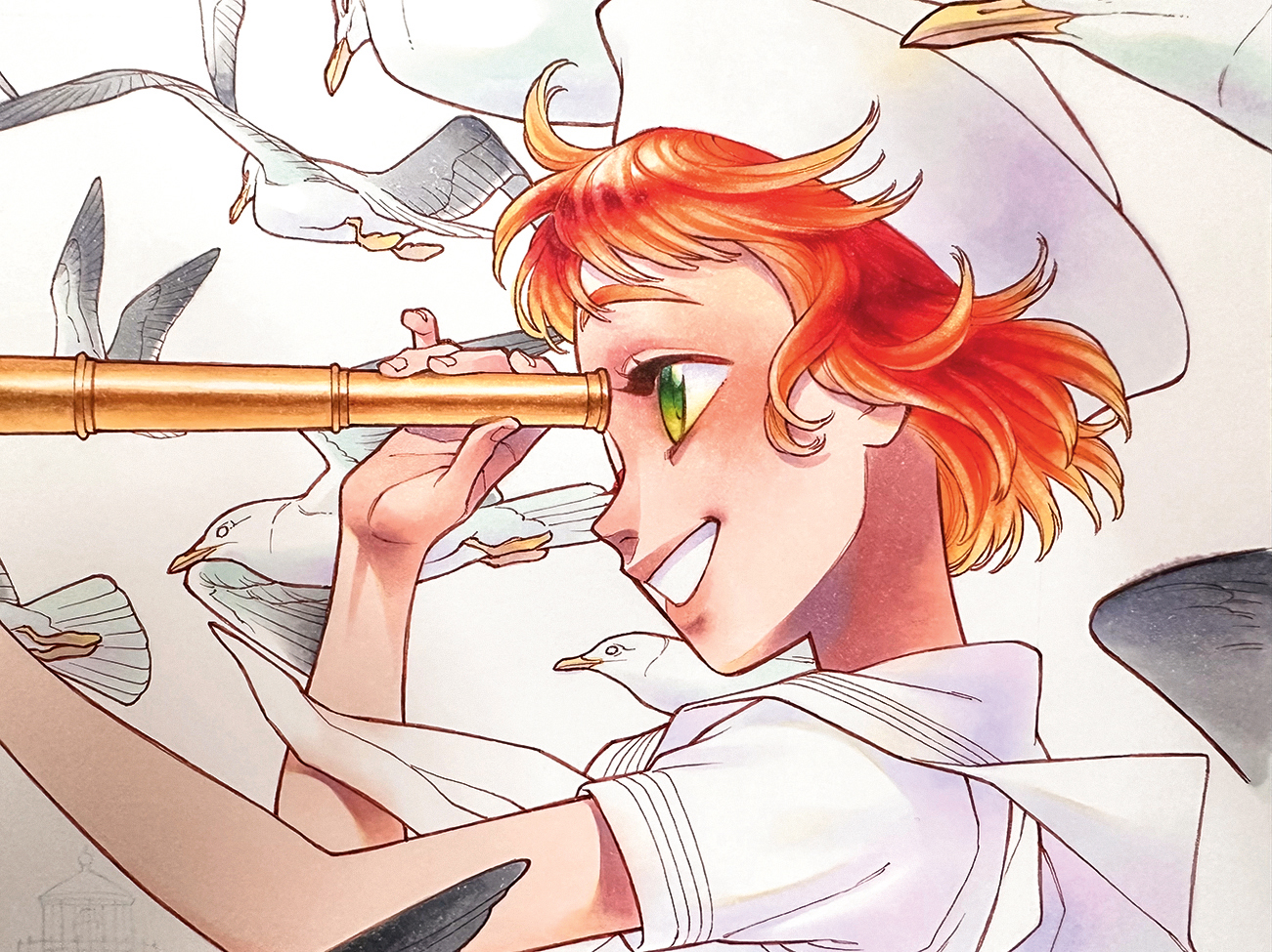
The eyes are the most important part of any character, so pick colours that stand out from the face and the areas around them. As our character has red hair and her skin is pink, we’re going to use the opposite colour in green. I like to make the eyes transparent and jewel-like, and think of it as if I’m colouring a marble; because marbles are transparent, the light goes through the material instead of shining on the surface. Add the lightest colour at the bottom of the eye and the darkest colour on top where the eyelids cast a shadow.
13. Work on the clothes
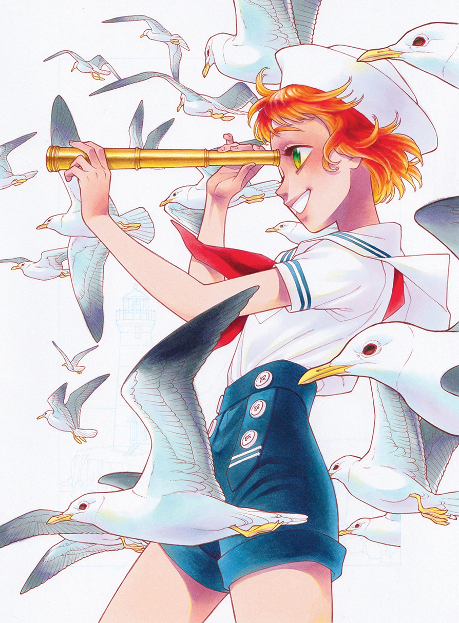
With alcohol markers, I find it easier to blend the colours if I go from dark to light. With the light colours we’ll colour the base first and add the shadows after, but with dark colours any ink added afterwards will darken it, so start with the shadows unless crisp lines are the goal. Any colour I want to blend, I colour it in first and blend it out using the lighter ink. Because there’s also reflective light involved here, keep the edges lighter.
14. Fill in the background
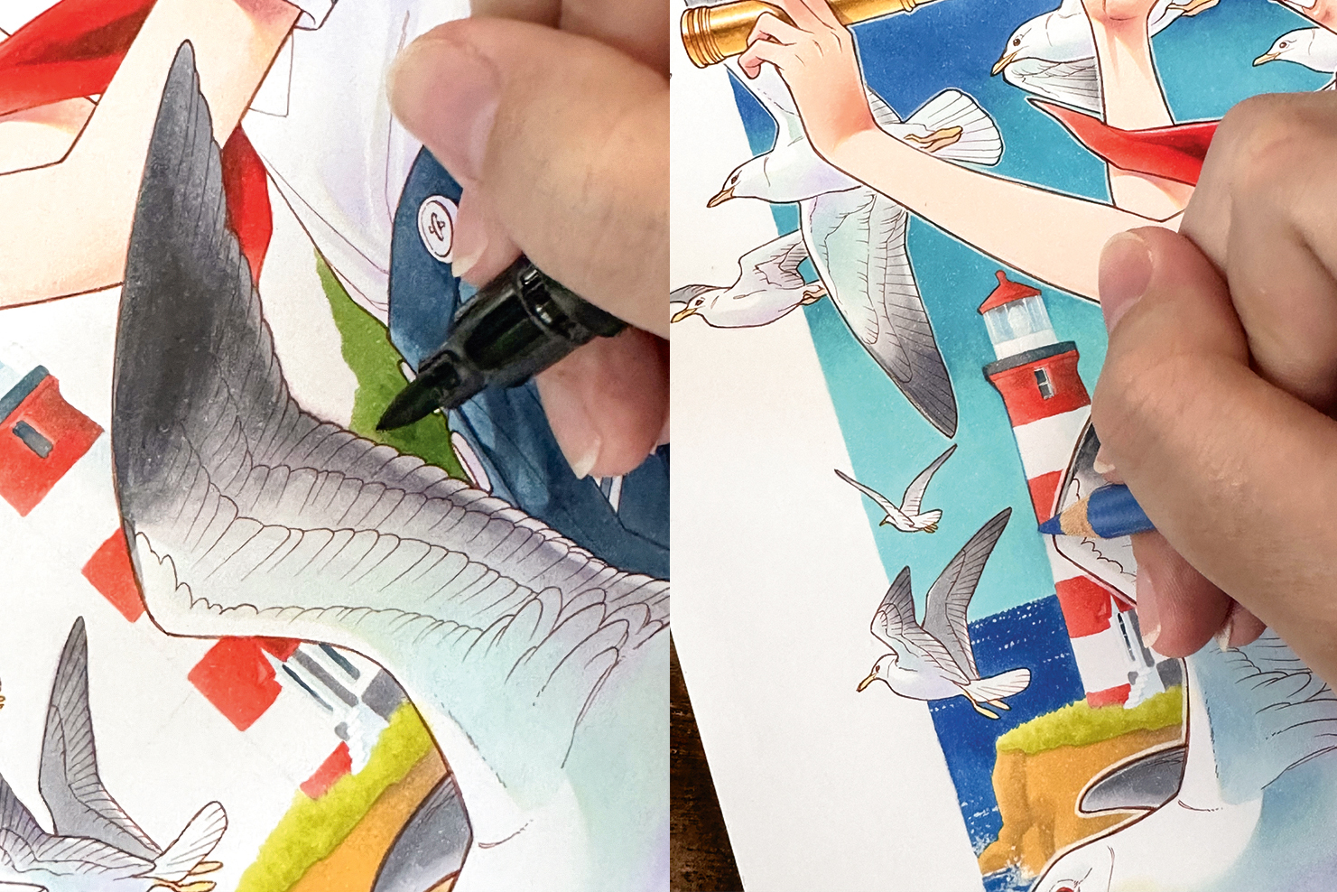
Outlining with coloured pencil first could smudge the line and leave a mark on the marker tip, so colour first. We want to use a lighter tone to colour the background and keep it simple so it doesn’t steal the focus from the character. Next, outline using a blue pencil to match with the sky and the ocean, so as not to make it stand out too much from the image as a whole.
15. Pencil in highlights
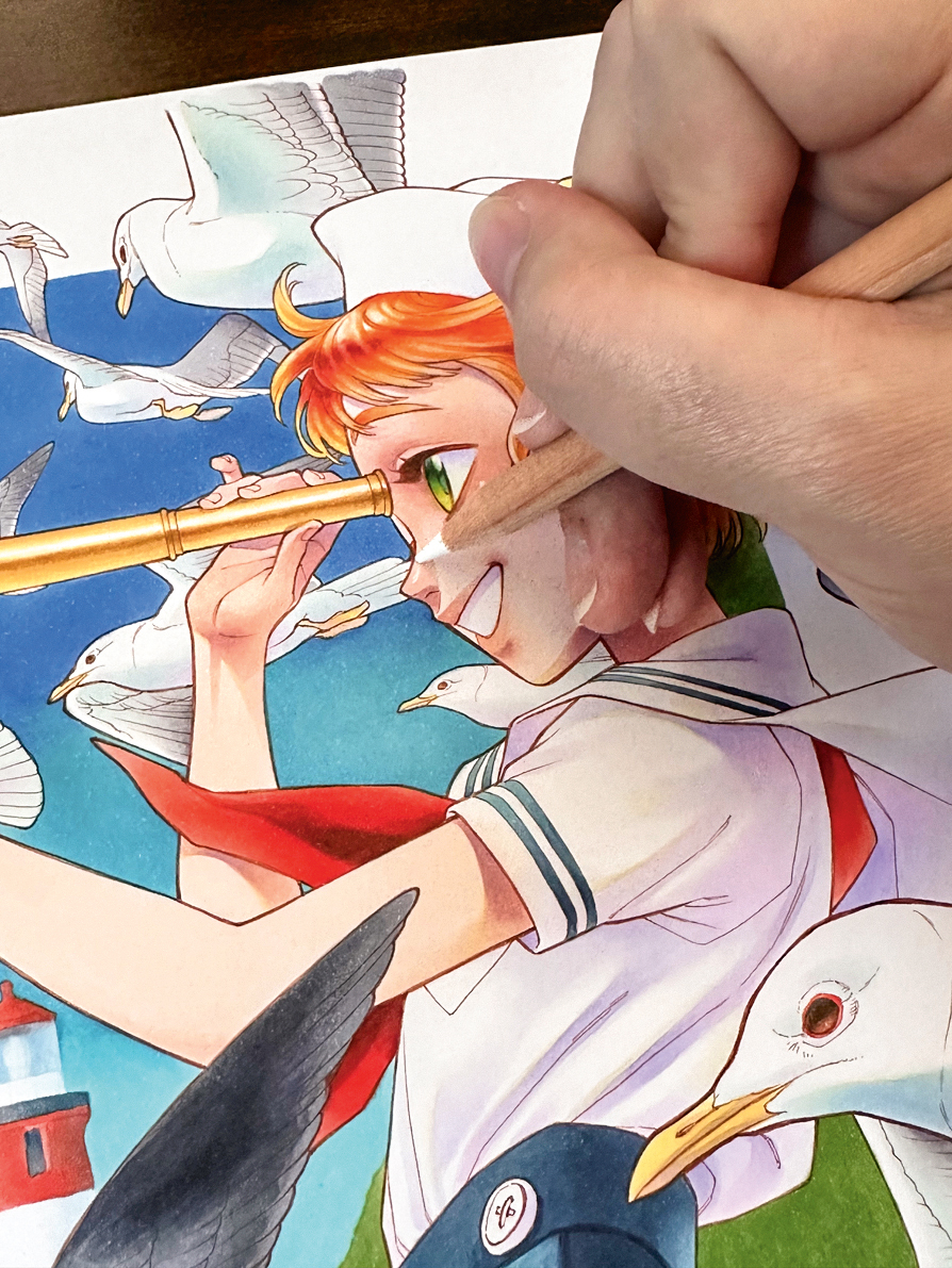
We won’t be using the marker anymore, so you can take off the sketch paper from the back. The blotches of colour on the paper is where a lot of ink was used. Now use the white charcoal pencil to add some highlights to the eyes, and the edges of the characters and the birds. Put the highlights where the light touches the most, and where the reflective lights would be.
16. Use extra character outlines
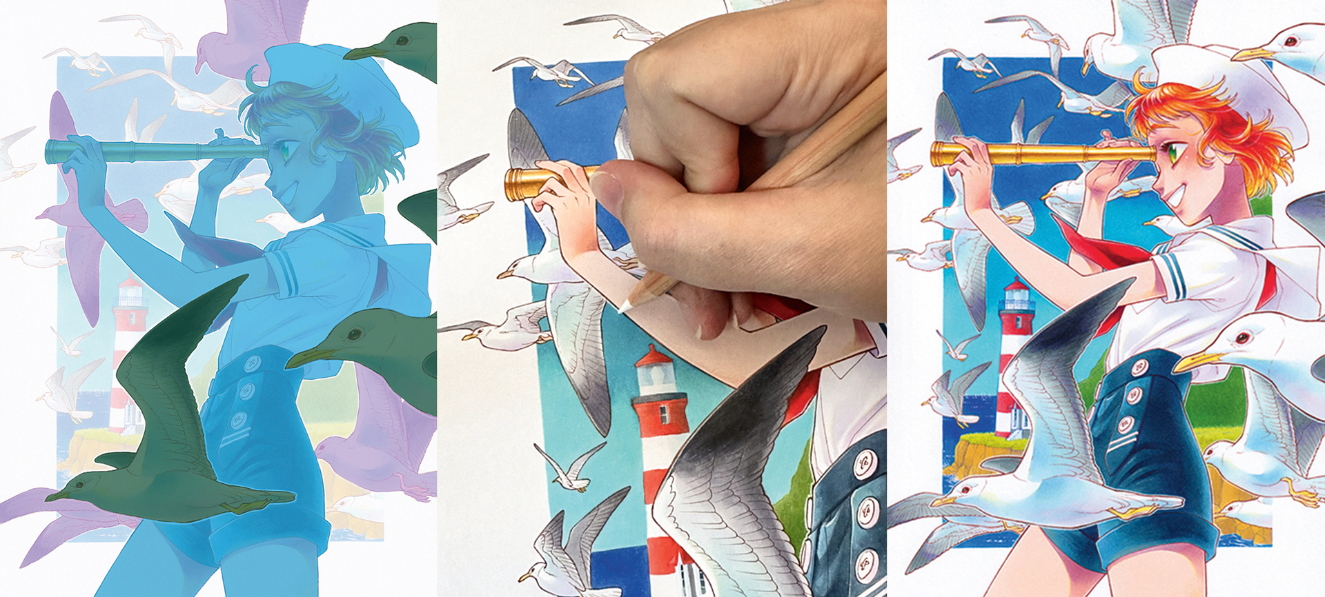
To develop a little more depth, add white outlines to the birds and the character in the foreground. This technique is used a lot in manga, and I find it a nice, easy way to show depth in the drawing without having to colour realistically. We’ll group the layers in the drawing: the three seagulls in the front as the first, the girl as the second, and the four closest seagulls behind the girl as the third and add the outlines on each layer, overlapping the layer underneath. The rest of the drawing will be the fourth layer, which is left without the outlines.
This article originally appeared in ImagineFX. Subscribe to ImagineFX to never miss an issue. Print and digital subscriptions available
Sign up to Creative Bloq's daily newsletter, which brings you the latest news and inspiration from the worlds of art, design and technology.
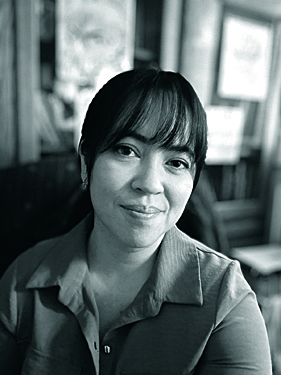
Chihiro Howe is a manga artist currently working on a Webtoon Originals series called Raven Saga. She has also worked at Imagination International Inc., a former distributor of Copic markers in North America, as a resident artist.
