Bold identity work takes a line art approach
Woodlake Design Studio takes us behind the scenes of its identity design for Guya Hansen.
Sign up to Creative Bloq's daily newsletter, which brings you the latest news and inspiration from the worlds of art, design and technology.
You are now subscribed
Your newsletter sign-up was successful
Want to add more newsletters?
"Guya Hansen, a copywriter, approached us because she wanted an all-new corporate identity – something brave and bold, which would suck her future clients in," recalls Christian Frech of Woodlake Design Studio. "She also wanted it to feature the 'H' initial of her surname."
The Frankfurt-based consultancy crafted a minimalist design for the new branding, referencing line art in the concept and applying it across everything from business cards to letterheads. "We thought of the 'H' not as a letter, but as related to writing and thinking, which is why the final design completes the 'H' as a zigzag," he says.
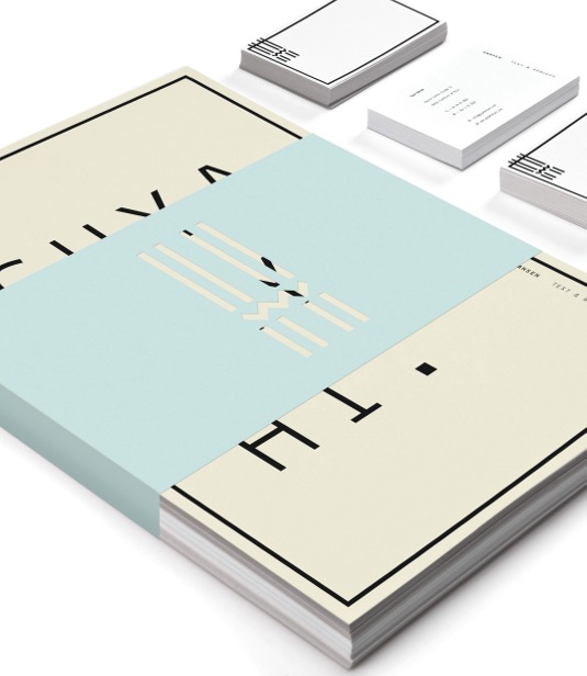
Woodlake studio was inspired by line art in its identity design. "Lines are a reference for writing and drawing; text and concept," says creative director Frech.
Article continues below 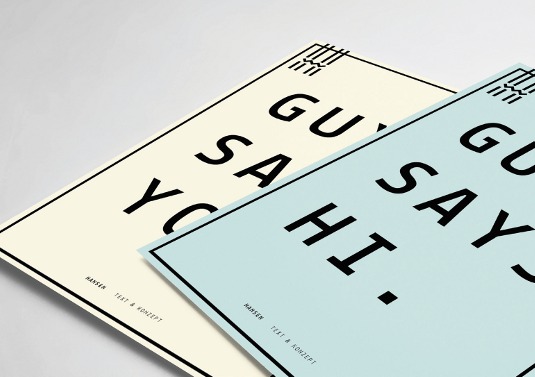
"I sketched various 'H' letterforms, just to see what worked and what didn't work," recalls Frech. "The more I drew, the less lines I used. I then moved into Illustrator and InDesign."
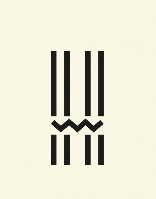
The final identity design was applied across all branding collateral from letterheads to envelopes, business cards - front and back - and small promo-posters.
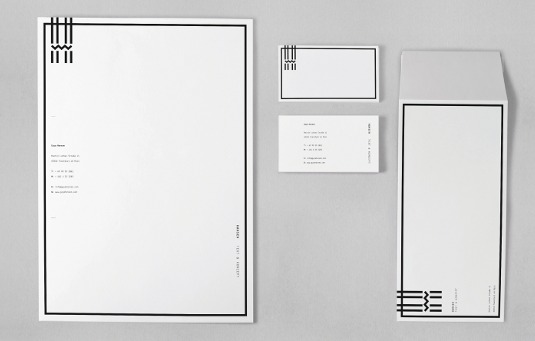
Hansen asked for her new identity to be brave, bold and incorporate the initial of her surname. The most challenging part of the project was to keep the design "as simple as possible, yet have something of an impact," says Frech.
This article originally appeared in Computer Arts issue 218.
Sign up to Creative Bloq's daily newsletter, which brings you the latest news and inspiration from the worlds of art, design and technology.
Liked this? Read these!
- The ultimate guide to logo design
- Illustrator tutorials: amazing ideas to try today!
- Our favourite web fonts - and they don't cost a penny
Seen some great identity work? Tell us about it in the comments!

The Creative Bloq team is made up of a group of art and design enthusiasts, and has changed and evolved since Creative Bloq began back in 2012. The current website team consists of eight full-time members of staff: Editor Georgia Coggan, Deputy Editor Rosie Hilder, Ecommerce Editor Beren Neale, Senior News Editor Daniel Piper, Editor, Digital Art and 3D Ian Dean, Tech Reviews Editor Erlingur Einarsson, Ecommerce Writer Beth Nicholls and Staff Writer Natalie Fear, as well as a roster of freelancers from around the world. The ImagineFX magazine team also pitch in, ensuring that content from leading digital art publication ImagineFX is represented on Creative Bloq.
