Branding the drink of the gods
Start-up beverage brand Thor Drinks gets a thunderous branding package to hammer home the point.
Sign up to Creative Bloq's daily newsletter, which brings you the latest news and inspiration from the worlds of art, design and technology.
You are now subscribed
Your newsletter sign-up was successful
Want to add more newsletters?
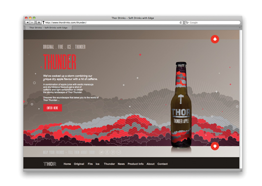
Last summer, Thor Drinks contacted London-based art director, illustrator and graphic designer Radim Malinic wating him to design the identity, packaging design and website for the company’s new range of 'soft drinks with edge'. "The brief was wide open," recalls Malinic, who works under the moniker Brand Nu. "I had to brand the main operation as well as the bottle packaging for each flavour."
The bold results give a nod to the mythological Norse god of thunder that the brand takes its name from, featuring a hammer - his weapon of choice - and clouds, representing his control over the weather. The drinks are aimed at older consumers, with each flavour (Original Apple, Fire Ginger, Ice Mint and Thunder Apple) represented by its own corresponding colour palette.

A month before launch, Malinic began work on the website design and development. The overall aesthetic expands upon the theme with the addition of accompanying soundscapes. "This project was about exploring possibilities without getting too carried away - without venturing too far from the reality of consumer goods," Malinic explains.
Article continues below"It was decided very early in the process that the bottles would be shrink-wrapped and therefore the design would have to fit and print perfectly. It took time to perfect and fine-tune most of the small parts."
This article was originally published in Computer Arts issue 211.
Like this? Read these!
- Free graffiti font selection
- Illustrator tutorials: amazing ideas to try today!
- Great examples of doodle art
Do you have any new projects that you'd like to share with us? Let us know in the comments box below!
Sign up to Creative Bloq's daily newsletter, which brings you the latest news and inspiration from the worlds of art, design and technology.

The Creative Bloq team is made up of a group of art and design enthusiasts, and has changed and evolved since Creative Bloq began back in 2012. The current website team consists of eight full-time members of staff: Editor Georgia Coggan, Deputy Editor Rosie Hilder, Ecommerce Editor Beren Neale, Senior News Editor Daniel Piper, Editor, Digital Art and 3D Ian Dean, Tech Reviews Editor Erlingur Einarsson, Ecommerce Writer Beth Nicholls and Staff Writer Natalie Fear, as well as a roster of freelancers from around the world. The ImagineFX magazine team also pitch in, ensuring that content from leading digital art publication ImagineFX is represented on Creative Bloq.
