Drafting-inspired brand identity is a polished affair
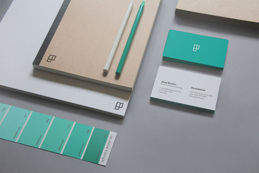
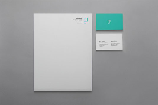
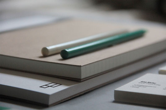
The rebrand of Homepolish takes inspiration from the company's floorplans for a simple and sleek finish.
Sign up to Creative Bloq's daily newsletter, which brings you the latest news and inspiration from the worlds of art, design and technology.
You are now subscribed
Your newsletter sign-up was successful
Want to add more newsletters?

Leo Porto is a 20-year-old graphic design and advertising student from Brazil, currently studying at the School of Visual Arts in New York. Homepolish is an interior design company based in the city and founded as an alternative to overpriced, commission-based interior design.
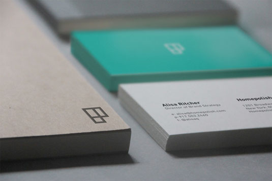
When Porto was asked to help rebrand Homepolish, he took inspiration from floorplans and set about creating a visual language that reflects the company’s overriding ethos. For the logo, he used the 'H' and 'P' in Homepolish to create an understated, abstract mark.
"My work tends to be minimalist and geometric," he explains. "I’m very much influenced by Swiss design and the modernist movement."
Article continues below 


See more inspiring work over on the Leo Porto website.
Liked this? Read these!
- The designer's guide to working from home
- The best collage maker tools - and most are free!
- The designer's guide to special characters
What do you make of this brand identity? Let us know in the comments box below!
Sign up to Creative Bloq's daily newsletter, which brings you the latest news and inspiration from the worlds of art, design and technology.

The Creative Bloq team is made up of a group of art and design enthusiasts, and has changed and evolved since Creative Bloq began back in 2012. The current website team consists of eight full-time members of staff: Editor Georgia Coggan, Deputy Editor Rosie Hilder, Ecommerce Editor Beren Neale, Senior News Editor Daniel Piper, Editor, Digital Art and 3D Ian Dean, Tech Reviews Editor Erlingur Einarsson, Ecommerce Writer Beth Nicholls and Staff Writer Natalie Fear, as well as a roster of freelancers from around the world. The ImagineFX magazine team also pitch in, ensuring that content from leading digital art publication ImagineFX is represented on Creative Bloq.
