Erik Spiekermann on why type is brand
Erik Spiekermann argues that nothing communicates a brand's personality quite like a custom typeface.
Sign up to Creative Bloq's daily newsletter, which brings you the latest news and inspiration from the worlds of art, design and technology.
You are now subscribed
Your newsletter sign-up was successful
Want to add more newsletters?
Without language there is nothing. Communication is language and type is its visible form. One of mankind's greatest achievements. It wasn't until the invention of writing that action and thought were separated - reading slows down reaction. Hearing means believing, without facts, without proof. It is only when we read about something that we can form an opinion and express objection.
The magic world of hearing is at odds with the neutral world of the eye. As Marshall McLuhan wrote in his book, The Medium is the Massage: "Until writing was invented, man lived in acoustic space: boundless, directionless, horizonless, in the dark of the mind, in the world of emotion, by primordial intuition, by terror. Speech is a social chart of this bog."
Censoring literature or - worse still - burning books destroys one of the foundations of our civilisation. Writing means keeping a presence. Today we read more than ever, regardless of what many false prophets of progress through electronic media say. While homemade cat videos might top the charts on YouTube, most of the internet consists of text.
Article continues belowCorporations and brands speak to their customers, employees, the press. To the public, in public. They do so mainly in writing, regardless of the medium. Even a TV spot cannot exist without showing the brand name or the claim: both are writing.
In other words, most of what we know about a brand or a product is what we've read about it. If these messages have not been designed to communicate with the target audience, if they don't agree with the brand's essence (or, worse, if the brand doesn't have an essence in the first place) and if they ignore the specifics of each medium, money and effort are wasted by the sender, while taking precious time away from the recipients.
Building an identity
It is thus not surprising that the communication industry spends billions designing these messages in order for them to reach their audiences, from packaging to annual reports, from TV spots to banner ads. Every brand strives to shape its communication in order for it to be memorable, authentic, believable, and attributable. The identity of the message has to be in line with the identity of the sender.
These days, even an accountant knows that a brand needs a logo, like a badge on the corporate cap. A logo alone, however, doesn't make a brand. How a brand speaks, how it presents itself, cannot be left to the unpredictable mood of the marketplace or some design trend. It has to fit - the content, the times, the medium.
Sign up to Creative Bloq's daily newsletter, which brings you the latest news and inspiration from the worlds of art, design and technology.
Some brands have managed to achieve uniqueness by owning a colour. While seemingly unsubtle and even annoying at first, the colour magenta is now equated with T-Mobile in its markets in Europe and the US. Turquoise stands for either Tiffany's the jeweller or Bianchi, the bicycle makers. Those can coexist under one colour because they have no overlap. Red is Vodafone, Manchester United (as well as Bayern Munich and dozens of other football clubs), Audi or - once upon a time - Marlboro.
British brands tend to favour British Racing Green and other subtle tones, and even non-smokers know that purple stands for Silk Cut. BMW needs two colours: white and blue, a combination it shares with Ford, VW, GM and many other brands. There simply aren't enough distinguishable colours around for all the brands in the world.
Matters of familiarity
If a distinctive colour is joined by a unique typeface, however, a brand's identity becomes much easier to express and maintain. We know Facebook not only by its (boring and predictable) blue, but also by its typeface. It's called Klavika and was designed by Eric Olson. It takes its place slightly to the left of Helvetica. It is a little different from other typefaces and that small 'f' alone is enough to recognise the brand by. It does, of course, help when a logo is seen by billions of people every day, but at the beginning even Facebook was an unknown name. That combination of blue and a slightly odd letter helped build the brand.
Every country has those combinations: what would British motorways be without its combination of blue signs with the Transport typeface on them? It always takes me a while to get used to green signs in Switzerland or France because my local German Autobahn also sports blue. And the DIN typeface on our signs has also become the standard typographic expression of engineering neutrality and solid construction.
Approaching a newsstand, we recognise our favourite newspaper well before we've read the masthead. In fact, we do not read mastheads, we recognise them. As we do the faces of our friends, regardless of changes in haircuts or glasses. If the 'Gaurdian' appeared thus one day, I bet most readers would not notice, as long as that word was set in the right typeface (designed exclusively for the relaunch by Christian Schwartz and Paul Barnes, but now commercially available) and printed dark blue. Type is more than an alphanumeric message, it is an image, a code.
If you take a train in Germany, you quickly learn that regional trains are red with white stripes while the national (and faster) trains are white with a red stripe. What the public calls white here is actually a very light grey, but in contrast to another colour it appears lighter than it really is. What they see may not be what they get, but nobody goes around with a Pantone chart, except the worst design nerds.
The Deutsche Bahn's printed matter echoes that colour combination. Every timetable, leaflet and web page shows a red stripe, a white background and the occasional light grey area, signalling its pedigree. But what no lay person knows (but would recognise if told about it), is the fact that every word, every headline, every number is set in one member of the large family of typefaces that were designed for that particular corporation.
Variety and legibility
DB Type was introduced in 2008 and gradually replaced the dozens of faces used until then. A timetable, the menu in the dining car, the headline in an ad, a poster on the station wall, the house magazine and the annual report could not all be set in the identical typeface. Just like the Guardian needs dozens of weights and versions for its columns, headlines, subheads, intros, bylines, small ads and information graphics, the range of communication published by a large business like the German railways required more than a Regular weight and its Italic.
We expect long text to be set in a typeface as we know it from books or magazines, while advertising headlines need to be simple and bold. Vital information like train times need to be legible under adverse conditions (outside in bad weather, bad lighting, or if you're in a hurry), so numbers and letters need to be very clear and not prone to be confused with each other. Try reading Helvetica in small sizes - or on a smartphone for that matter - and you may miss your train. It does make a difference whether a train leaves from platform 3 or 8, at 22:00 or at 23:00, on Sa or on Su. '1', 'l' and 'I' are also frequent victims of confusion, as anybody who has tried to enter a password that sports those characters will know.
We may not have to spell out every letter in the Guardian's masthead because we recognise rather than read it, but mixing up vital information can have consequences that might even make information design play an important role, for once. When Deutsche Bahn expanded its reach beyond running trains and became the world's fourth-largest logistics company with business units across the globe (amongst them, the Arriva bus franchise in London), it realised that it wasn't one target group it was trying to reach. Now, its audience was essentially everybody, everywhere.
It had to speak with one voice to be seen as one brand. And the typographic expression of that voice was to be a family of some 30 typefaces, from a serif for long text to a compressed sans for lots of information in a small space. These typefaces are not only available for external communications but are also installed on every computer across the company, albeit as a reduced set, as necessary for internal communication.
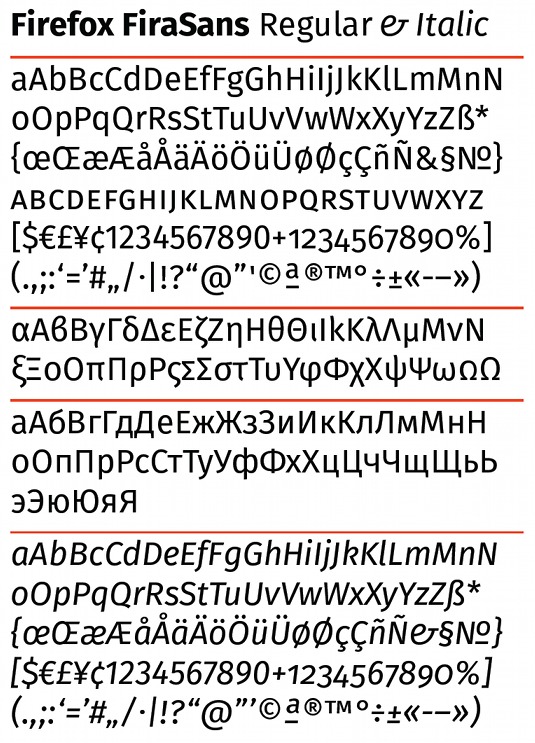
As the company expands across the globe, DB Type is now also available for the Cyrillic and Greek alphabets. Type has thus become the common denominator, joined by red, grey and white to shape a brand environment that can incorporate every medium and every purpose without losing face, so to speak.
A unique approach
An exclusive typographic system of this complexity used to be the exception. While it was possible, financially and technically, to design and produce a typeface exclusively for the use of one company, it was not really feasible. Once, however, the same personal computer that was used to design typefaces and produce fonts was also used as the main communication tool inside companies, it became easier to convince marketing and technical people alike that fonts were meant for more than the occasional campaign headline, and easier to implement than new versions of Windows.
But even as late as the '90s, marketing folk didn't understand that an exclusive typeface not only created an exclusive look for their brand, but also saved money in its implementation, compared to having to license whatever new stuff the advertising agency would suggest from season to season.
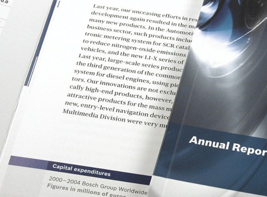
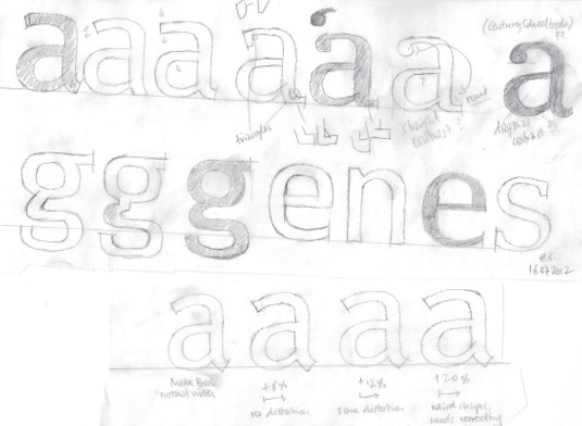
When Christian Schwartz and I were asked to design a house typeface for Bosch in 2004, the initiative didn't stem from its desire to communicate with one voice, but actually from the procurement people who were fed up having to spend lots of money as soon as they had to license their existing fonts for yet another market or language system. Baskerville and Akzidenz Grotesk were its existing faces, as the communication people at Bosch already understood that just a few weights of a sans were not enough to cover the width and breadth of the brand which supplies anything from drill bits and spark plugs to packaging plants and turnkey power stations. But those faces were not available in compatible versions for all the necessary platforms, there weren't enough weights and versions, and what was available didn't really fit together. Over time, a well-meant concept had become a legacy, expensive and impractical.
The new family of faces for Bosch comprises a sans as well as a serif version, each with sufficient weights to serve all purposes, internally and externally. Bosch Sans is also available for non-Latin writing systems. The fonts are supplied free of charge to printers, agencies and other services. The investment in the house faces has already paid off in terms of money saved on licenses and logistics, not to mention improved internal communications and brand recognition.
Saving face
Not every company gives away free fonts. The bean counters at Daimler Benz wanted to get some of the money back they had paid to Kurt Weidemann for the work on his trilogy of faces for them. Only a few months after Corporate A (for Antiqua), S (for Sans) and E (for Egyptienne) had been released, they made a deal with a distributor to release the fonts commercially.
While Daimler Benz was the first brand to commission such an extensive family of typefaces back in 1990, it squandered its advantage by enabling every backstreet garage to appear - at least typographically - like the inventor of the automobile. When a premium brand such as Leica uses Corporate S as its house face, I am not quite sure whether its agency knew it was the Daimler Benz typeface and tried to jump onto that bandwagon, or whether it was simply unaware of that heritage and just used it because it seemed suitable. Naming the face for the original client might have prevented that.
Deutsche Bahn had a better idea: it made every supplier pay for the fonts. They get it from a distributor who makes sure every buyer signs the agreement of exclusivity, before shipping the latest version. The client doesn't have to deal with the logistics of shipping or version maintenance (fonts are software and can be updated, expanded or improved) and has already had more than its original investment back. Suppliers who have paid a market price for the privilege of working for DB are also less likely to use the fonts for other purposes or clients.
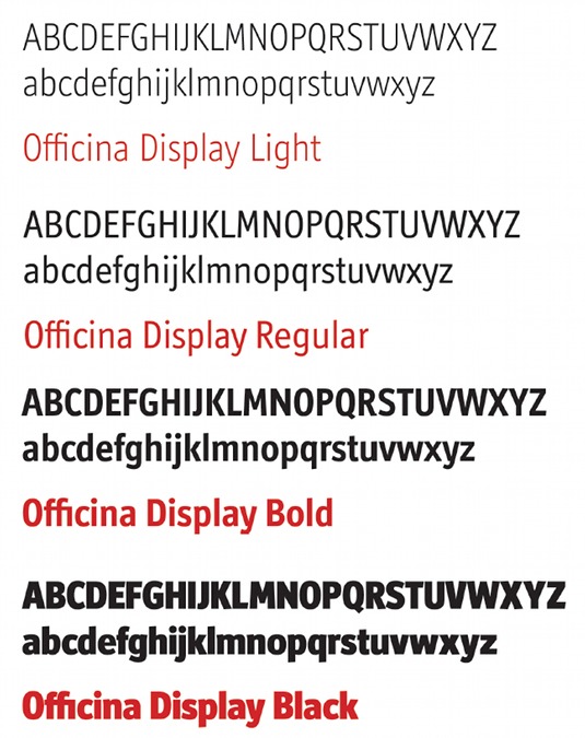
Corporate fonts - like other fonts - are not restricted to alphanumeric glyphs. They can incorporate logos, special characters, pictograms, bullets, icons. Fonts are easier to distribute and use than other formats. IT people used to be afraid of anything but system fonts and considered anything from the outside as dangerous as a virus. Now that OpenType has become the standard font format, albeit in different 'flavours', and can be used across platforms, those arguments count for even less than they did back in the '90s. Fonts don't care whether they run on a Mac or a PC, they can be distributed and installed easily, and the files are much smaller than even the smallest images.
As brands communicate across media they need to make sure that their online presence doesn't deviate from the standards used for print. While colour has been free on screens for a long time, type used to be expensive or difficult to get. Today, however, there is no excuse not to use proper typefaces on the web, in apps and even for that little screen on your microwave oven.
Typographic choices
We have never had better typographic choices, with more typefaces being added into the mix every day by great type designers from all over the world. And if you haven't got the budget, the expertise or the guts to design an exclusive typeface for your clients, you can easily find the right face for the job and make it your own by using it properly. A good compromise would be to license an existing face and have it renamed for the particular job or the client. Most foundries do that for a small fee. This way you can make sure that other suppliers or the people in-house have no more excuses not to use the proper face.
A brand that doesn't pull out all the typographic stops will not communicate properly. Only those that do know how to speak to their audiences will survive. Type is visible language.
Words: Erik Spiekermann
This article originally appeared in Computer Arts issue 224.

The Creative Bloq team is made up of a group of art and design enthusiasts, and has changed and evolved since Creative Bloq began back in 2012. The current website team consists of eight full-time members of staff: Editor Georgia Coggan, Deputy Editor Rosie Hilder, Ecommerce Editor Beren Neale, Senior News Editor Daniel Piper, Editor, Digital Art and 3D Ian Dean, Tech Reviews Editor Erlingur Einarsson, Ecommerce Writer Beth Nicholls and Staff Writer Natalie Fear, as well as a roster of freelancers from around the world. The ImagineFX magazine team also pitch in, ensuring that content from leading digital art publication ImagineFX is represented on Creative Bloq.
