Logo and branding inspired by the print process
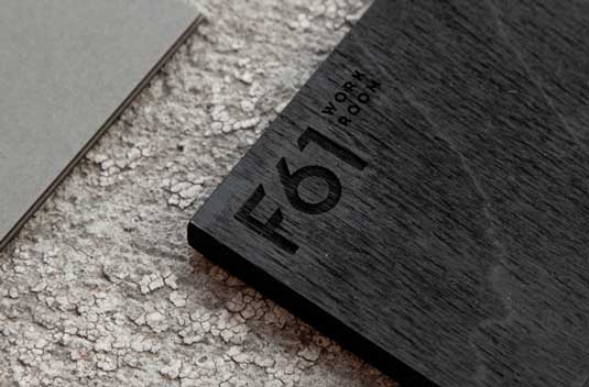
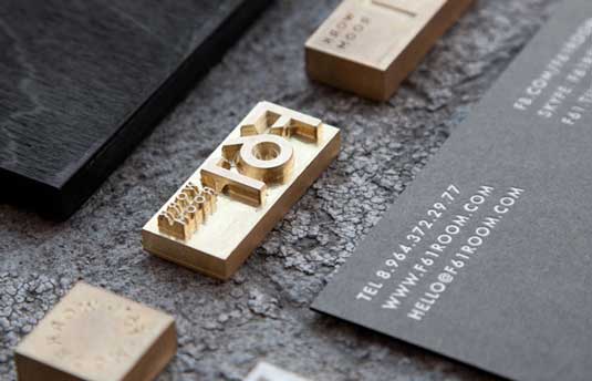
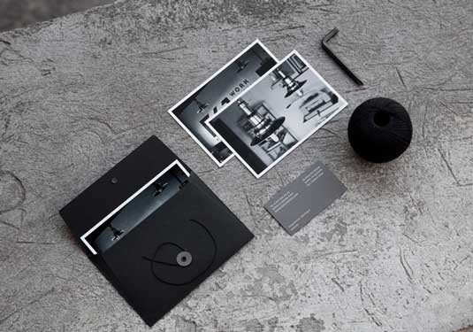
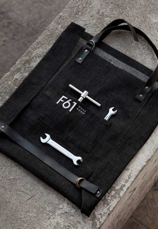
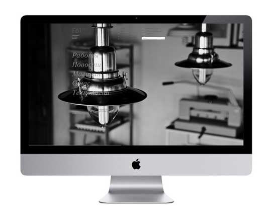
Inspired by the parallel lines and clear geometric shapes of its own print machines, these gorgeous new designs for printing company F61 Work Room set a new bar for branding.
Sign up to Creative Bloq's daily newsletter, which brings you the latest news and inspiration from the worlds of art, design and technology.
You are now subscribed
Your newsletter sign-up was successful
Want to add more newsletters?
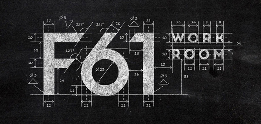
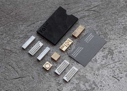
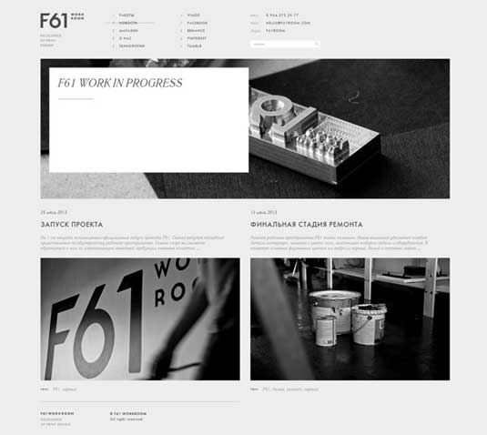
This new logo and brand identity for printing company F61 Work Room has got to be one of the most well presented and detailed projects we've ever seen. Based in St Petersburg, the team "love minimalism and analog types of printing, typography and the beauty of simple forms, natural materials and good paper", all of which is evident in these gorgeous designs.
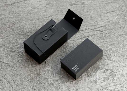
With a raw, authentic feel, the F61 team and graphic designer Pavel Emelyanov paid meticulous attention to detail when developing and implemeting their ideas. "We were inspired by the print machines schemes: circles, cylinders, parallel lines, clear geometric shapes," they explain. "The black-and-white palette of the style gives it a finished, strict look and stands out from the traditional printing companies. Tag line 'Excellence of Print Design' speaks for itself and reveals the philosophy of the studio."
This is a stunning design, with everything from the contrast in textures, font and paper choices and colour palette executed perfectly. Not only does this new branding showcase the quality and cleanliness of the company's work, it also really highlights the craftsmanship involved. Just beautiful.
Article continues below 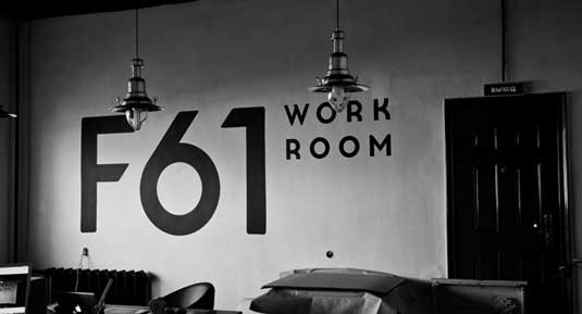
Liked this? Read these!
- Create a perfect mood board with these pro tips
- The ultimate guide to designing the best logos
- Download the best free fonts
What do you think of the F61 Work Room identity? Let us know in the comments!
Sign up to Creative Bloq's daily newsletter, which brings you the latest news and inspiration from the worlds of art, design and technology.

The Creative Bloq team is made up of a group of art and design enthusiasts, and has changed and evolved since Creative Bloq began back in 2012. The current website team consists of eight full-time members of staff: Editor Georgia Coggan, Deputy Editor Rosie Hilder, Ecommerce Editor Beren Neale, Senior News Editor Daniel Piper, Editor, Digital Art and 3D Ian Dean, Tech Reviews Editor Erlingur Einarsson, Ecommerce Writer Beth Nicholls and Staff Writer Natalie Fear, as well as a roster of freelancers from around the world. The ImagineFX magazine team also pitch in, ensuring that content from leading digital art publication ImagineFX is represented on Creative Bloq.
