Asian-style branding for European accessories company
We speak to the Portuguese studio charged with creating new branding to help accessories company Qu’on expand across Asia.
Sign up to Creative Bloq's daily newsletter, which brings you the latest news and inspiration from the worlds of art, design and technology.
You are now subscribed
Your newsletter sign-up was successful
Want to add more newsletters?

Five times a week
CreativeBloq
Sign up to Creative Bloq's daily newsletter, which brings you the latest news and inspiration from the worlds of art, design and technology.
Once a week
By Design
Sign up to Creative Bloq's daily newsletter, which brings you the latest news and inspiration from the worlds of art, design and technology.
Once a week
State of the Art
Sign up to Creative Bloq's daily newsletter, which brings you the latest news and inspiration from the worlds of art, design and technology.
Seasonal (around events)
Brand Impact Awards
Sign up to Creative Bloq's daily newsletter, which brings you the latest news and inspiration from the worlds of art, design and technology.
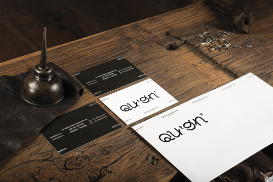
"The design is inspired by the collision of two universes," says Pedro Serrão: the "simple, smooth, almost minimal forms" of the Far East, and the "wisdom and know-how" of experienced handcraft practitioners. Serrão is co-founder of Portuguese multidisciplinary design studio This is Pacifica, the team behind recent branding work and logo design for accessories company Qu'on.
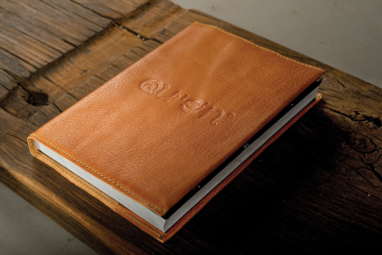
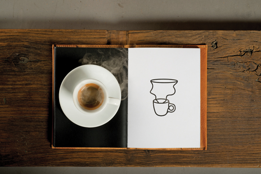
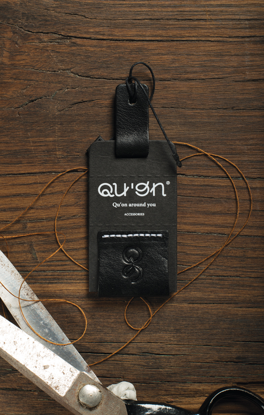
The project takes in everything from stationery and creative business cards to leather book and key covers, all using typography created especially for Qu'on. "Our approach," says Serrão, "is mostly creative. We don’t focus on a specific formula; we’re inspired by the essence of things. The problem is part of the solution: if we deny it, we miss the essential question.
Raw material
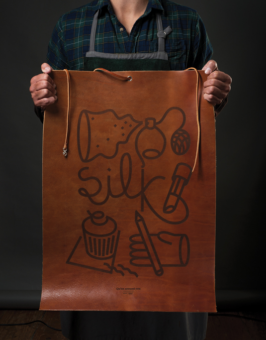
"The briefing was based on several assumptions that we consider essences in defining a creative approach," Serrão continues. "The enhancement of the raw material of the brand, the leather, and the definition of a visual grammar."
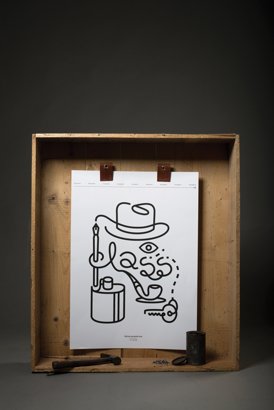
The typeface designed especially for the project has Japanese influences, and represents Qu'on as a 'non-verbal brand'. "The realisation," Serrão says, "consists in the purification of graphical elements - visual simplification based on leather as a texture, material and experience of life."
This article was originally published in Computer Arts issue 217.
Liked this? Read these!
- The ultimate guide to logo design: pro tips
- Download the best free fonts
- Free Photoshop brushes every creative must have
Have you seen any inspirational branding recently? Tell us in our comments box below...
Sign up to Creative Bloq's daily newsletter, which brings you the latest news and inspiration from the worlds of art, design and technology.

The Creative Bloq team is made up of a group of art and design enthusiasts, and has changed and evolved since Creative Bloq began back in 2012. The current website team consists of eight full-time members of staff: Editor Georgia Coggan, Deputy Editor Rosie Hilder, Ecommerce Editor Beren Neale, Senior News Editor Daniel Piper, Editor, Digital Art and 3D Ian Dean, Tech Reviews Editor Erlingur Einarsson, Ecommerce Writer Beth Nicholls and Staff Writer Natalie Fear, as well as a roster of freelancers from around the world. The ImagineFX magazine team also pitch in, ensuring that content from leading digital art publication ImagineFX is represented on Creative Bloq.
