Floating Eye branding is a vibrant masterpiece
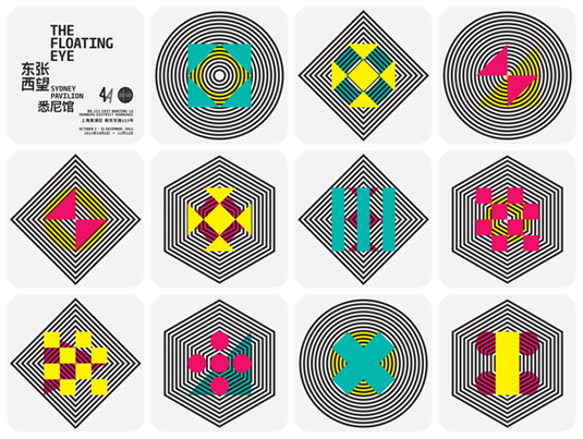
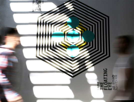
A visual language of symbols, this branding for ‘The Floating Eye’ theme of the Sydney Pavilion in Shanghai Bienale is a vibrant feast.
Sign up to Creative Bloq's daily newsletter, which brings you the latest news and inspiration from the worlds of art, design and technology.
You are now subscribed
Your newsletter sign-up was successful
Want to add more newsletters?

Woah! This isn't one for those with a tendancy for headaches. It is, however, one for those of you who adore splashes of vibrant colour and the sort of branding that isn't afraid to go bold. Created by a talented team of designers and art directors, this is the sort of branding that we quite simply, adore.
Crafted for 'The Floating Eye' - the curatorial theme of the Sydney Pavilion in the Shanghai Bienale, the art event is the largest in mainland China. Attracting over 8million visitors, Sydney was part of the Inter-City Pavilions, offering observations of a city's shifting references and influences.
Conveying the varied perspectives of the city's transforming reality though its demographics, environment, history, politics, geography and society, the team built a visual language of symbols. These, combined and intertwined by a shifting graphical interpretation of the lens of the viewer, made for a striking device.
Article continues below 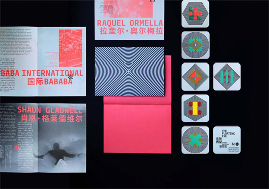
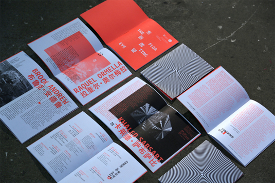
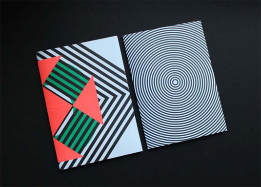
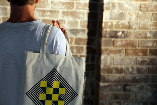
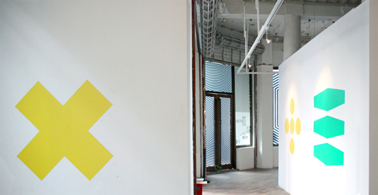
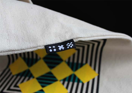
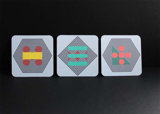
See more examples and meet the team over on the Behance page.
Like this? Read these!
- Free tattoo fonts for designers
- Free Photoshop actions to create stunning effects
- Create a perfect mood board with these pro tips
Do you dig this branding? Let us know in the comments box below!
Sign up to Creative Bloq's daily newsletter, which brings you the latest news and inspiration from the worlds of art, design and technology.

The Creative Bloq team is made up of a group of art and design enthusiasts, and has changed and evolved since Creative Bloq began back in 2012. The current website team consists of eight full-time members of staff: Editor Georgia Coggan, Deputy Editor Rosie Hilder, Ecommerce Editor Beren Neale, Senior News Editor Daniel Piper, Editor, Digital Art and 3D Ian Dean, Tech Reviews Editor Erlingur Einarsson, Ecommerce Writer Beth Nicholls and Staff Writer Natalie Fear, as well as a roster of freelancers from around the world. The ImagineFX magazine team also pitch in, ensuring that content from leading digital art publication ImagineFX is represented on Creative Bloq.
