This paradoxical brand identity is both intangible and tactile
This retro-influenced identity for Soap reflects the brand's inherent contradictions.
Mobile app company Soap's name provided plenty of inspiration for Socio Design's identity scheme. "We felt that the inherent contradictions of the brand - the intangible nature of the business, versus the tactile nature of something like soap - were a key feature to highlight," says creative director Nigel Bates, who founded Socio back in 2004 with James Cramp.
"The result is an equally paradoxical brand that reflects Soap's craftsmanship and tactile work ethic through industrial insignia and angular typography," explains Bates.
This idea of contradiction is carried through the identity, with metal foils set against soft pastel papers, and three different marques, which appear across different elements of branding collateral.
Article continues belowTake a closer look at Socio's paradoxical branding for Soap.
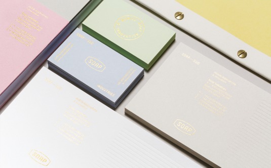
Briefed to create a unique identity system for mobile app company Soap, Socio Design created a retro-influenced scheme with a focus on tactility and craftmanship, and a colour palette inspired by the brand's name.
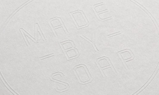
Three different marques were included, some of which play upon the shape of a bar of soap.
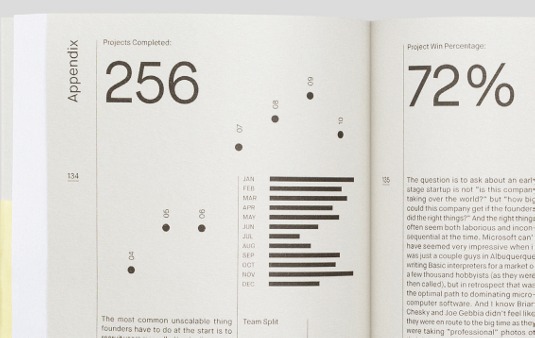
Socio Design created a book that would act as an aid to new business activity - it contains all of Soap's company information, and shows off a collection of case studies.
Sign up to Creative Bloq's daily newsletter, which brings you the latest news and inspiration from the worlds of art, design and technology.
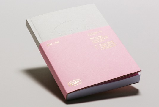
The printed material features metallic gold foils and pastel papers from GF Smith Colorplan, the combination of which is intended to mimic the inherent contradictions within the Soap brand.
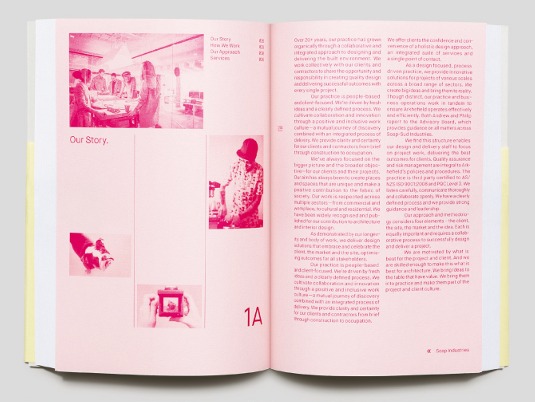
"The brand book was printed on a combination of coloured and white Colorplan papers with a blind emboss on the cover and a foiled belly band," says Socio co-founder Nigel Bates.
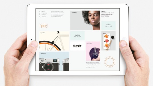
The distincitive pastel colour palette is continued through to the digital elements, lending a retro feel to the entire scheme.
This article originally appeared in Computer Arts issue 226.

The Creative Bloq team is made up of a group of art and design enthusiasts, and has changed and evolved since Creative Bloq began back in 2012. The current website team consists of eight full-time members of staff: Editor Georgia Coggan, Deputy Editor Rosie Hilder, Ecommerce Editor Beren Neale, Senior News Editor Daniel Piper, Editor, Digital Art and 3D Ian Dean, Tech Reviews Editor Erlingur Einarsson, Ecommerce Writer Beth Nicholls and Staff Writer Natalie Fear, as well as a roster of freelancers from around the world. The ImagineFX magazine team also pitch in, ensuring that content from leading digital art publication ImagineFX is represented on Creative Bloq.
