
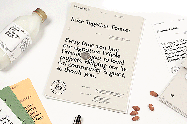
Putting together an identity for an up-and-coming business is a brilliantly creative and fun process. With endless possiblities, pretty much anything goes once you've got your core values in place. This beautiful brand for Leeds Juicery was created by Abbas Mushtaq and Greta Madline.
"Aimed at young working professionals, and busy individuals who can rely on Leeds Juicery for their daily fix. Promotional and point of sales material is highly typographic , communicative and gives reverence to what's most important – the pure ingredients," they explain.
"The tri-circle graphic device forms the graphic language and all iconography across the brand identity. Business card reverse variants emphasise a personable and Yorkshire tone of voice, and are useful for notes attached to weekly cleanse deliveries to your door." Personality, originality and beauty all make this branding a winner in our eyes.


Liked this? Read these!
- Are traditional brand guidelines still relevant?
- 5 big branding trends for 2015
- 10 designs that reinvent the business card

