There have been a number of outstanding uses of colour in branding throughout the years. From Coca-Cola to Starbucks and Facebook to Apple, colour could be said to be the most important aspect of any brand. This branding project for a wake boarding company focuses on accented colour throughout and we couldn't be more in love with it.
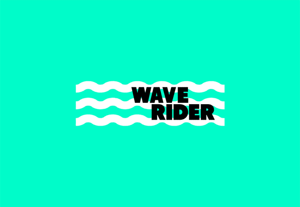
"The aim was to develop the brand attributes with the accent colour, bold typography and identity waves," Bristol-based designer Jonathan Quintin explains. "I've also thrown in a visual mock up of the board design too, showing how the branding can evolve."
Using the typography and colour throughout the business cards, stationary, website, app and the boards themselves, it's a seamless execution in creativity and consistency. Take a look at some of the process below, as well as the finalised delivery.


What do you think about this branding? Let us know in the comments box below!

