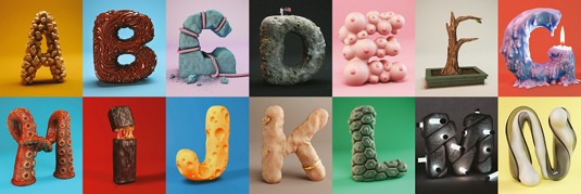
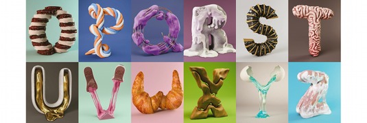
Foreal's graphic alphabet is as easy as ABC
Spawned from an aborted commercial project, this alphabet goes from mouth-watering to kooky and occasionally disgusting.
Sign up to Creative Bloq's daily newsletter, which brings you the latest news and inspiration from the worlds of art, design and technology.
You are now subscribed
Your newsletter sign-up was successful
Want to add more newsletters?
Foreal's alphabet all began, unsurprisingly, with the letter 'A'. The studio designed the letter for a commercial project that never made it, and the project grew from there.
"We saw it as a canvas for playing around with different tools," explains Benjamin Simon, who co-founded the studio with Dirk Schuster. "Everyone was free to create whatever came to mind, just following one simple rule: use the new sculpting tools."

Although certain experiments - such as a phallic 'G' - didn't make the cut, the final alphabet still manages to run the gamut from mouth-watering to kooky, taking in some satisfyingly disgusting creations along the way.
Article continues below"There is no favourite letter for us. We love some for their graphic effect, or how they work in terms of space and colour," says Schuster. "Some for their weirdness. Others just look cool."

This article originally appeared in Computer Arts issue 227.
Sign up to Creative Bloq's daily newsletter, which brings you the latest news and inspiration from the worlds of art, design and technology.

The Creative Bloq team is made up of a group of art and design enthusiasts, and has changed and evolved since Creative Bloq began back in 2012. The current website team consists of eight full-time members of staff: Editor Georgia Coggan, Deputy Editor Rosie Hilder, Ecommerce Editor Beren Neale, Senior News Editor Daniel Piper, Editor, Digital Art and 3D Ian Dean, Tech Reviews Editor Erlingur Einarsson, Ecommerce Writer Beth Nicholls and Staff Writer Natalie Fear, as well as a roster of freelancers from around the world. The ImagineFX magazine team also pitch in, ensuring that content from leading digital art publication ImagineFX is represented on Creative Bloq.
