How editorial design will improve your typographic skills
magCulture's Jeremy Leslie reveals why thinking like an editorial designer can improve your typographic design skills.
Sign up to Creative Bloq's daily newsletter, which brings you the latest news and inspiration from the worlds of art, design and technology.
You are now subscribed
Your newsletter sign-up was successful
Want to add more newsletters?
Whether or not you are a regular magazine reader, paper publications are still such an everyday sight that it's easy to assume they always stay the same. Indeed, it is one of magazines' successes that the basic functional form of a series of folded and bound papers has held strong for over a hundred years.
But the content printed onto those shiny, matt, coated or uncoated paper surfaces has changed considerably as technology has encouraged new methods of presentation and layout. Improved halftone photographic reproduction and litho printing meant 1940s news magazines such as Picture Post were able for the first time to deliver photo-reportage of war and peace to readers' homes, albeit mainly in black and white.
The post-Second World War growth in consumerism saw the same technology applied to what today we call lifestyle and fashion magazines. In particular the New York creative play-off between Vogue and Harper's Bazaar saw experiments with new editorial techniques as each bastion of rival publishing houses Condé Nast and Hearst sought the lead creative reputation.
Article continues belowTwo European émigrés, Alexey Liberman (who'd worked on French photo-reportage mag Vu) and Alexey Brodovitch respectively, took charge of the magazines and invented what we recognise today as magazine art direction. Both magazines had a tradition of illustrated front covers and close relationships with leading artists and writers of the day, but design as a distinct discipline was unrecognised. Creative partnerships were extended to include photographers, those all-important Paris fashion shows were a catalyst for speed (back then, images had to be brought back to NY by ship) as well as creativity of presentation, and both art directors developed layouts based on the modernism of their homelands.
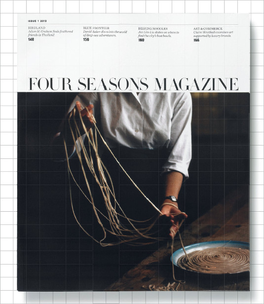
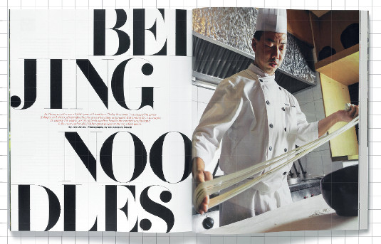
Thus the old craft of magazine layout evolved into the modern art of editorial design, the relationship between the meaning of words and the way they looked becoming an essential part of a title's visual character. Text wasn't just fitted to pages, it was designed to work with illustration and photography, making luxurious use of empty space in studied compositions. The thick and thin strokes of Bodoni came to represent fashion and luxury, a role that it still plays in editorial, advertising and packaging today.
The three elements of magazine art direction were now present: typography had been added to illustration and photography.
Liberman and Brodovitch set the scene for the 60s boom in magazine publishing, driven by the baby boom era of consumerism and advertising. Colour printing improved and became more affordable, and publishers and editors allowed designers more input into the pages. Figures such as George Lois (US Esquire) Willy Fleckhaus (Twen), Ruth Ansell (US Harper's Bazaar), David Hillman and Harry Peccinnoti (Nova) took advantage and placed editorial design at the forefront of contemporary graphics. These titles provide a unique graphic record of their era, matched only by record sleeve design.
Sign up to Creative Bloq's daily newsletter, which brings you the latest news and inspiration from the worlds of art, design and technology.
The best magazines maintain this role of visually reflecting their time, almost by default – the temporary nature of a single issue permits the evolution of design elements in a way that corporate design – so often constrained by branding guidelines – may struggle to replicate. Meanwhile, the quick turnaround in production means decisions have to be taken fast. Producing a magazine is an organic process, relying on templates and stylesheets not as absolute parameters but instead as guides to take advantage of or battle against as the situation demands. It's an endless struggle between respecting structure and trying to break it. Brodovitch's cry to students – 'Astonish me' – may be over 60 years old, but still rings true.
Many graphic designers may regard the appealing blend of compelling content and stylish design that defines top-quality editorial work with envy, but handled right there are ways to apply the craft and working processes that help shape the world's best magazines to corporate work, from brochures to annual reports. More on that later.
The first magazine that made an impression on me was The Face, as designed by Neville Brody. Not only did Brody's typographic designs hark back to Dada and Constructivism, but I related to the content of the pages as much to the design, and I could tell Brody did too. He had read the words and reacted to them typographically with strong, aggressive designs with implicit meaning. Headlines emphasised key words and reflected their subject. He had read and really understood the words – a vital lesson for any designer working with long-form content, in any context – and in the process developed a consistent yet shifting visual language across the magazine.
For those seeking inspiration, the canon of editorial design is well-documented elsewhere – but key figures to search out include Roger Black, Andy Cowles, Simon Esterson, Janet Frolich and Fred Woodward. Of contemporary designers I would add Jop van Bennekom, Mirko Borsche, Scott Dadich and Matt Willey. All have contributed to our idea of what good editorial design is. Whether working in weeklies, monthlies, art mags or TV listings, they have combined art direction and typographic design to unique purpose.
Yet there remain plenty of magazines where content overrules design. The weekly celebrity titles use typography and design in their loosest manifestations – I know, I've tried to prove otherwise. Here, design is entirely at the call of the words, with rough and ready type used for absolute emphasis and new typefaces thrown in at random. Their identities rely more on raw paparazzi photography and coarse colour than type.
Unlikely to influence other areas of creative endeavour, the design of this particular subset of magazines reflects the worst excesses of our throwaway culture. Ironically, in that respect at least, their design and content are a perfect marriage.
Outside of the magazine world, other fields of design face comparable challenges in terms of achieving a symbiotic relationship between design and content. Vince Frost, creative director at Frost* Design, has experience in both editorial and corporate design camps. He's passionate about the potential crossover, but realistic about the challenges: "When designing corporate communications you try to help the organisation tell its story, but often the guidelines you have to work with lack any imagination," he laments. "You have to focus on expanding on that tool kit to make it great, encouraging clients to focus on entertaining audiences, not just putting out information."
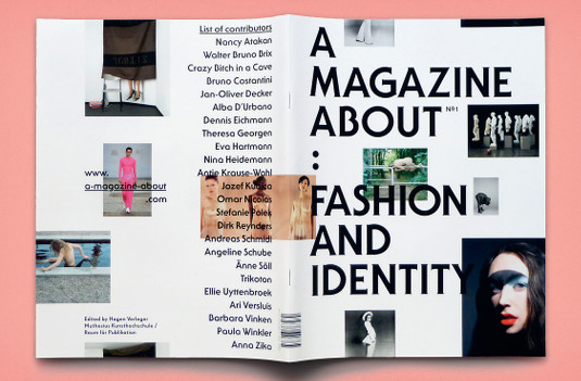
While some magazines are unable to take proper advantage of design to enhance their pages, others choose not to. There's an entire genre of indie mags and zines that knowingly challenge ideas of so-called 'good' design. Biannual German title 032c is the most prominent example, editor Joerg Koch overseeing a switch from modernist Helvetica to a deliberately clumsy set of system fonts in its 2007 redesign by Mike Méire.
The extreme typography of the earlier issues may have calmed down a little, but new issues still manage to surprise. The choice of typefaces and applied effects – outlines, artificial compressing, 3D rendering and more – accurately reflect the challenging combined coverage of art, fashion and design.
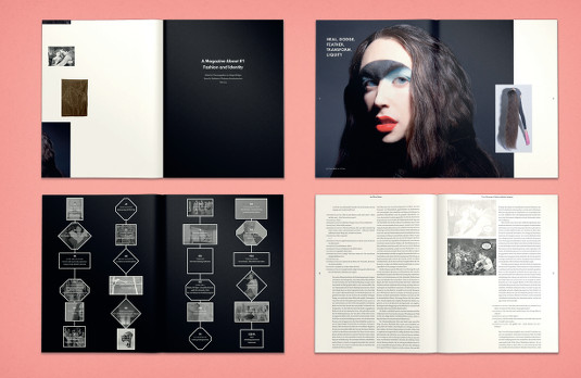
Such experimentation might suit a niche culture magazine, but what about the mainstream? It's unlikely we'll see Vogue looking to 032c for typographic inspiration, but surprises can still happen in unlikely places. As Frost points out, however, despite being at opposite extremes of the magazine world, what both titles have in common is the luxury of selling the content, rather than the organisation behind them.
"Real magazines have to work hard to sell the stories, to create desire and attract sales," he observes. "The content is what consumers buy. A corporate publication is selling the organisation who owns it. Imagine each edition of Vogue being a façade to encourage people to buy into Condé Nast."
For the past four years, however, a weekly business magazine owned by a software and data analysis company has been winning every award for editorial design going. Creative director Richard Turley (now at MTV) joined editor Josh Tyrangiel at Bloomberg Businessweek in 2009 and immediately reinvented the title. The result? An extraordinary project that demonstrates the power of editorial design when harnessed by a strong editor-and-designer team.
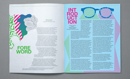
I often get asked, 'what is editorial design?' and Bloomberg Businessweek perfectly represents my answer. Editorial design strikes a balance between guiding and navigating the reader through an issue, and providing character and variation to attract and engage the same reader to the many parts of the issue. The magazine achieves the first part of this equation through a strong grid and typographic system that underpins every page. It is highly readable while fitting in lots of content and providing very clear navigation through the various sections. The pages look pleasingly simple but are hugely sophisticated and highly engineered.
On top of this typographic structure there is also some scope for the addition of photographs, infographics and illustration to add visual character. These are used to break the grid structure, often with hand-drawn elements and small pieces of information added around the page. That many of these elements feel spontaneous only adds to the newsiness of the weekly.
Technology now allows every detail of layout and typography structure to be set in advance, freeing the designer to react to the individual elements of content with degrees of change as they see fit. But the front covers are the star of Bloomberg Businessweek. The magazine logo is a piece of heavy sans serif modernism that sits on the cover while everything else changes around it week to week. The cover story might be represented by a stock photo, studio shoot, illustration, typography or a combination.
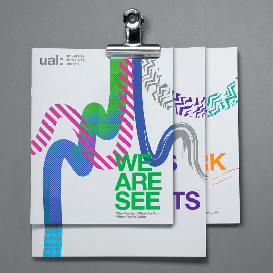
Every cover is a weekly event. There's no template, just a strong, direct idea. It all changes – even the type of the logo has on occasion been adapted to suit a story.
The thinking and direction behind each cover holds them together as a set, despite being different each time. All popular culture is up for reference – computer games, manga, fashion shoots, old magazines – but always handled with expert weighting to suit the magazine. These BBW covers are the editorial equivalent of today's flexible brand identities, and the craft behind them can be applied to almost any field of design.
The mantra in editorial design – be it for print, apps or online – is 'suit the content'. There's no one rule to follow, and sometimes too much freedom works against a magazine. Open briefs are both a blessing and a curse.
One common factor shared by the most successful magazines is a pair of lead creatives who can steer the title through these challenges. Editor and designer have a clear idea of what they are setting out to do, and share a vision. This dynamic is comparable to the traditional working relationship between copywriter and art director in advertising, and according to Frost, it's something to aspire to.
"I believe it's not until you've worked with a clever editor and full editorial team that you realise the collaborative efforts and the profession of storytelling," he reflects. "The content should always be the hero."
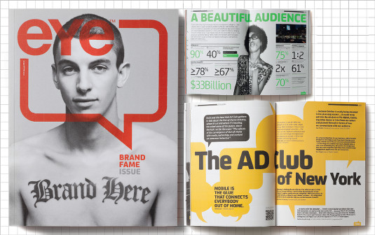
London design agency Alphabetical embodies the belief that the same editorial chops learned from working on newsstand publications apply to every aspect of design. "There is often a diff erence between the approach we apply to creative and corporate typography, mostly due to the constraints imposed by brand guidelines in the latter," admits creative partner Tommy Taylor. "But one rule remains constant – content is key. The best layouts, whether for a creative piece or a corporate one, celebrate the words. Both should be inviting to read, not just beautiful."
The dynamic between creatives is key to Alphabetical: "Successful editor and art director relationships constantly push each other as far as they can go," notes the agency's other creative director, Bob Young. "If you're juggling both roles, it's your responsibility to push both yourself and the client."
Much lip service is paid by clients to storytelling, but to do so successfully they have to be persuaded that design is not a service separate from content. Gone are the days of emailing text to the designer for layout; today writer and designer must work alongside each other and the client has to be ready for early ideas to mutate and change as text and image meld. This involves a lot of hand-holding, but ultimately will satisfy the client's desire for truly engaging content.
"I don't think that design needs to be intentionally edgy, fashionable or aggressive to have a successful connection between design and content," says Young. "With corporate clients the stereotypical content may keep rearing its ugly head, but it's our job to guide the client to a collective conclusion that works both for them and the reader."
Back in the magazine world, my favourite example of editorial unity is Fantastic Man. This men's biannual presents a tongue-in-cheek character that loves the fashion world, while being prepared to parody it. From the magazine name to the way it addresses its interviewees as 'Mr Boris Becker' and 'Mr Jeremy Deller', preceding their proper titles with the arch and unapologetic 'Tennis superstar' and 'The Popular artist', it has a clear identity that's emphasised by its design.
Simple monochrome typography is used throughout, with little ornament other than column rules. The logo uses capitalised Times Roman, which is also used sparingly throughout as body copy alongside a small, changing selection of tasteful sans typefaces. Headlines are either overlarge or very subtle, there's nothing middling.
That Net a Porter's men's online shop adopts a similar identity is disappointing but perhaps no surprise. Mr Porter is strikingly close to Fantastic Man in design and language, but by staking the same visual territory it at least positions itself more cleverly than Porter, the recent title launched by the same company's women's shop.
Here is one of our most innovative online businesses expressing belief in print as a marketing vehicle. Hurrah! And they're far from the first website to move into print this year. But what we get in Porter is a poor copy of a traditional women's magazine.
Making magazines to support services and brands is not a new idea: the customer publishing industry is over 30 years old. But the first such magazines were poor copies of existing genres, and surely we're past that.
Better examples come from the offices of Fantastic Man and its sister title The Gentlewoman, where the joint creative team produces magazines for brands such as COS. These make use of familiar techniques and devices, aligned intelligently with the brand being promoted. Although self-evidently promotional tools, they are beautiful in their own right and all the more powerful for that.
"Some corporate projects will try desperately to appeal to their audience, but no matter how much you try to look cool, bold or dynamic the subject matter is often dry and unimaginative," says Frost.
"Great editorial comes with inquisitive minds who find the stories of interest," he concludes. "Find a writer who's passionate about, or at least interested in, the subject. If they do it purely for the money, it'll turn out to be a brochure."
Words: Jeremy Leslie
Creative director of editorial studio magCulture, Jeremy has 25 years' experience of magazine design and has written three books on the subject. This article originally appeared in Computer Arts issue 229.

The Creative Bloq team is made up of a group of art and design enthusiasts, and has changed and evolved since Creative Bloq began back in 2012. The current website team consists of eight full-time members of staff: Editor Georgia Coggan, Deputy Editor Rosie Hilder, Ecommerce Editor Beren Neale, Senior News Editor Daniel Piper, Editor, Digital Art and 3D Ian Dean, Tech Reviews Editor Erlingur Einarsson, Ecommerce Writer Beth Nicholls and Staff Writer Natalie Fear, as well as a roster of freelancers from around the world. The ImagineFX magazine team also pitch in, ensuring that content from leading digital art publication ImagineFX is represented on Creative Bloq.
