How Underline Studio branded Canada's magazine awards
The Toronto agency explain how they branded this celebration of print design, talking us through their choice of colour, typography and more.
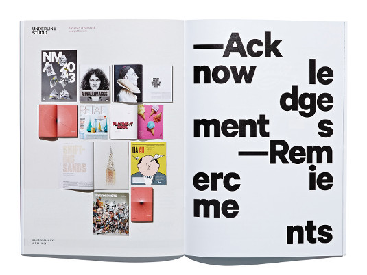
This year, Underline Studio was chosen to create posters and design the programme for Canada's National Magazine Awards, held in Toronto. For Fidel Peña and Claire Dawson, it was an opportunity to bring a new level of craft into their design work.

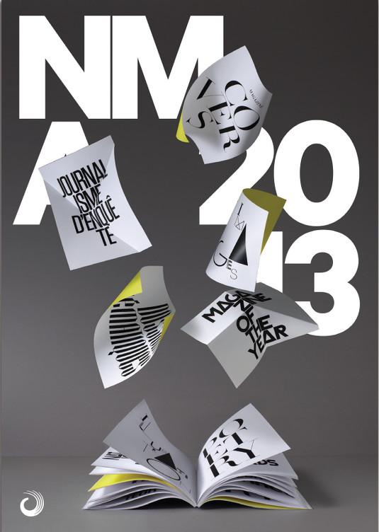
"It's a visual thing, just about a celebration of the pages of a magazine and what makes them up," says Claire Dawson. "They'd used illustration for many years so we thought it was a good time to switch to photography for 2013."
Letters, photographs, illustrations, text and other magazine page elements were designed and printed out, and then cut out to create props. These were put together to form sets, which Underline had photographed in order to design a poster, and for the event's programme. The imagery was created to represent the diversity of magazines in Canada, as well as the design elements that go to create a magazine.
Article continues below 
"We do enjoy that process, that's part of the fun for us, to get our hands into it and do the actual craft - whether it's carefully typesetting a long piece of text for a magazine or book, or doing this kind of thing in photoshoots. That gets us excited," says Peña.
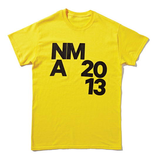
The colour palette, meanwhile, was constrained to greyscale and a bold yellow. The programme itself had to have a loose design that could accommodate both of Canada's official languages, French and English. "We used Calibre," adds Peña. "It's a fairly new typeface. Very bold and round, but not round as in Futura or Gill Sans. Round in a softer way."

Words: Garrick Webster
This article originally appeared in Computer Arts issue 220.
Sign up to Creative Bloq's daily newsletter, which brings you the latest news and inspiration from the worlds of art, design and technology.
Liked this? Read these!
- Useful and inspiring flyer templates
- The best collage maker tools - and most are free!
- The ultimate guide to logo design
Seen some inspiring print design? Tell us in the comments!

The Creative Bloq team is made up of a group of art and design enthusiasts, and has changed and evolved since Creative Bloq began back in 2012. The current website team consists of eight full-time members of staff: Editor Georgia Coggan, Deputy Editor Rosie Hilder, Ecommerce Editor Beren Neale, Senior News Editor Daniel Piper, Editor, Digital Art and 3D Ian Dean, Tech Reviews Editor Erlingur Einarsson, Ecommerce Writer Beth Nicholls and Staff Writer Natalie Fear, as well as a roster of freelancers from around the world. The ImagineFX magazine team also pitch in, ensuring that content from leading digital art publication ImagineFX is represented on Creative Bloq.
