Image of the day: Mag Is In by Francesca Oddenin and Vanessa Poli
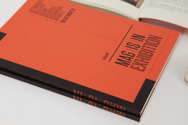
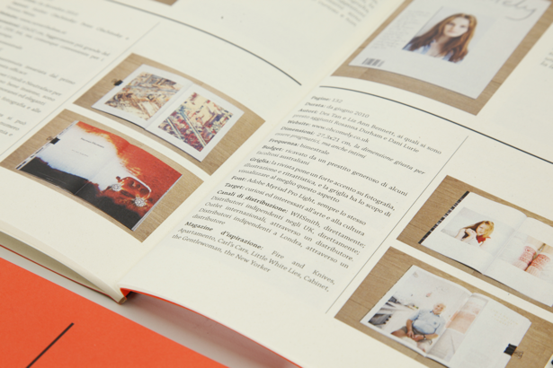
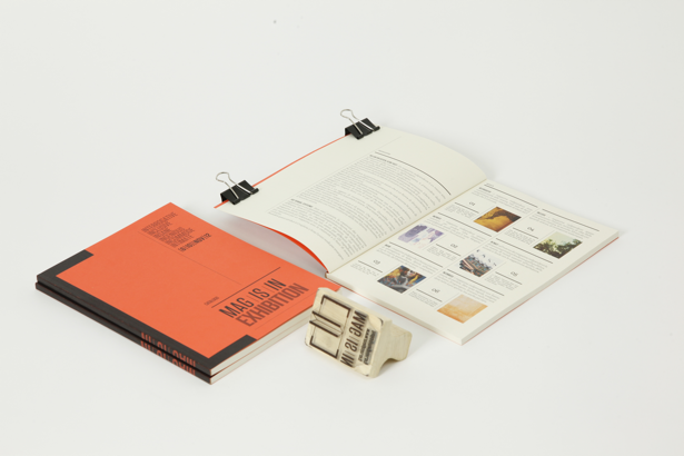
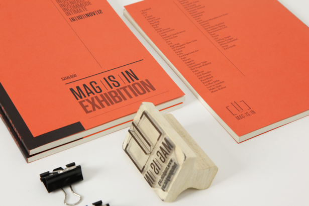
Francesca Oddenino and Vanessa Poli are behind Mag Is In, a publication looking at independent magazines that grew into a website, an international exhibition and conference. We caught up with Oddenino to find out more
Computer Arts: What is Mag Is In?
Francesca Oddenino: Mag Is In started as a university project at the Polytechnic University of Turin. We wanted to create a project that could raise awareness about independent and self-published magazines from all over the world.
We wanted to communicate the independents as a high-quality product, which needed to convey information in a more authentic and unique way. Our brief was to create a project that would convey the strength and the importance of independent and self-published magazines from all over the world in the most effective way.
CA: How did you put the piece together?
FO: The creative process has to start as a mental attitude, and it involves a lot of research to give meaning to the creative act. When we started thinking about Mag Is In, we first had two months spent doing nothing but researching. We'd always been passionate about independent magazines, about the craft, the experimentation and the unique content, but to create a really meaningful project about it we needed to know everything about it. We started researching blogs, books, other designers' works. We didn't want to find a name or an identity for the project before we knew what the project was really.
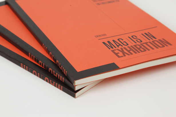
When we felt we knew enough to feel comfortable starting with the design, we first found the name. Mag Is In sounds like magazine, but at the same time the 'In' gave us room to have a constantly changing name, describing the project itself: MAG IS INternational, INterrogative, INclusive, INgenious, INcommode, INtimate, INsane, etc. Then we designed the logo: two brackets being a magazine, because magazines give an insight of reality, they deepen it, creating a new point of view about it. They do exactly what brackets do in a discourse. The colour palette was composed by a tangerine-pink, the colour of the paper of many avant-garde independent publications and fanzines and black.
CA: How did you get in to design?
FO: Vanessa and I got into graphic design at university. Vanessa had an artistic background, while I had a marketing-oriented one. We specialised in graphic design at university, where we understood that graphic design was what we wanted to do for the rest of our lives. We like to challenge ourselves, and, for us, what we do is never enough. A Great part of our inspiration comes from fields that are not directly connected with graphic design: from reading, talking with people, from listening to music and observing the world. And of course from mistakes.
Apart from the stars, Sagmeister & Walsh and Karlssonwilker, studios that always finds a way to have an original approach in its works, we really admire the designers who overcome constraints transforming them into advantages. Trapped in Suburbia are among them. We greatly admire typography designers and spend hours looking at their works. Hoefler & Frere-Jones are our point of reference. We are also infographics freaks, and in this field we especially admire Francesco Franchi and the work he's done for the italian magazine IL. Our style is a combination between an old style typographic approach and a contemporary way to convey it. Data visualization and illustration are fundamental elements, which we try to convey with constantly changing eyes. Our approach is strongly based on research and synthesis. Today we're studying at London College of Communication and we'll have our postgraduate degree in December 2013.
Check out more Francesca Oddenino and Vanessa Poli.
Sign up to Creative Bloq's daily newsletter, which brings you the latest news and inspiration from the worlds of art, design and technology.
Subscribe to Computer Arts for your monthly fix of the world's best inspirational design work. Available on iPad, in print or on other digital devices.

The Creative Bloq team is made up of a group of art and design enthusiasts, and has changed and evolved since Creative Bloq began back in 2012. The current website team consists of eight full-time members of staff: Editor Georgia Coggan, Deputy Editor Rosie Hilder, Ecommerce Editor Beren Neale, Senior News Editor Daniel Piper, Editor, Digital Art and 3D Ian Dean, Tech Reviews Editor Erlingur Einarsson, Ecommerce Writer Beth Nicholls and Staff Writer Natalie Fear, as well as a roster of freelancers from around the world. The ImagineFX magazine team also pitch in, ensuring that content from leading digital art publication ImagineFX is represented on Creative Bloq.
