Type glossary
Never get your bowls mixed up with your counters again thanks to our A-Z of typographical terminology.
Aesc (phonetic: ash)
A ligature of two letters - 'a' and 'e'. The aesc derives from Old English, where it represented a diphthong vowel, and has successfully migrated to other alphabets including Danish and Icelandic.
Aperture
The constricted opening of a glyph, as seen in the letter 'e'. Varying the size of the aperture has a direct effect on the legibility of a letterform and, ultimately, readability.
Ascender
The part of a lower case letterform that projects above the x-height of the font. Ascenders are important for ease of prolonged reading, though the combination of too much ascender-height and not enough x-height can cause problems.
Baseline
The baseline is where the feet of your capital letters sit. Below this line are descenders and loops.
Bowl
The shapely, enclosed parts of letters such as 'p' and 'b'.
Beak
The beak-shaped terminal at the top of letters such as 'a', 'c', 'f' and 'r'.
Bicameral (as opposed to Unicameral)
Bicameral refers to alphabets that have upper and lower case letterforms, such as Roman and Cyrillic - as opposed to the likes of Hebrew and Arabic.
Sign up to Creative Bloq's daily newsletter, which brings you the latest news and inspiration from the worlds of art, design and technology.
Bracket
A wedge-like shape that joins a serif to the stem of a font in some typefaces.
Copyfitting
The job of adjusting point size and letter spacing in a bid to make text occupy its allotted space in a harmonious fashion.
Counter
The enclosed - or partially enclosed - portion of letterforms such as 'c', the lower part of 'e' and 'g'; easy to get mixed up with the bowl (see above).
Crossbar
The crossbar connects two strokes, as in 'H'. Not to be confused with the cross-stroke that cuts through the stem of letterforms such as 't'.
Cursive
These are typefaces that imitate handwriting. Ever popular with Joe Public, the design community is often less than thrilled by these sometimes flowery fonts.
Descender
The part of the letterform that falls below the baseline. In lowercase terms, this means 'p', 'y' and 'q', and sometimes applies to uppercase 'J' and 'Q'.
Diacritical
Is it so critical that you might die? No. Diacriticals refer to accents applied to letterforms by languages including French, Czech and German in a bid to enhance the function of the glyph.
Dingbat
Once known as printer's flowers, dingbats are decorative elements that can vary from simple bullets to delicate fauna and flora often formed into themed collections.
Display fonts
Any typeface intended to be used in short bursts can be defined as a display font. They're often created just for use at large point sizes, as with headlines and titles.
Drop cap
An oversized capital letter often used at the start of a paragraph that 'drops' into two or more lines of text, but can also climb upwards.
Ethel
A ligature of the letters 'o' and 'e'.
Em
Often referred to as 'Mutton' to distinguish it from the very similar-sounding En, Em is a horizontal space equal to the current point size of text.
En
'Nut' to its friends, the En is a horizontal measure one half the size of an Em. That being the case, 'lamb' might have been more appropriate.

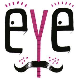
Eye
The eye is similar to a counter, but instead refers specifically to the enclosed part of the letter 'e'.
Fleuron
A subcategory of, or perhaps the precursor to, the dingbat. Fleurons are floral marks dreamed up by printers of the past to help decorate text.
<font-face>
The HTML5 tag that brings typography to the internet with typefaces directly embedded in web pages.
Glyph
Any singular mark that makes part of a font, whether a letter, number, punctuation mark or even a dingbat. Glyphs are the building blocks of typography.
Grapheme
Very similar to glyph, but possibly a bit broader. A grapheme is a fundamental unit of language, such as a Chinese pictogram, an exclamation mark or a letterform.
Gutter
The spaces between facing pages of text, and very often columns of text.
Justified
In a paragraph of justified text, the contents are arranged so that there is no white space at the end of a line: each begins flush left and finishes flush right.
Kerning
The art of adjusting the proximity of adjacent letters to optimise their visual appeal and readability.
Logotype
The lettered part of any marque or identity. The logotype can be taken separately from its graphic companion.
Ligature
The conjoined but non-identical twins of the typographic universe. Ligatures pull two forms together to produce a new glyph.

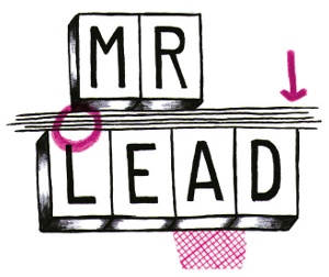
Leading
In olden times actual strips of lead were used to separate lines of text vertically. The naming convention persists.
Legibility
The ease with which one letterform can be distinguished from the next. It feeds into but is not the same as readability.
Loop
The lower part of the letter 'g' is known as its loop or lobe. Sometimes this is called the tail - a term that also takes in the lower portion of letter 'y'.
Manicule
Also known as the bishop's fist (stop sniggering at the back), the pointing hand symbol is a popular dingbat.
Monospace
Fonts in which every letterform occupies the same horizontal space.
Octothorp
It might sound like the ideal name for an international super-villain, but the word 'octothorp' in fact refers to the pound sign, and often symbolises the word 'number'.
OpenType
Designed by Microsoft and Adobe, OpenType supplanted and improved upon TrueType and PostScript fonts.
Oblique or sloped roman
To be distinguished from italics, in which the letterforms are purposefully drawn to be different to their upright cousins. Oblique letters are merely slanted versions of the standard roman form, often arrived at by mechanical means.
Orphan
The first line of a new paragraph stranded at the bottom of a page. This is considered to be as bad as the name suggests.
Pica
One sixth of an inch in length, the pica is associated with line-length and column width. There are a total of 12 points or 16 pixels in one pica.
Pilcrow
The paragraph symbol, it now marks the presence of a carriage return but at one time is thought to have denoted a change of theme in flowing text.
Point
A standard typographical measurement equal to 1/12 of a pica or 1/72 of an inch.
Readability
Readability refers to the ease with which a block of text can be scanned by eye.
Serif
A flare or terminating flourish at the end of a letterform's strokes believed to originate with the Roman tendency to paint letters onto marble before chiselling them out.
Sidebearing
The horizontal space to either side of a letterform, separating it from other letters.
Squoosh
The inadvisable process of squashing or expanding a typeface digitally either to fit a space or for visual effect. If you do it, just make sure you keep it to yourself.
Spur
A small projection from the curve of a letterform, sometimes known as a beak or a beard. G provides a good example.
TDC
The Type Directors Club is a typography organisation based in New York.

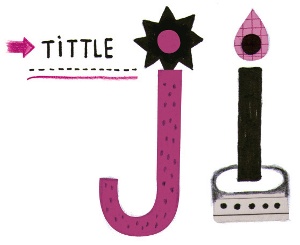
Tittle
The brilliantly suggestive name for the dot above letters 'i' and 'j'.
Terminal
A type of curve at the end of a stroke. Examples include the teardrop shapes in: 'finial', 'ball', 'beak' and 'lachrymal'.
x-height
The height of the lowercase x in any given typeface. This delimits the size of the glyph's detail and therefore also of its ascenders and descenders.

The Creative Bloq team is made up of a group of art and design enthusiasts, and has changed and evolved since Creative Bloq began back in 2012. The current website team consists of eight full-time members of staff: Editor Georgia Coggan, Deputy Editor Rosie Hilder, Ecommerce Editor Beren Neale, Senior News Editor Daniel Piper, Editor, Digital Art and 3D Ian Dean, Tech Reviews Editor Erlingur Einarsson, Ecommerce Writer Beth Nicholls and Staff Writer Natalie Fear, as well as a roster of freelancers from around the world. The ImagineFX magazine team also pitch in, ensuring that content from leading digital art publication ImagineFX is represented on Creative Bloq.
