The 8 greatest Dalek designs of all time
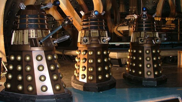
We've selected the eight most iconic Dalek designs from over 50 years of Doctor Who, and we've enlisted some leading designers to explain why they work. First here's Dave Bradley of the sci-fi bible, SFX magazine, to explain exactly why these cruel cyborgs have become so iconic...
Dave Bradley, editor-in-chief of SFX magazine

"You know when a TV creation has achieved 'phenomenon' status when tabloid newspapers can refer to it without further explanation and when even your mum can name it just from its silhouette. Daleks have achieved just such a significance.
"Originally conjured up by writer Terry Nation (who went on to influence our sci-fi culture further with the likes of Blake's 7) for Doctor Who’s second adventure, the chilling simplicity of their design inspired script editor David Whitaker to describe them as 'worthy of Jules Verne'.
"In the almost 50 years since, Doctor Who has become an Easter and Christmas tradition and a ratings sensation for the BBC thanks in no small part to the calibre of villains who always send kids scuttling behind the sofa - it's impossible to imagine the Time Lord without his plunger-wielding nemeses."
01. Mark I Dalek
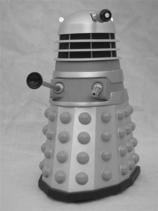
The original Daleks, introduced in 1963, still have the capacity to send shivers down the spine. And it's testimony to the ingenuity of their creators (concept: Terry Nation; design: Raymond Cusick; construction: Shawcraft Engineering of Uxbridge under Bill Roberts) that the basic design has remained largely unchanged since.
Unlike later versions, the original Dalek had no shoulder slats or mesh, and a distinctly ‘toffee apple’ shaped eyeball. Also, the eye lenses were illuminated and had an iris that could expand and contract.
The Daleks were designed to glide, not walk. Creator Terry Nation was inspired by a performance by the Georgian National Ballet, in which dancers in long skirts appeared to glide across the stage. For many of the shows, the Daleks were played by retired ballet dancers.
Daily design news, reviews, how-tos and more, as picked by the editors.
The expert view
Rob Redman says

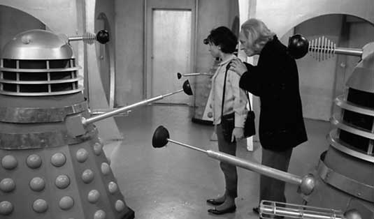
"The designers of the original Daleks hit the spot perfectly, creating something completely different to the face-painted aliens that had come before. Even though the Daleks of today have evolved a little they still bear a striking resemblance to the original and that has to be down to the fact that the design is such a strong one. The segmented bodies made them look invincibly armour-clad and while they had no faces it was more than obvious what they were looking at and, more importantly, which way their weapons were facing."
Rob Redman is a 3D artist and founder of Pariah Studios.
Jason Arber says
"The original Daleks were the best design, and subsequent versions seem to lack the utilitarian feel the Mk I Daleks had.
"The job of designing the Daleks fell to Raymond Cusick when Ridley Scott, then a designer at the BBC, was unavailable. Imagine what those Daleks might have looked like..."
Jason Arber is a photographer, filmmaker, writer and musician. He co-founded Pixelsurgeon.
Watch this!
Here's the very first appearance of a Dalek on TV - a scene that's a masterclass in suspense.
02. Movie Daleks
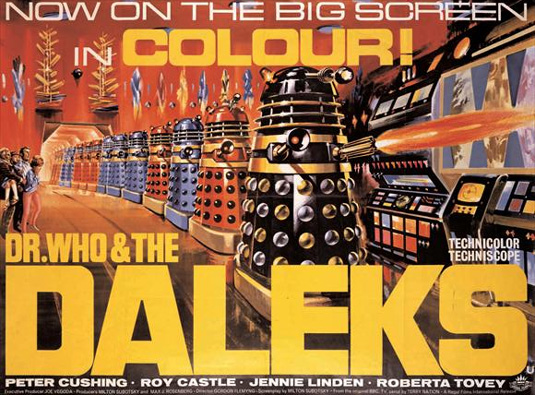
The popularity of the 1960s TV show led to two cinema releases, Dr Who and the Daleks, and Daleks - Invasion Earth: 2150AD. The obvious difference was that they were appearing in colour (British TV being black and white at the time), and the production team at Shawcraft Engineering made the most of it, painting the Daleks in bold hues. Drones were primarily silver with mid-blue domes, hemispheres and fenders, and gold collars, while higher up the hierarchy other Daleks were gold, black and red.
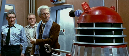
Aside from colour there were only minor variants from the TV show: in the first film, for instance, some Daleks were fitted with a two-jawed mechanical claw instead of a plunger and one was seen with a cutting torch instead of a telescopic arm.
03. Mark III ('70s version)
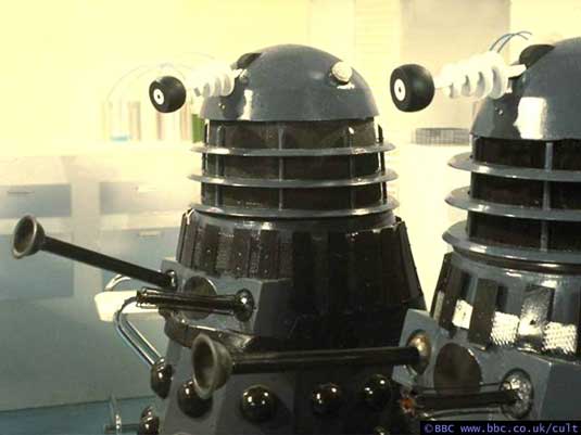
When colour TV came to the BBC in the '70s, the production team went in a very different direction colour-wise. In contrast to the garish hues of the movies, the new Daleks were finished in a colder, military grey, with pitch-black hemispheres and fender.
Despite the occasional adornment with black slats and/or collars, this sinister look remained the standard Dalek colour scheme over the next 16 years.
Mark McGee says

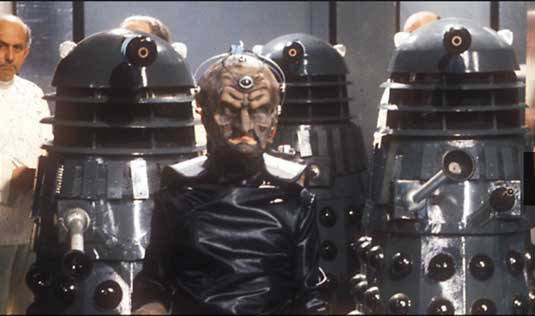
"My favourite Dalek has to be the grey and black version that appeared in Genesis of the Daleks in 1975. This is one of my earliest memories of the Daleks (from behind the sofa of course).
"Although I also liked the brightly coloured designs from the Peter Cushing movies, I always felt the grey/black variants were more menacing, as there were obvious Nazi parallels to both the Daleks themselves and the Kaleds that they (supposedly) served. The design of this variant was pretty much spot on; the eye bulbs were subtle, the bumper was not over the top and it didn't have lots of extra bits sticking out like some of the others. It was a functional travelling machine created by a mad scientist for a brutal regime and it performed its role perfectly."
Mark McGee is a freelance digital marketing consultant for InfoJuice.
Watch this!
This short clip shows the Dalek creator Davros testing out his new invention:
04. Special Weapons Dalek
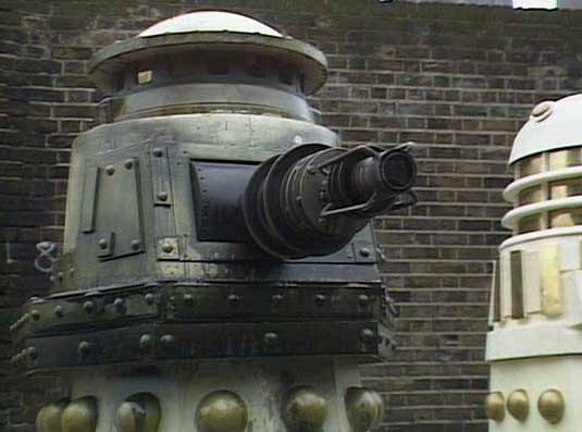
If you thought Daleks couldn't get any more horrific, here's one that pushed the boundaries further.
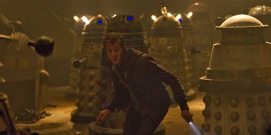
Seen in 1989's Remembrance of the Daleks (also the first episode in which the Daleks could fly), the Special Weapons Dalek is heavily-armoured and is all about the firepower. It has no manipulator arm, eye-stalk or dome lights, just a large energy cannon mounted on the front of the casing. The casing appears battle-scarred and far dirtier than other Daleks, which are usually shown in a clean condition.
Reminiscent of First World War hardware, this was the Dalek that even scared other Daleks. They called it 'The Abomination', and it returned in the most recent series on a planet where the craziest Daleks are imprisoned by the Daleks themselves.
Gavin Rothery says

"For me the most significant version has to be the Special Weapons Dalek. It was the first time I ever saw a 'non-standard' Dalek, and it was very exciting when it appeared. The Daleks were always built up as a significant threat whenever they appeared in a story, so the appearance of a special version that was even more dangerous was a real thrill. There aren't that many baddies that evoke this sort of feeling in me, but I love it when they do.
"The Special Weapons Dalek actually played a key role in the narrative and wasn't just some inconsequential 'extra danger'. Couple this with the limited screen time and you have a truly memorable sci-fi character in much the same way Boba Fett played out in the original Star Wars trilogy. The ingredients are the same - not much screen time at all, very cool looking, framed narratively as a very dangerous threat and used appropriately within the narrative.
"This all adds up to leaving a strong impression in your mind afterwards, creating a truly memorable character. For me, this is sci-fi done right and I love it."
Gavin Rothery was concept artist and VFX Supervisor on the Duncan Jones movie Moon.
05. Gold Dalek
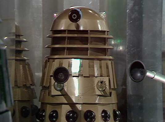
While the rank and file foot-soliders of the Dalek army remained stubbornly monochrome, the generals were often permitted a splash of colour. A Gold Dalek first appeared in Day of the Daleks (1972), with black hemispheres and fender.
Matt McGuire says

"My favourite Dalek design is the 'Gold Dalek Supreme', which appeared in 'The Planet of the Daleks' in 1973. What I find fascinating about this Dalek is that it is actually a modified prop given to Terry Nation from the 1965 Peter Cushing movie Dr Who and the Daleks! I always loved the big bold colours, bulbous 'talk lights' and the thick base the movie Daleks afforded over their TV counterparts. Combining the two (purely due to budget I'd reason) was a match made in heaven. Oh, it also had a standard torch built into its eye piece! What self-respecting Dalek wouldn't aspire to that?"
Matt McGuire is a Flash animator and back-end developer working within Future Media and Television Platforms at the BBC.
06. New Series Dalek (2005)
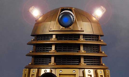
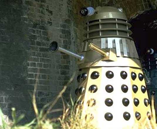
After a 16-year hiatus, Doctor Who returned to our screens in 2005. Almost every component was re-designed to give it a heavier and more solid look. With input from executive producer Russell T Davies, comic book artist Bryan Hitch and production designer Edward Thomas, the first batch were constructed by special effects company The Model Unit under the direction of Mike Tucker.
The new designs incorporated additional detailing to many of the components, including the dome, gun, appendage boxes, plunger and eyeball, and were finished in an metallic bronze colour scheme.
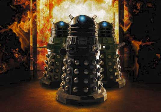
Only minor variations to the design were made subsequent episodes, until the groundbreaking New Paradigm Daleks were introduced in the 2010 episode Victory of the Daleks.
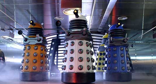
These new models came in bright, shiny colours and seemed like they were trying to appeal to fans of Apple products. We've included a picture of the New Paradigm Daleks below so you can see what they look like - but they're not on our list of best designs because, quite frankly, most people we spoke to hated them.
07. Dalek Sec
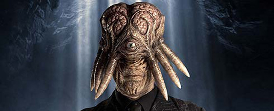
The Daleks may appear to be united, but we've recently learned there are several rebellious factions. One such splinter group is the Cult of Skaro, led by Dalek Sec, who carried out an experiment to become a Dalek-human hybrid in the 2007 episode Daleks in Manhattan. Neill Gorton and his team at Millennium FX did an impressive job on the prosthetics, combining the human and the inhuman to grotesque effect to create a truly original design.
08. Churchill Daleks

The original story of the Daleks was so clearly influenced by the rise of the Nazis that it was a masterstroke of irony when the 2010 episode 'Victory of the Daleks' saw the evil race in camouflage colours, sporting Union Jacks, and claiming to fight on the side of Winston Churchill. Of course it was a trick, but we loved the use of iconic wartime imagery to add a new twist to a classic design.

Now read SFX!
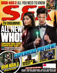
The latest issue of SFX, the world's number one sci-fi mag, features a behind-the-scenes preview of the new series of Doctor Who including an interview with the new companion. There's also a look behind the scenes of Iron Man 3 and a tribute to the great Gerry Anderson. SFX is available in all good book stores or can you can buy an iPad version via Newsstand or order your print copy from this site.
For more on sci-design read:
- The best designs in sci-fi movies
- The 10 scariest movie monster designs
- How Gavin Rothery created the iconic design for Moon
- 10 awe-inspiring designs from Kubrick classics
Did we include your favourite Dalek? Let us know in the comments!

Tom May is an award-winning journalist specialising in art, design, photography and technology. His latest book, The 50 Greatest Designers (Arcturus Publishing), was published this June. He's also author of Great TED Talks: Creativity (Pavilion Books). Tom was previously editor of Professional Photography magazine, associate editor at Creative Bloq, and deputy editor at net magazine.
