This quirky font foundry logo is a feast for the eyes
I love the heritage-inspired design.
Sign up to Creative Bloq's daily newsletter, which brings you the latest news and inspiration from the worlds of art, design and technology.
You are now subscribed
Your newsletter sign-up was successful
Want to add more newsletters?
Independent font foundries are a unique platform to discover fresh typography that stands out from the conventional offerings of big commercial brands. One such foundry breaking the mould is Fincker Font Cusine, a bespoke company created by type designer Julien Fincker.
Steeped in family tradition, Fincker Font Cuisine is a unique foundry born out of Julien's extensive experience in the industry. There are countless types of typography options on the market, but Fincker's bespoke offerings of retail and custom designs provide "everything the typographic heart desires" thanks to Julien's expert personal flourish.
For Julien, launching his own foundry was a slow and steady process, taking time to curate his skills before taking the plunge. "The desire to have my own foundry was there right from the start. But before I opened the foundry, I wanted to take my time to gain experience in designing and selling fonts. After six years, the time was right to take my own path, and here we go," he says.
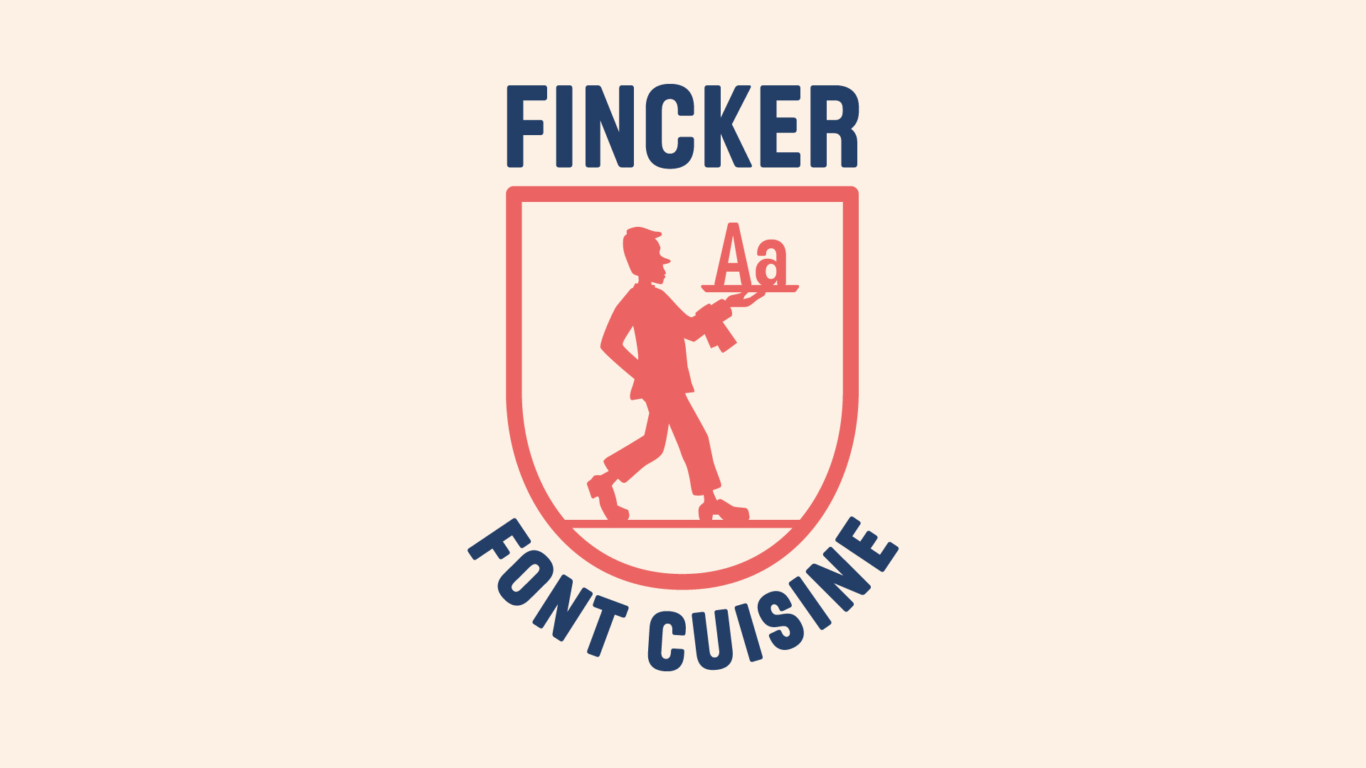
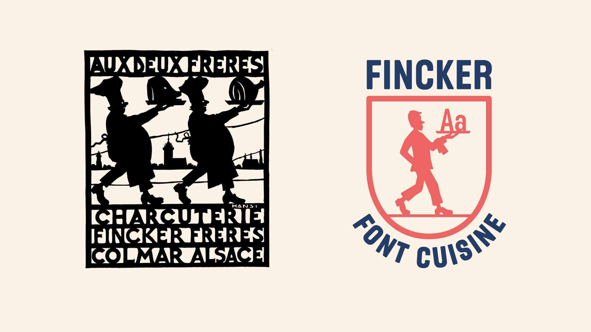
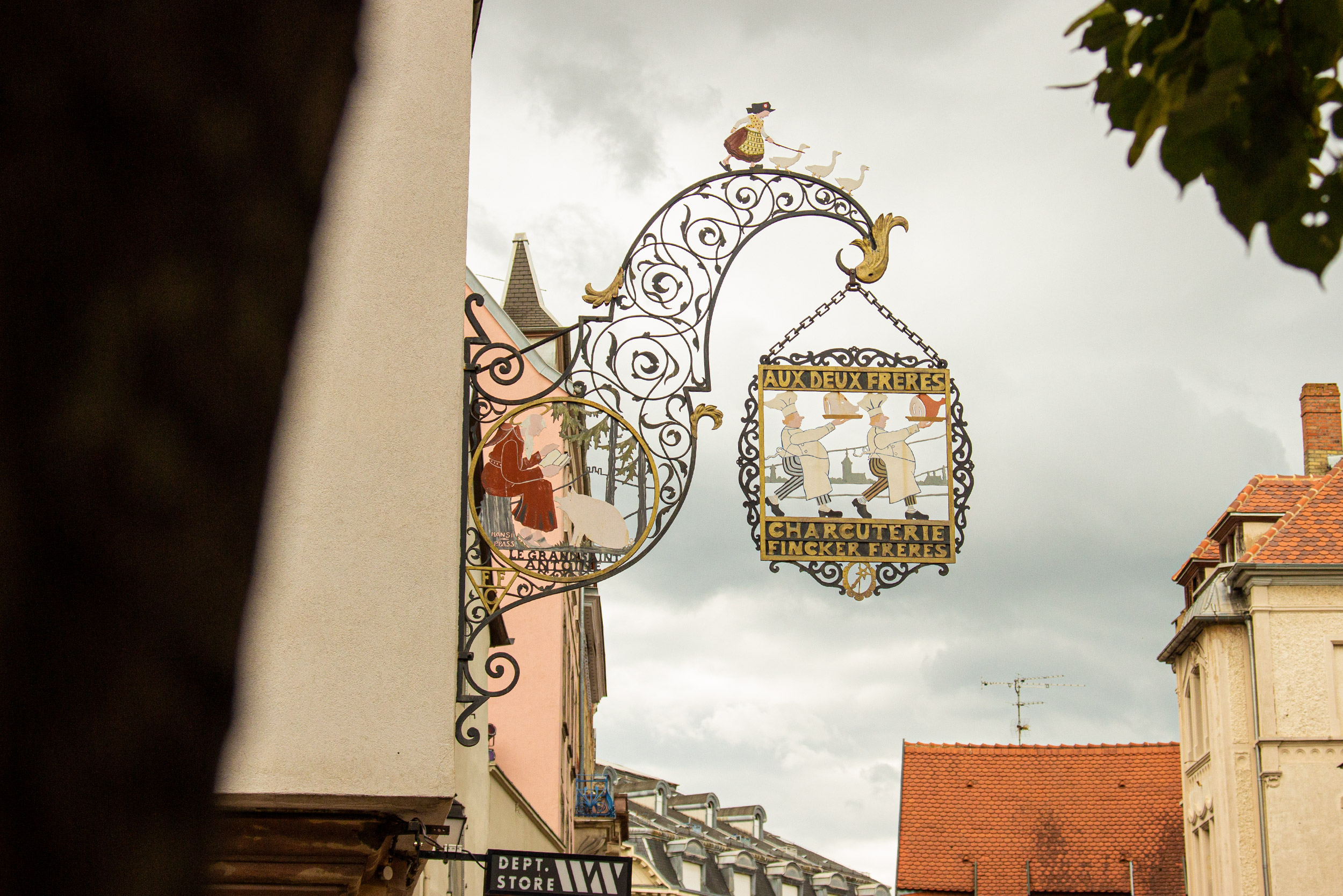
Article continues belowAt the core of the launch is the foundry's charming logo inspired by Julien's rich family heritage. Fincker Font Cuisine's logo draws upon the traditional design of the early 20th-century delicatessen butcher’s shop owned by Julien's family. "For the time (around 1920-1930) it was a really playful and high-quality corporate design," Julien says. To this day, the design remains iconic, becoming its own tourist attraction in Colmar, France.
"The symbol of the butcher's shop shows my great-grandfather and his brother serving pork parts. This playfulness with the silhouettes has always fascinated me. That's why I stylistically reduced the design and also used silhouettes to represent myself. But I serve letters, which is a bit more appetizing," Julien adds.
When it comes to designing fonts, Julien has a unique analogy that inspires his craft, drawing parallels between cooking and creating custom typography. "Cooking and designing fonts have a lot in common. The smallest changes can produce a completely different result in terms of taste. When cooking, for example, if you use different spices than usual, you get a completely new dish. It's the same with fonts. The smallest adjustments, for example, to the serifs or the edges can completely change the typeface. Dosage plays an important role too. Of course, it still has to be edible!" he says.
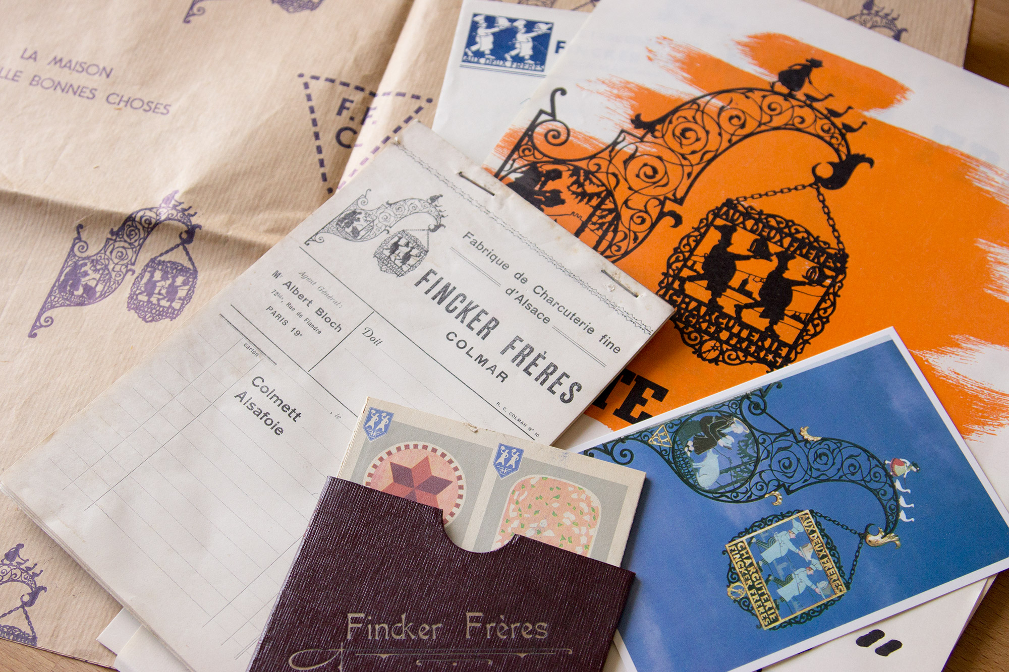
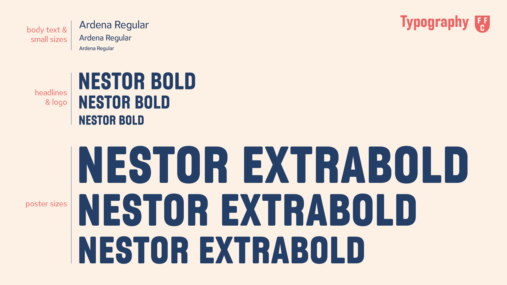
Published alongside the foundry's launch, Julien's latest font Nestor is a stylish flavour of Fincker Font Cuisine's offerings, providing a unique option for strong headlines, editorial, packaging, branding and advertising. "Nestor is a soft and narrow sans-serif typeface family. It was also inspired by the butcher’s shop labels and posters. Advertising at that time often used very narrow, sans serif fonts and often only capital letters. The font should therefore be easy to read in capitals. It should also be bold and also soft in a way, so that it appears confident but not too strict, as you can see from the slightly more playful 'a'," Julien says.
Sign up to Creative Bloq's daily newsletter, which brings you the latest news and inspiration from the worlds of art, design and technology.
With a simple licensing process split into Standard and Extended options, Fincker Font Cuisine prioritises ease and accessibility for its users. As for projects that require a more bespoke design approach, Julien also offers custom fonts, modifications and extensions.
Find out more about Fincker Font Cuisine here.
For more typographical inspiration, check out our collection of the best free fonts to add to your next creative project. If you're after more indie foundries, check out Jessica Walsh's new foundry, Type of Feeling, which creates custom typefaces inspired by emotions.

Natalie Fear is Creative Bloq's staff writer. With an eye for trending topics and a passion for internet culture, she brings you the latest in art and design news. Natalie also runs Creative Bloq’s 5 Questions series, spotlighting diverse talent across the creative industries. Outside of work, she loves all things literature and music (although she’s partial to a spot of TikTok brain rot).
