How to make a text logo
Our step-by-step guide to crafting a compelling text logo.
There’s a lot of pressure on a text logo – its impact is reliant on only a few subtle elements of design. As the designer you’ve got an ambitious job; it’s essential to create a punchy logo that conveys the right message with only one or two strategically designed words and flourishes. Your audience judges your brand with only a brief glance, meaning that only the tiniest of adjustments form the overall message.
Photoshop is the industry go-to, and that's what we'll be demonstrating with today, so if you're not familiar, be sure to check out our guide on how to make a logo in Photoshop too (though we wouldn't really recommend PS for logo making!). For beginners searching for cheaper software options, you can take a look at the best free design tools currently on the market.
Household names such as Google, Amazon, Uber and Calvin Klein have all grown into industry-leading brands with simple typographic logos. Brands like these have used iconic logos to express a wide variety of messages from classy to eccentric, and from luxury to vibrant. We’re going to show you how to do the same!
Article continues below1. Conduct market research
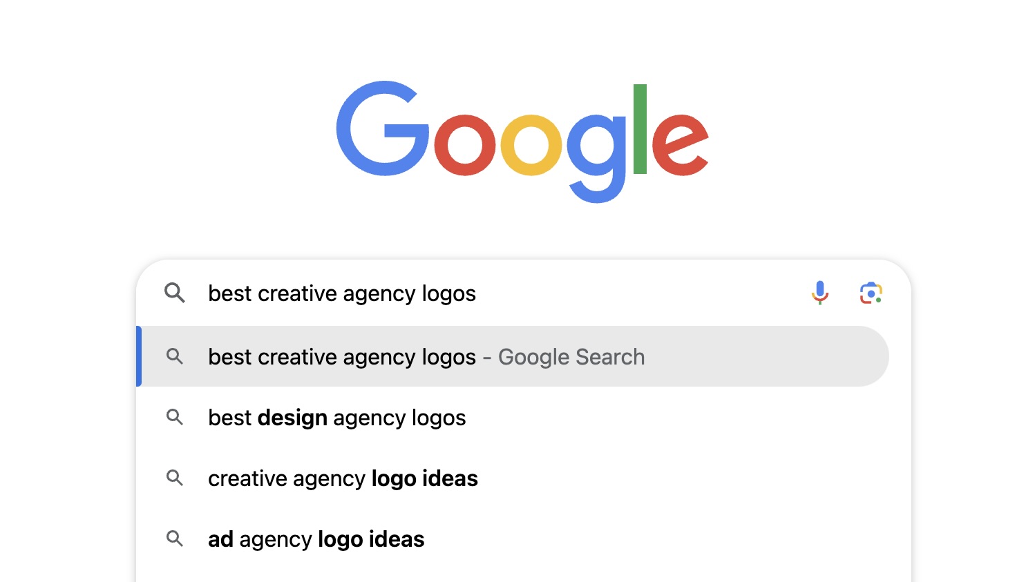
Before you get started, take advantage of the most powerful tool at your fingertips: Google. Take some time to conduct market research on the stylistic and branding decisions of other text logos in your industry, and take note of correlations. Design is, above all else, rooted in communication, so you can use this research to work out what features you should include in your own logo to help communicate the right message and slot seamlessly into the industry. We have plenty of inspiration here on Creative Bloq, see our best logos of the decade series to get you started.
2. Choose your font
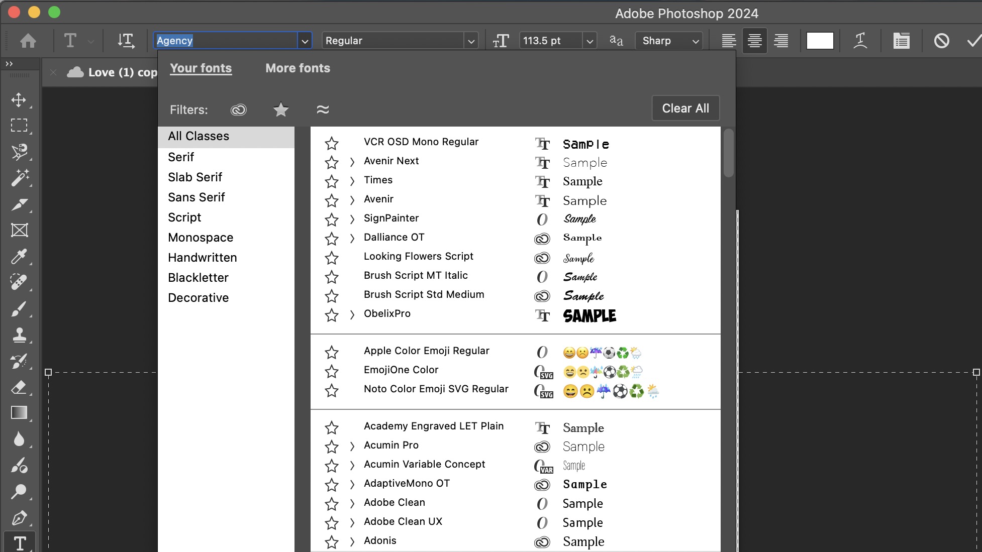
As the base of your design, choosing the font is the most crucial stage of the process. While other logos rely on a combination of visual features such as illustrations, symbols and images; a text logo is almost entirely reliant on typography. If you have specific styles and effects in mind for the final creation, consider a more minimalist sans-serif font that allows room for customisation. However, if you would prefer the font to stand on its own without too much editing, look for more decorative fonts where the editing has already been done for you. Adobe Fonts is full of fonts designed by professionals that can be freely downloaded directly into your Adobe software and apps (see our best Adobe Fonts roundup). For when you’re researching which font styles to verge towards, Google Fonts is an excellent resource for reading up on extensive background history and context on all types of fonts. If you’re looking to download unique and unusual fonts, DaFonts is one of the largest free font databases that usually includes more decorative fonts than the ones you will find on Adobe.
3. Pick a colour palette
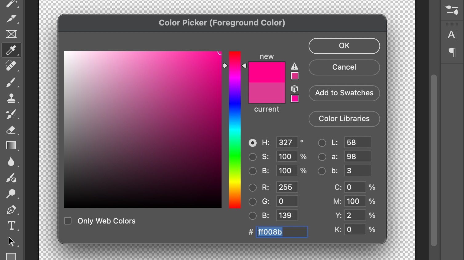
It goes without saying that the colours you choose for your text logo should match the colour palette of your overall brand. A limited number of colours tends to work best for effective branding, with the best brands usually selecting only two or three at the most. Choosing your logo’s colours is one of the most exciting parts of the design process, so take a minute to experiment with different combinations outside of your comfort zone that you might not usually try. Sometimes inverting the order of your colours can make all the difference to a brand’s messaging.
4. Consider the background
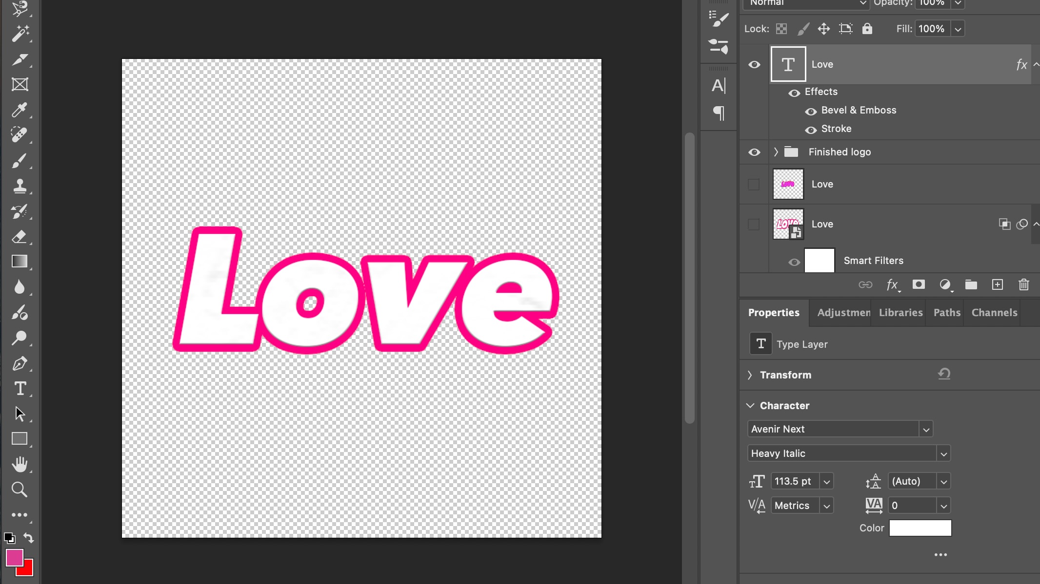
Founded on simplicity, text logos usually aren’t too busy. This is why many brands opt for a transparent background behind their text logo to allow the typography to stand on its own - not to mention the increased professionalism of the ability to place the logo anywhere on a website or asset, and layer it over the top of any image or colour background. Make sure to remember to export your logo as a .png to include the transparent background.
5. Decide on spacing
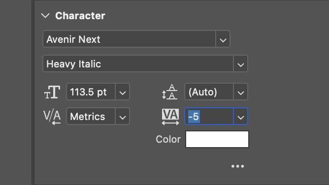
Spacing in a logo can radically change a business from a skincare brand to a food shop, and no one wants to get those mixed up. For example, wider spacing paired with a lighter weight of font tends to connote skincare or self-care based luxurious brands. For a shorter and snappier message, opt for a more condensed font such as Avenir Condensed or Futura, and lean into the natural design of the typeface. Line spacing is also important to consider – it can often come across as more professional for the line and letter spacing to be closer together to create a feeling of conciseness. This ensures that the audience’s eyes do not have to travel too far or exercise too much effort to read and understand the logo. Remember, the majority of your audience will judge your logo in just a few seconds, so its ease of legibility goes hand in hand with its style.
6. Add personal touches
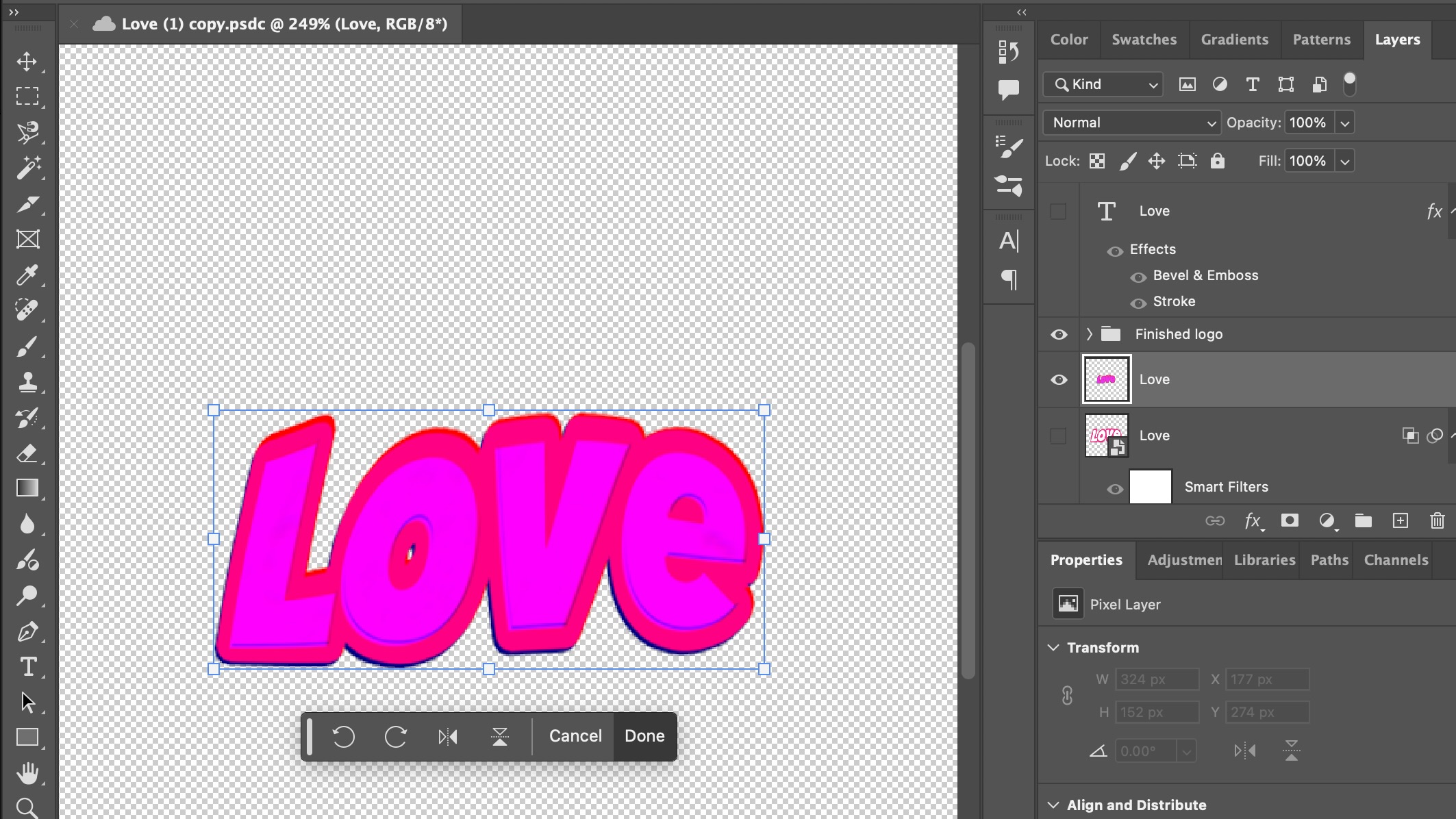
Now it’s time to make the typography your own! Editing the effect controls in each layer of your design is one way to play around with different looks. These allow you to add effects such as gradients and textures as well as edit the visibility of the RGB settings. The various tools in Photoshop also allow you to tweak, skew, liquify and distort the shape of your text - and you can even blend your adjustments with the original layer to create something uniquely yours. Don’t forget to experiment with tools outside your comfort zone too – you might just stumble across the perfect design that might not have occurred to you otherwise.
7. Convert into a vector
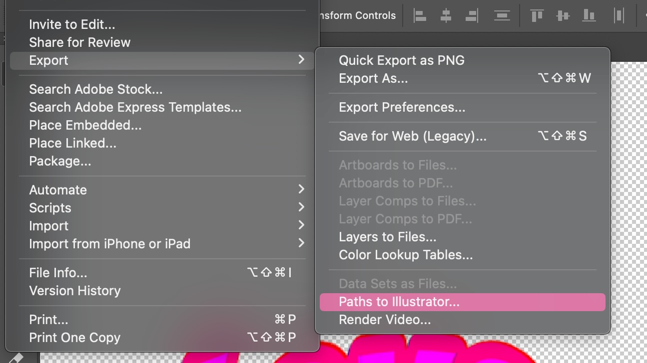
If your logo is going to be resized often (especially in print), it’s a good idea to convert it into a vector. This means that the design is not made out of pixels, meaning that it is universal to all sizes: digital and print. Illustrator is the best place to make your logo into a vector. Use our handy guide to Illustrator to start getting to grips with the software.
For more on logos, see our top tips on how to design a logo.
Sign up to Creative Bloq's daily newsletter, which brings you the latest news and inspiration from the worlds of art, design and technology.

Mabel is a writer and multi-disciplinary artist. She is a regular freelance contributor to Creative Bloq and has also written for T3, TechRadar, Tom's Guide, and other Future publications. She's currently working on obtaining her degree in illustration and visual media from UAL, as well as running her independent publishing house Mabel Media, which has just launched its debut fine print publication, ‘One day I could be living again’, stocked in Magalleria, MagCulture and the London Review of Books bookshop. When she's not writing or making art in the physical form, she's making films for Mabel Media, rollerskating or travelling.
