8 famous textless logos and why they work
These top brands all ditched their names from their logos, but we instantly know who they are.
Textless logos are often the sign of a brand that has supreme confidence. Many brands will use both a symbol and a wordmark in a lockup, but ditching the type to use a symbol alone is sometimes only possible when a brand's become firmly established
For a textless logo to work, consumers need to recognise and respond to the design components that make up the brand identity. That usually takes time. Brands such as Nike, Apple and Mastercard all used text alongside their logomark initially until they decided the mark was recognisable alone. However, it's not impossible for a relatively young brand to use a textless logo, especially in the case of mobile apps, since the app icon can come to represent the brand.
Read on as we explore eight huge brands that made the decision to drop the company name from their logos. Also see our posts on the best animated logos and the best TV logos for more logo inspiration. And if you want tips for your own designs, see our article on how to design a logo guide.
Why use a textless logo?
A textless logo can be an iconic, powerful visual shorthand, commanding global brand recognition and transcending language. It's also perfect for digital applications. When a wordless symbol is familiar enough, it can help a global superbrand appear more immediate, personal and less corporate. Here are eight examples.
01. The Mastercard logo
Pentagram rebranded Mastercard in 2016, dropping the wordmark from the logo and causing quite a splash. In doing so, Mastercard was reborn for the digital space with the removal of the, now dated, Mastercard font that used to sit atop the venn diagram-like circles. The visually impactful graphic was already so recognisable that lifting off the words felt like a no-brainer.
See here how designers reacted to the rebrand when it happened.
02. Apple
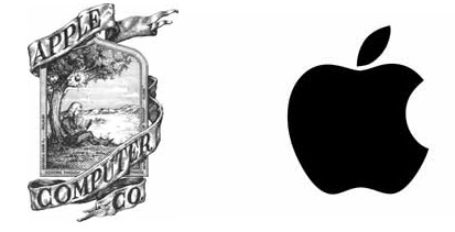
Apple has proudly sported a wordless brand mark for decades – you have to go all the way back to 1984 to find its name anywhere near its logo. Apple's original logo was very different, sporting a woodcut-style illustration of renowned apple enthusiast Isaac Newton under the tree where he reportedly received his fruity inspiration for gravity (see our guide to the Apple logo history).
Daily design news, reviews, how-tos and more, as picked by the editors.
To say it didn't last long, in branding terms, would be an understatement. The logo was replaced by Rob Janoff's iconic bitten apple just a year later. The rainbow apple retained the wordmark until 1984 when it finally became wordless. While it has also since lost its rainbow stripes, that silhouette has remained constant. Now, it's almost unthinkable for this trailblazing champion of minimalist design to write its company name next to its logo. Why would it need to?
03. The Instagram logo
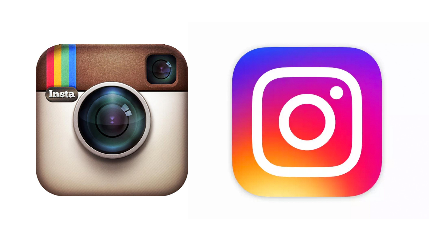
Though Instagram is a relatively young company (compared to some of the stalwarts on this list) because it is an app-based brand, it has been elevated into the realm of the textless logo heavyweights through the fact that users interact with the app icon so consistently. Insta has had much less need to use its wordmark because the icon itself is so ingrained into consumer consciousness. It's not dropped it with a lot of fanfare in the way other brands have because it's always relied more heavily on its icon from day one.
Founded in 2010, Instagram has been through a few incarnations of its camera icon, with the analogue camera finally dropped in 2016 in favour of the modern, neon aesthetic used now (see our Instagram logo history).
04. The Starbucks logo
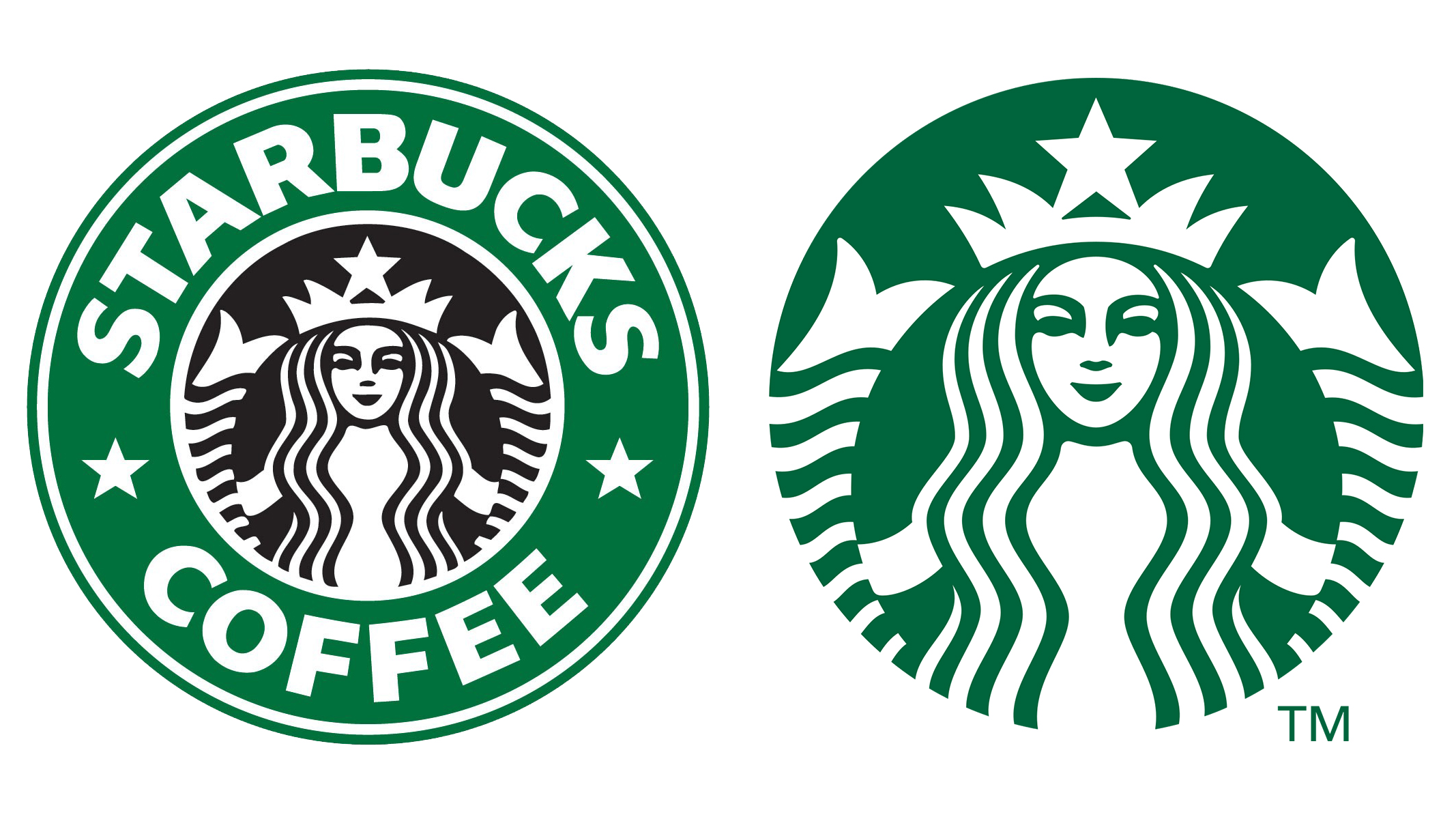
Seattle's world-conquering coffee chain boasts a fascinating story behind its logo. The company was named after Captain Ahab's first mate in Moby Dick, so the original logo designer Terry Heckler decided to draw on a 16th-century Norse woodcut of a two-tailed mermaid for inspiration.
Starbucks' siren has been re-crafted several times since the company was founded in 1971, but it wasn't until Lippincott's 2011 rebrand that she was trusted to shoulder the lion's share of the global chain's branding equity.
Dropping 'coffee' from the name reflected diversification, but dropping 'Starbucks' entirely showed true confidence in the iconic mark's instant familiarity to coffee lovers around the world. Read more about the iconic Starbucks logo.
05. The Shell logo

It's always going to take time for punters to link a two-tailed mermaid with a caffeinated beverage – but the fact that there's no logical link there gives Starbucks a distinctively ownable association to create from scratch. Sometimes, however, a brand's name lends itself perfectly to symbolic representation – making that visual shorthand much easier to establish.
Apple is one example, and Shell is another. In fact, it's something of a trailblazer in the world of wordless logos: from 1900 until 1948, a realistically drawn black-and-white scallop shell did all the work.

The red-and-yellow colour scheme was gradually introduced into Shell's service stations – and was finally incorporated into the logo itself, alongside the company name, in 1948. The shell became increasingly bold and stylised, and by 1999 it had accumulated enough brand equity to stand alone once again.
06. The McDonald's logo
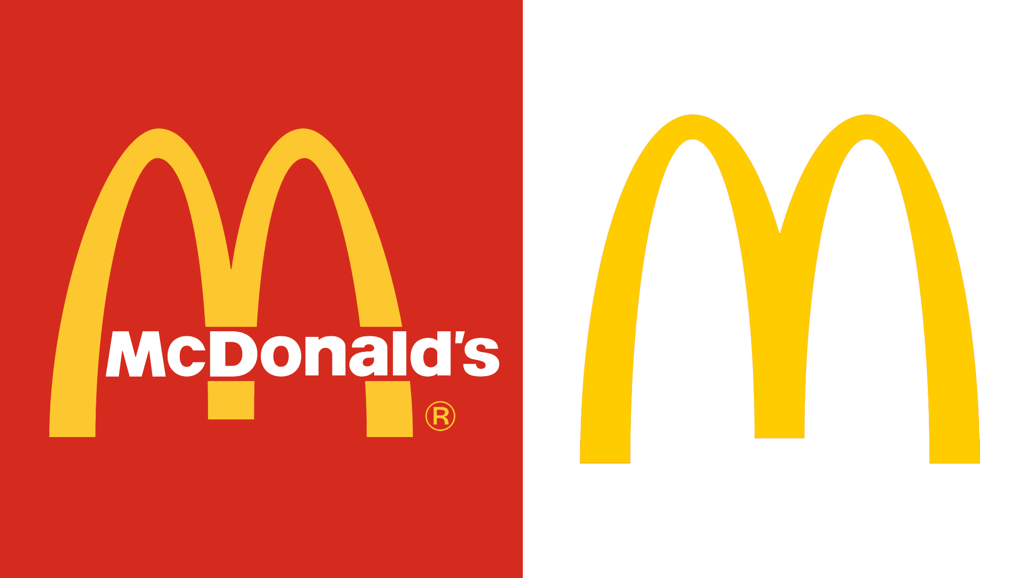
Once a prominent architectural feature of its restaurants, the Golden Arches first made their way into McDonald's logo in 1961 – before that point, the fast food chain's text-heavy logos incorporated taglines such as 'McDonald's famous barbecue' (1940) and 'McDonald's famous hamburgers... buy 'em by the bag' (1948).
In 1968, the Golden Arches adopted their modern-day form – with the company name overlaid at the bottom. This approach was refined further in 1975 with the distinctive red background, and many other variants were introduced in different contexts. The tagline 'I'm lovin' it' made an appearance in 2003, and went on to replace the company name across many brand touchpoints.
Decades of ubiquity had given the Golden Arches symbol all the brand equity, confidence and global recognition it needed to stand alone by 2006, without the company name, any accompanying slogans, or any graphic treatments to speak of – just a pared-back, flat-colour 'M' that is unmistakably McDonald's.
More recently, McDonald's has got even more playful in its marketing confidence, such as with these billboards that don't even show the entire logo, and these type-only ads.
07. The Target logo
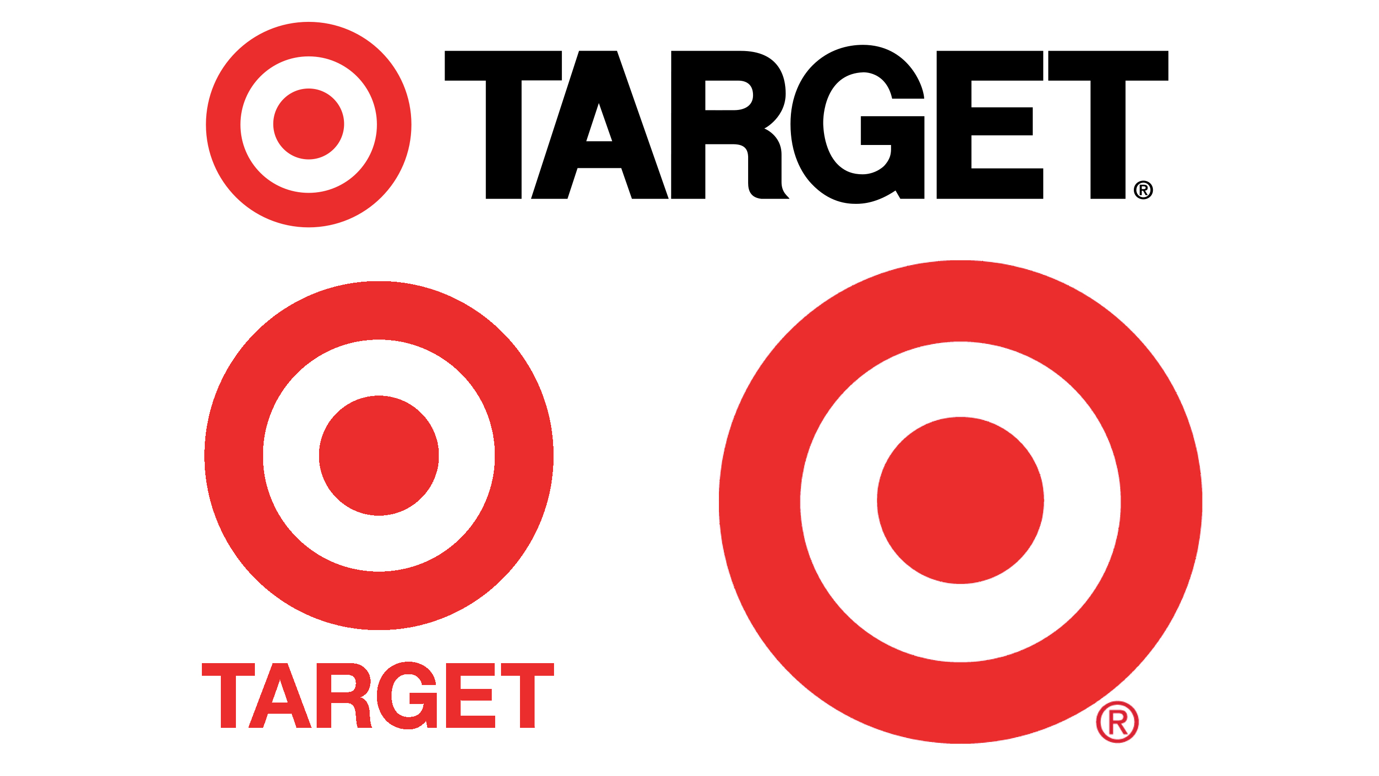
Like Shell and Apple, Target has the good fortune to have visual shorthand baked right into its company name. In fact, the brand mark functioned without the company name as far back as 1968, when the US retailer refined and simplified its original six-ringed target, which had the company name overlaid across the centre, to the pure three-ringed symbol we know today.
However, the company name was re-introduced in 1975, and while the distinctive target was retained, it was shrunk to a much less dominant scale and was scaled to match the height of a chunky black all-caps wordmark.
The emphasis was reversed again in 2004, when the wordmark was scaled to match the diameter of a much larger target symbol which, since 2007, has been widely used in isolation, just as it was in 1968. In this case, the brand equity in the logo was there all the time – it just took the confidence to bring it back.
08. The Nike logo
When design student Carolyn Davidson sketched the Nike Swoosh in 1971 for the princely sum of $35, little did she know it would go on to become one of the world's most instantly recognisable textless logos.
Until the mid-90s, an italicised all-caps wordmark in chunky Futura Bold accompanied it, but the Swoosh ultimately became such an iconic mark in its own right that the need to state the brand it represents became redundant.
Of course, the common factors that all of these examples share is a huge marketing budget and global ubiquity, so building layers of meaning and brand association into a textless graphic symbol may seem comparatively easy for them. But even the world's biggest brands had to start somewhere – and their success stories prove the long-term value of any brand investing equity in its mark.

Thank you for reading 5 articles this month* Join now for unlimited access
Enjoy your first month for just £1 / $1 / €1
*Read 5 free articles per month without a subscription

Join now for unlimited access
Try first month for just £1 / $1 / €1

Nick has worked with world-class agencies including Wolff Olins, Taxi Studio and Vault49 on brand storytelling, tone of voice and verbal strategy for global brands such as Virgin, TikTok, and Bite Back 2030. Nick launched the Brand Impact Awards in 2013 while editor of Computer Arts, and remains chair of judges. He's written for Creative Bloq on design and branding matters since the site's launch.
- Georgia CogganEditor
