The best animated logos often add a new dimension to a brand identity and help make it even more memorable. Logo animation can range from subtle movements to complex 3D effects, but at either extreme, the best animated logos complement the wider brand identity and might even tell us something new about the brand.
How are the best animated logos used? Moving logos can be placed in the intros and outros of videos, in social media posts, email campaigns, presentations, and in place of regular logos on websites. Some brands are even using several animated logos for different uses, following the trend of developing temporary logos for individual campaigns and products, and more uses are likely to emerge as AR and VR develop further.
Here we look at 10 of the best examples of moving logos to inspire your work. you can see our roundup of cool CSS animation effects for more inspiration.
10 of the best animated logos
A logo that moves has more chance of getting noticed, can keep the viewer's attention for longer and often requires fewer interactions to be recalled. Also, as we mention in our guide to how to design a logo, logos also need to live and evolve. Movement is one way that this can happen, potentially giving new character to an old design. Here are 10 examples of logo animation used in different ways, each showing us something that animated logos can contribute to a brand identity.
01. LG's new animated logo

The South Korean tech brand LG's logo redesign raised a few chuckles when it was launched. Isn't it just the same as the previous logo, but just flatter and brighter? But it's in the logo animation the intent becomes obvious. LG's identity felt rather staid, and even old-fashioned – not great for a company that wants to portray itself at the cutting edge of tech.
The new animated logo feels a lot more youthful and approachable with its winking emoji-like face, and it has a lot of character for such a simple design. It almost feels like an avatar. As well as demonstrating the power of animated logos, it also shows how effective the best circular logos can be.
02. The WWF animated logo
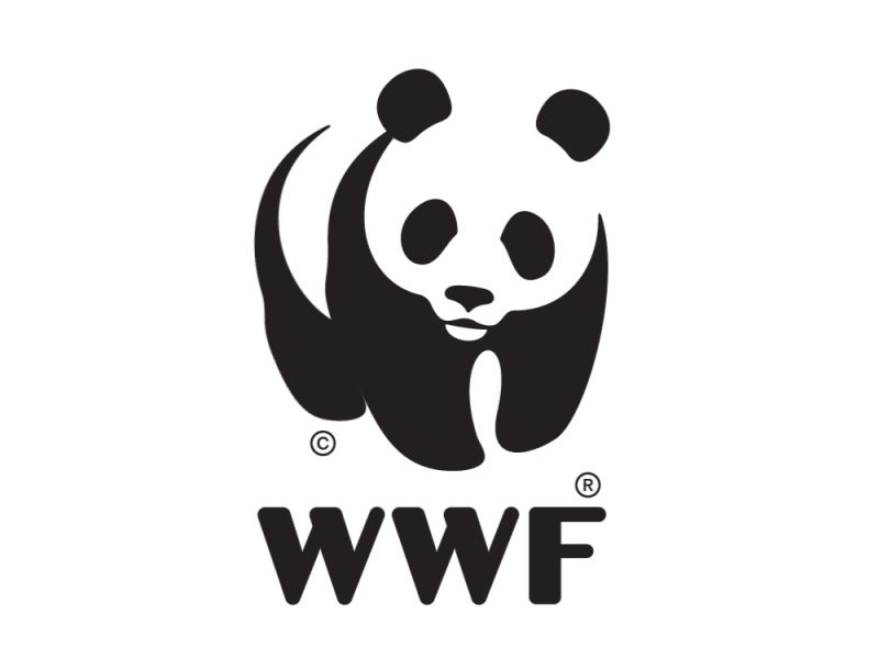
Logo animation can take many forms but many of the best animated logos use only very subtle movement. Even the smallest action is often enough to create a pleasing effect that keeps the viewer watching for a second longer and makes the logo more memorable. An animation that lasts too long can feel overblown and detract from the logo itself.
Jenny Leibundgut’s 1986 WWF logo is a classic logo design. When Brien Hopkins animated it for a Planet Nutshell-produced animated film for a campaign to prevent arctic drilling (below), he added just enough movement to the mark in the logo lockup to make us smile, adding extra emotional engagement and interest. Bringing the panda to life with movement of the paws and head to make it look like it's walking also fit the mood of the animation in the film that preceded it.
03. Animated Sonic Team logo
But the best animated logos aren't always subtle. Context is important, and at the other extreme, dramatic, overblown effects can be just the ticket, especially if you're the developers behind everyone's favourite blue hedgehog. Sega's Sonic Team unveiled a new logo ahead of the release of Sonic Frontiers. It begins with the classic gold rings on Green Hill Zone, before Sonic shoots through them in a blur of blue streaks that then trace out his spiky profile in the air. It's over the top, but fans appreciated the drama.
04. Designtorget
Another elaborate take on animating a logo can involve using movement to tell us more about the brand than a static logo can. This animated logo created by Stockholm design agency Kurppa Hosk for Scandinavian interior design store Designtorget tells us more about what it does.
The 'D' and 'T' are used to create various products that the store sells – furniture, tableware – in a way that also highlights the brand's stylish, often minimalist Scandinavian aesthetic. It's a great example of how animating a logo can contribute to the story behind a brand.
05. Allvit
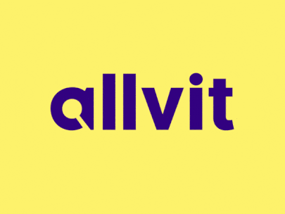
Another use of animated logos can be to draw attention to something we may not have noticed in the original logo. Many logos carry meaning through symbols used in place of letters or hidden in the negative space in their designs, but sometimes people never even notice them (every day someone notices the shape of the white space in the FedEx logo for the first time).
These features can be exploited and made more apparent in moving versions. This animated logo by Nikita Melnikov for Norwegian online book search depository Alvit makes the magnifying glass in the negative space of the 'a' explicit, telling a story that highlights the website’s searchability.
06. Feral Sphere
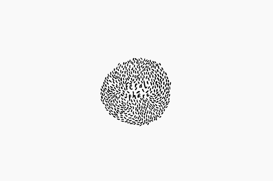
Animation can also help emphasise the personality of a logo, and of the brand itself. UK fashion label Feral Sphere makes clothing made from organic cotton using 100 per cent renewable solar and wind energy. Its logo, devised by Mind Design and illustrator Lenia Hauser, was inspired by Japanese Shinto spirits. It is quite literally a feral sphere, and the animation highlights its feral personality even more.
The movement of the lines brings to mind the wind in trees, flocking birds and swarming bees, all connections to nature that seem appropriate for a brand with a commitment to sustainability. The movement emphasises the brand's organic feel by highlighting the wild sense of freedom in the logo's hand-drawn design. It feels distinctive, personal and hand-crafted.
07. Fox
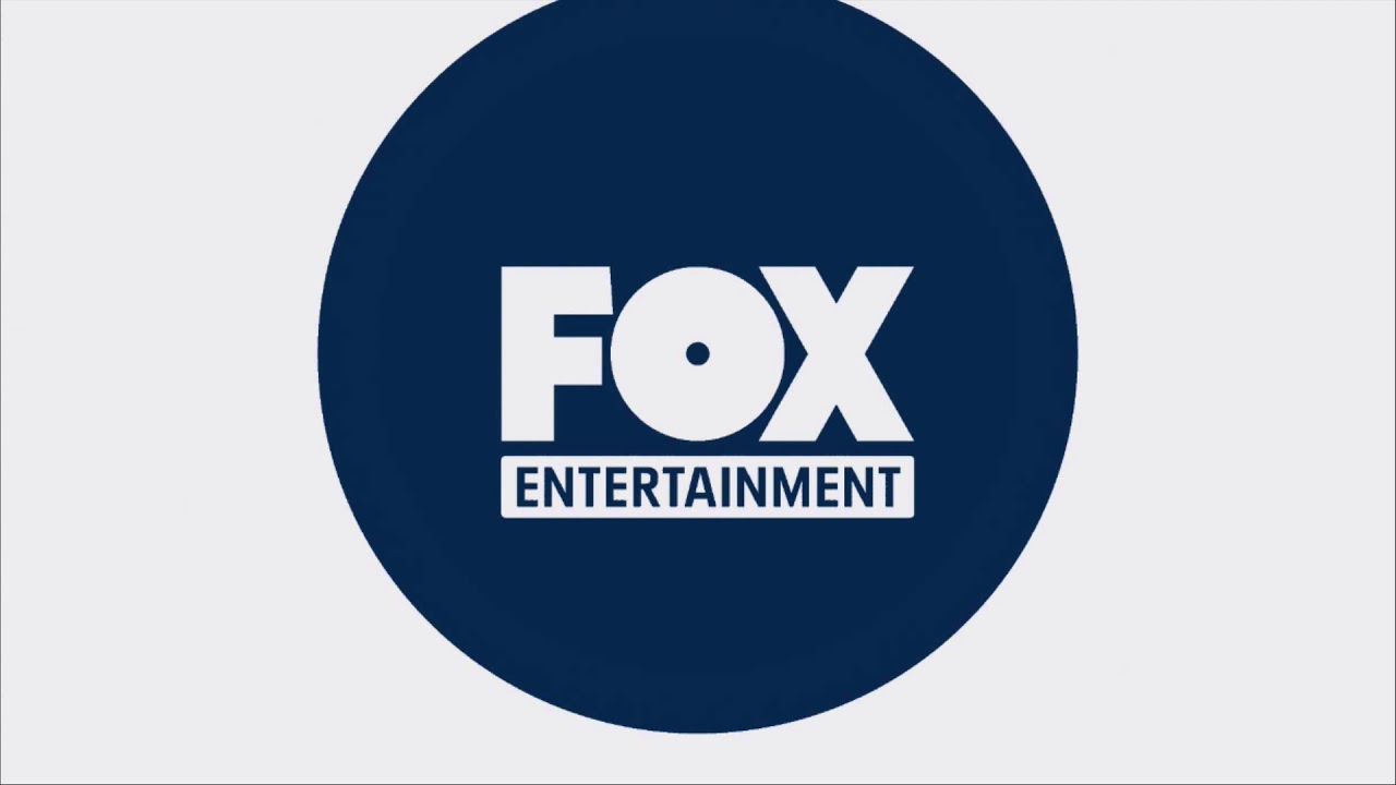
Animating logos can also be useful when making a transition to a new brand identity. If a rebrand is particularly radical, animation can be used to show a recognised logo transition into a new design in order to communicate the change. Last year, Fox Entertainment launched an additional logo to complement its main identity, with radically different chunky letterforms.
The abstract treatment for animations and digital use, designed by Trollbäck + Company, has a satisfying weight to it and aims to show a company taking risks and leading the way. But used alone it may have confused viewers, particularly since the 'F' looks more than a little like a 'V', meaning the logo could be read as Vox. Using it in animations showing a transition from the regular logo help to ease the new identity on board.
08. Eat
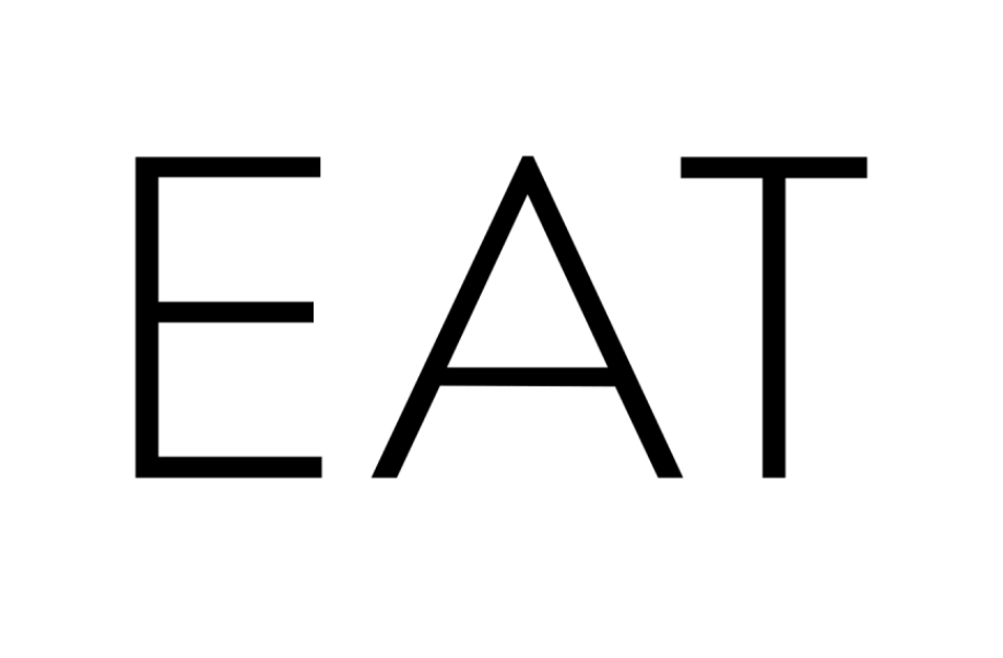
Black and white is a classic combination for logos and there's no reason to stray from that when animating them either. Black and white logos are among the most enduring and can potentially never go out of style. They can be simple and classy, they can call attention without distracting, and they can be applied to a wide range of designs.
This simplicity also allows motion designers to play with concepts when animating them, like in this logo for EAT, an exhibition on food in Singapore. Designed by Fable, it plays with beefing up the logotype as it eats, and becomes "FAT".
09. Yokohama
For additional impact that creates a memorable logo, movement can be combined with sound. A logo with its own soundmark can even become a meme – the Intel logo chime anyone? (See our best audio logos for more examples.) Television and film companies have long used moving logos accompanied by sound at the intro or outro of productions to generate strong brand awareness.
In 2018, Japanese rubber company Yokohama took a novel approach when it animated its red lines logo by recording the sound of the wind passing through the leaves of trees in the company's own forest, to show its greater commitment to the environment. It even made the above video about the making of the sound. The video of course closes with the logo in question.
10. Boro
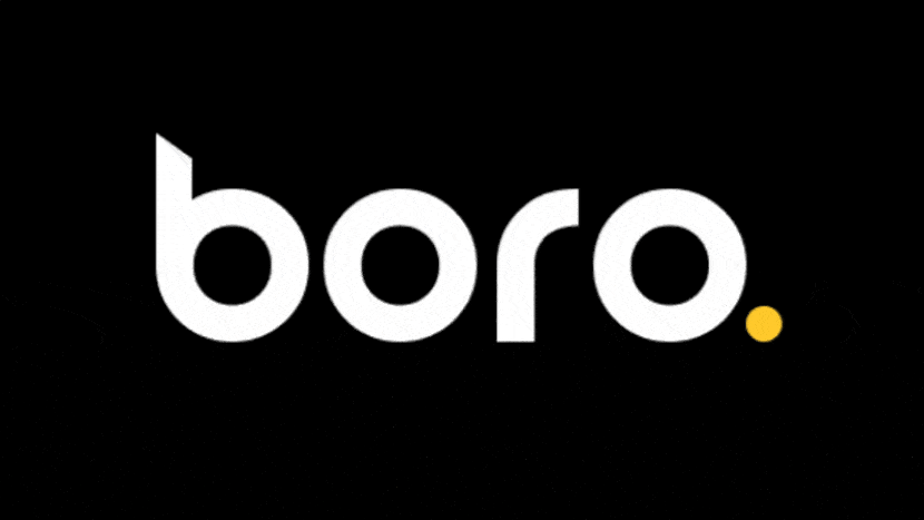
When it comes to logotypes, animation is a great way to bring out the character of the type, whether that involves rigid geometry, sharp angles or rounded curves. This animated logo designed by UI design agency Boro for itself accentuates the rounded shapes of the type, showing the letters rolling out of each other. The finishing touch is the little surprise of the full stop that pops out of the curve of the 'r' after a slight hesitation. It makes the agency seem modern, fun and approachable.
Looking for the best tools for your own work? See our pick of the best animation software. You might also want to see the best drawing books and brush up on the Disney principles of animation.

