The secrets of typesetting

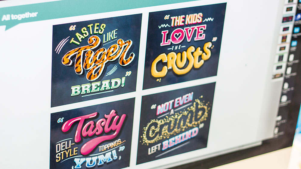
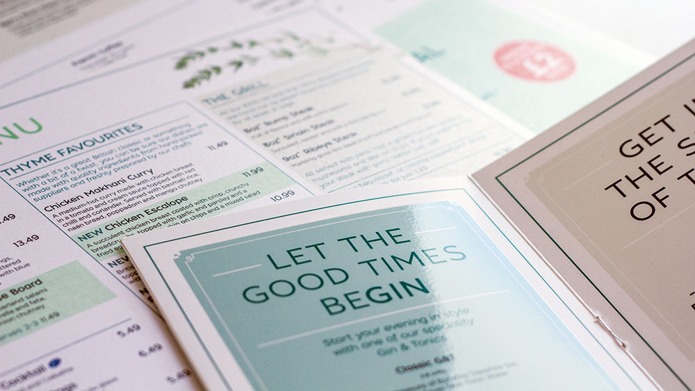
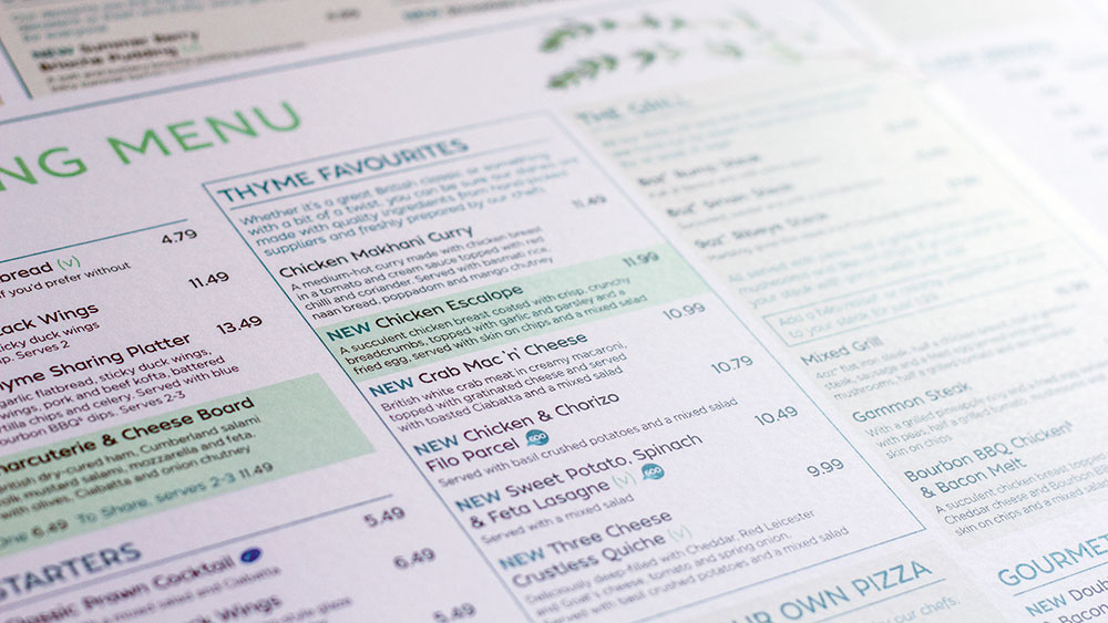
Typesetting might sound like an antiquated term. But it is, quite simply, the art and science of arranging text on a page in an attractive and legible manner. It’s a phrase originally used to describe the arrangement of physical, metal type in editorial design. But nowadays, it’s normally used to refer to the arrangement of digital type on screen, using software such as Adobe InDesign.
Here, we talk you through what typesetting is and what it isn't, as well as its challenges, and top tips for typesetting. To skip to the tips, click here.
“Traditional typesetting used to be quite a fixed mechanical process,” says Luke Tonge, a freelancer who previously worked at LIFE. “So the variables were easier to control, but obviously much more time-consuming and complex. In our fluid digital times, thanks to computers, we type with total ease, so achieving consistency across countless devices and platforms is the new aim.”
Article continues belowModern typesetting, then, is all about the choices that can be controlled by the designer, including typefaces, sizes, placement and colour. And it should always take into account where the type will eventually live: be that outdoors, indoors, on a desktop or tablet computer, printed, or on a tiny watch screen.
All these variables mean that the potential for bad typesetting is huge. “Software is a poor alternative to the kind of experience and eye that comes with years of studying and understanding type as a stand-alone craft,” Tonge points out. “So the onus is on designers today to ignore the default settings and pay even more attention to it.”
Typesetting challenges

All this means that as a junior designer (if you're not sure what one is or how to become one, see this post) your first forays into typesetting for a real client can be quite a challenge. Michele Stocks, who promoted from junior designer to designer at Nelson Bostock Unlimited in 2017, recalls her initial experiences. “It started off being very difficult to choose the right typefaces,” she recalls.
“Then if a secondary typeface was needed, that would prove really hard to get right. Because when it’s even slightly not right, it’s very obvious. It was frustrating, because when I looked at beautiful typographic pieces, they made it look so easy. But what I had in my head wouldn’t come out right on the page.”
Sign up to Creative Bloq's daily newsletter, which brings you the latest news and inspiration from the worlds of art, design and technology.
Thankfully, though, she soon got the hang of it. “You start to get to know what can work and what doesn’t, and quite quickly I found I knew what I was doing,” she says. Ultimately, it was practice that helped her improve, as well as looking at a lot of different types of inspiration. “There are no real shortcuts: it just takes experience to get it right,” she says.

Maya Walters, a creative artworker who previously worked at Hogarth Worldwide, recalls that one of the biggest challenges she faced early on in her career was dealing with multiple client guidelines. “Having a large list of clients, each with a wide variety of fonts and typefaces, meant a steep learning curve,” she explains.
“I needed to understand which rules were applied to each typeface in terms of font size, leading, tracking, horizontal scaling, and so on. In the first few months, even maybe the first year, I remember checking my notes, client guidelines and magazine tips many times a day while working on various projects. The more jobs I worked on, the more aware I became of the importance of typography and guidelines as part of my skill set.”
And it wasn’t just her day-to-day work that helped improve her typesetting skills. “After this initial learning stage, working on freelance and personal projects was another great way to put all of these skills into practice,” Walters adds. “I continued to face new challenges, working with typesetting skills that were outside of my comfort zone.”
And that’s an important point, because typesetting isn’t something you ever completely master, but something you should strive to develop and improve throughout your career. Not doing so may adversely affect your career prospects, and Tonge stresses that it’s not always the juniors in a studio who have the worst typesetting habits.
Typesetting sins

“There’s a roll call of typesetting sins that designers of all ages can commit,” Tonge grimaces. “The obvious ones I’ve spotted over the years include too much shouty CAPITALISATION, stretching type awkwardly to fit a space, and excessive line lengths.
"But probably the biggest mistake I see is around quantity of text. No-one is going to read several paragraphs of text on a presentation slide, especially at 30 words per line in 8pt! Brevity is highly underrated.”
Avoiding such pitfalls and progressing your skills involves a combination of creative flair and technical craft, he adds. “It’s relatively easy to teach technical craft: this is often what college courses do, and certainly something juniors should be picking up from seniors and artworkers.
"But the more difficult aspect to teach is the expressive/intuitive part, which is evident when someone just ‘gets’ type and typesetting. Educating on this is more about exploring why certain approaches work, what’s been successful in other work, and so on, than instilling a specific formula.”
How to break the rules

Improving your typesetting abilities is a process of learning the rules, then learning to break them. “You need to learn the accepted rules and basics,” says Luke Tonge.
“Understand hierarchy, learn about rhythm and visual flow, figure out the difference between readability and legibility, get your grammar, punctuation and consistency nailed. Then… forget the lot! Fall in love with abstract and expressive type, hand lettering and brush work, collage and experimental, barely legible type.”
The point he’s making is that type can sometimes be a dry subject if all you do is follow the rules. “But it needn’t be, you just need to know how and when to break them,” stresses Tonge.
“Study typographic legends like David Carson, Neville Brody and Jonathan Barnbrook. Explore the output of typographic outsiders such as James Victore, Sister Corita Kent and Neasden Control Centre. Always ask yourself: ‘What does this collection of shapes emotionally convey – not just say?”
Ultimately, being good at typesetting is indivisible from being good at design, he notes. “At its most distilled, graphic design is words and pictures, plus hopefully an idea. Type is the clothes words wear, which means typesetting is of huge importance when evaluating a designer’s work.
“Typesetting is like writing,” he concludes. “You can spot a good bit of copy (and equally a stinker) at a glance; it is very difficult to hide poor typesetting. The proof of good typesetting usually means the typesetting isn’t noticeable, it feels natural and confident, and helps deliver a great piece of work.”
- Font design: How to create your own font
5 top typesetting tips

01. Take your time
“Getting typesetting right is something that will largely come with time, says Stocks. “So just keep practising, and don’t get put off when it doesn’t look good immediately. I recommend looking at a lot of inspiration too, because it helps you get an idea of what works well together.”
02. Keep studying
“First you need to learn the tools: font size, leading, tracking, horizontal and vertical scaling, paragraph styling, language settings and grid systems,” says Walters. “Then you need to extend your knowledge: there’s always something new to learn. Read a book on typography and set challenges for yourself to put your new skills into practice, such as working on a personal project.”
03. Read books
For reading matter, Tonge suggests Type Matters! by Jim Williams and Thinking with Type by Ellen Lupton. And if you really want to treat yourself, he adds, The Visual History of Type by Paul McNeil is “the best book on type this year”.
04. Use online resources
“There are countless online resources to help you improve your skills too,” says Tonge. “They include I Love Typography, Typographher, Letter Form Archive, Typewolf and Fonts In Use. Plus, on Twitter there are heaps of amazing foundries, magazines, designers, publications and organisations to follow, to further immerse yourself in the world of type.” (Check out these 50 design agencies to follow on Twitter for a start.)
05. Put clients first
“Above all, find out about the client’s needs when it comes to typesetting,” says Walters. “Do they have guidelines and styles? If so, they should be made a prime consideration for the typography you create.”
This article was originally published in a 2017 edition of Computer Arts, the world's leading graphic design magazine. Subscribe to Computer Arts here.
Related articles:

Tom May is an award-winning journalist specialising in art, design, photography and technology. He is the author of the books The 50 Greatest Designers (Arcturus) and Great TED Talks: Creativity (Pavilion). Tom was previously editor of Professional Photography magazine, associate editor at Creative Bloq, and deputy editor at net magazine.
