How to create a brilliant print and digital portfolio - part 1
Luke O’Neill demonstrates how to seamlessly work across print and digital to create a striking portfolio that can be sent out to potential clients via post or the App Store.
The need to get your design work out there and seen by potential clients or employers has never been greater. With increasing job competition it’s important to stand out, but beware sending large email attachments - they’ll receive short shrift from potential clients - while a simple web link will likely end up buried in a mountain of other emails, and even a well-targetted piece of print can prove costly and of little value if the company works predominantly in digital.
One solution is to create a bespoke portfolio design that can be run off in limited numbers for print and used as a simple app that can be downloaded directly to prospective clients’ iPads.
With Adobe Creative Cloud you can work seamlessly across both print and digital, all within InDesign CC and the Digital Publishing Suite (DPS) - plus a little help from our old friends Illustrator CC and Photoshop CC. Through this tutorial I’ll run through how to create a simple app design that will showcase your work as well as your digital skills, and can also easily be applied to a beautiful, bespoke A5 piece of print.
Article continues below01. Setting up
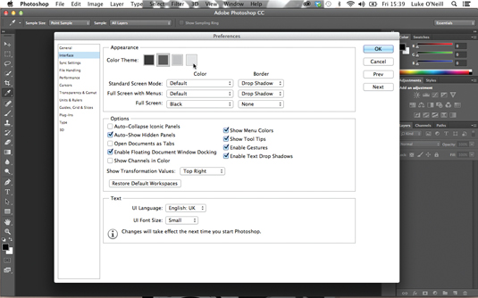
If you’re migrating to CC from CS6, you’ll be used to the new, default darker interface and application window. But bear in mind it can be turned off by navigating to Preferences>Interface and selecting a lighter colour (which I’ve done here). I’ve also unchecked the Application Frame option in the Window menu.
02. Digital first
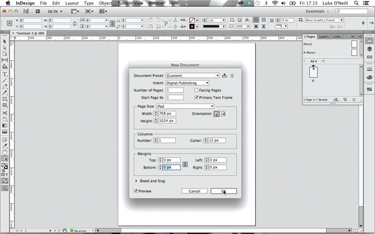
Let’s start with the digital document so that we don’t fall into any old print design habits. In InDesign, create a new document, select Digital Publishing in the Intent drop-down menu and set Page Size to iPad. Select a portrait orientation, choose 1 column and set all the margins to 0. Save this as our cover file.
03. Modular grid
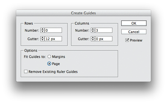
As we’re designing for iPad first we can eschew any traditional column-based print grid systems and instead choose a modular grid more akin to online design. Go to Layout>Create Guides, set rows to 0, columns to 3 with a 0px gutter, and check the Page option so that the guides fit to the page.
04. Basic grid
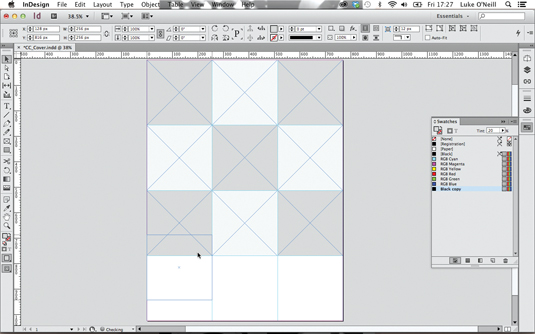
Now to block out our basic grid design. Hold Shift, draw a perfect square from the top-left of the document and snap it to the nearest guide. Next, press Alt, and drag and duplicate it to fill out the grid, snapping vertical guides to the bottom of the squares as you go. Clicking on Smart Guides under the View drop-down makes this a breeze.
Sign up to Creative Bloq's daily newsletter, which brings you the latest news and inspiration from the worlds of art, design and technology.
05. Main focus
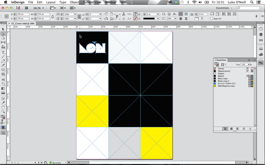
Now start fleshing out the landing page a little more. At this point, introduce your logo to the design. In my case it’s a square logo, which I’ve placed in the top-left to fill one of the cells. Next pick a colour scheme and think about the layout. Here, I’ve made one of the squares much bigger to be the main focus.
06. Design details

Next, add some key details for our title/landing page. I’ve drawn a simple outlined arrow using the Pen tool and duplicated it to indicate that the user needs to swipe right. I’ve also set up a simple typographic structure using the characterful serif Bella for the main headline and Helvetica for smaller body copy.
07. Jump to Illustrator CC
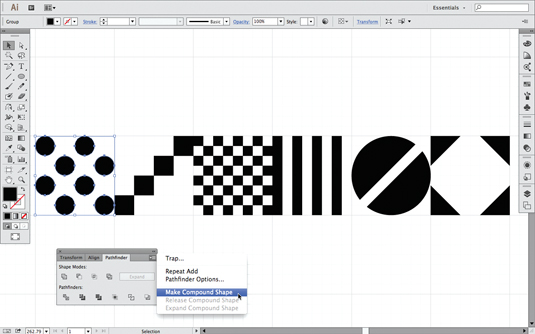
Switch to Illustrator and create some simple graphics using the Pen and shape tools, making sure Snap To Grid is on and they fit perfectly within the square grid. When happy, select each graphic, use the Pathfinder to unite the individual elements, select Make Compound Path from the drop-down and hit Expand.
08. Importing graphics

The next stage of the process is to import your new graphics by copying and pasting each one into InDesign. Resize each one, holding Shift, so it perfectly fits within the square grid. Repeat this process for all of your graphics until you have a selection of several to work with on the pasteboard.
09. Slideshow using Object States
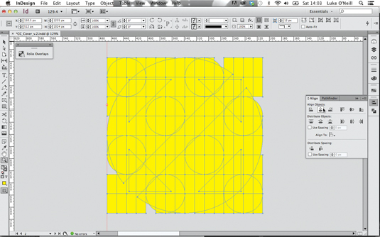
Select all the graphics and, using the Align panel, align their vertical and horizontal centres. Move the shapes into position and go to Window>Interactive>Object States. With the objects selected, hit the icon in the bottom of the panel to convert the selection to a multi-state object.
10. Setting intervals
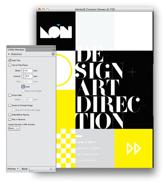
Now bring up the Folio Overlays panel and you’ll notice that, as it’s a multi-state object, the Slideshow panel is already displayed. As we want this to animate as soon as we launch the app, select Auto Play and choose a fast interval of 0.5 seconds. Tick the Loop box so that it’s continuous and turn off the Cross Fade option. Now hit Preview at the bottom of the Folio Overlays panel to see your slideshow cycle through the graphics.
11. Refining the slideshow
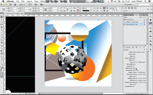
Now let’s add some images in the same way. Ensure that your images are all RGB in Photoshop and saved as PNGs. Remember that we’re dealing with pixels and not dpi here. You can check the effective ppi in the Links panel in InDesign. As a rule of thumb, if it’s above 144 then it will be fine for Retina iPad.
12. Slideshow details
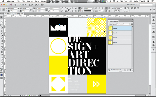
Next draw coloured boxes over the top of the images to match your colour scheme, set the blending mode to Screen and group each pair of objects. Now select all of the objects, align them as before, place them into position and turn them into a multi-state object.
13. Previewing in Content Viewer
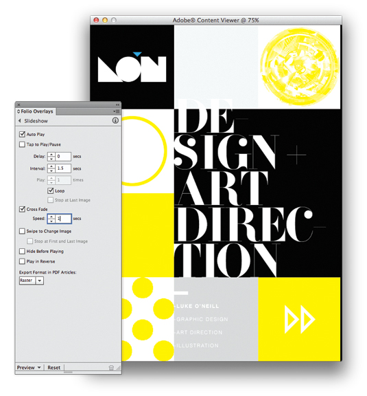
In the Slideshow pane of the Overlays panel, select Auto Play with a longer 1.5 second interval, make it loop and give it a 1 second subtle cross fade to contrast with the harsh and rapid transitions of the previous graphics. Now preview it in Adobe Content Viewer to see if you’re happy.
14. Back to print for a moment
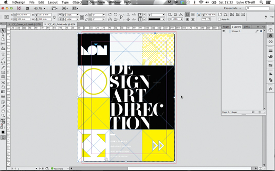
Before we get too far into the digital side of things, we want to make sure that this works in print as well. Set up a new document with A5 facing pages and a 3mm bleed on all edges. Back in our iPad document, group everything on the page, paste it directly into the A5 print document and resize it as best you can. As you can see here, part of the design is being cropped off on the left-hand edge.
15. Simultaneous print and digital
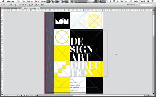
To make it work for print, add another row of squares and size it to fit the height of the document. Add a grey spine bar for a book feel, select the Release States to Objects command from the drop-down menu and ensure images are CMYK, 300dpi and extend to the 3mm bleed guide.
That's the end of part one - part two will be up on the site tomorrow.
Words: Luke O’Neill
Art editor of T3 magazine and former art editor of Computer Arts Collection, Luke works in the fields of design, art direction and illustration across both print and digital.
This feature first appeared in The Ultimate Guide To Adobe Creative Cloud.
Now read these:
- Photoshop tips, tricks and fixes to try today
- Free Photoshop brushes every creative must have
- Free Photoshop actions to create stunning effects
- The best Photoshop plugins

The Creative Bloq team is made up of a group of art and design enthusiasts, and has changed and evolved since Creative Bloq began back in 2012. The current website team consists of eight full-time members of staff: Editor Georgia Coggan, Deputy Editor Rosie Hilder, Ecommerce Editor Beren Neale, Senior News Editor Daniel Piper, Editor, Digital Art and 3D Ian Dean, Tech Reviews Editor Erlingur Einarsson, Ecommerce Writer Beth Nicholls and Staff Writer Natalie Fear, as well as a roster of freelancers from around the world. The ImagineFX magazine team also pitch in, ensuring that content from leading digital art publication ImagineFX is represented on Creative Bloq.
