Marta Cerdà on typography and visual tricks
The Barcelona-based graphic designer is famed for her lettering and illustration work. We uncover some of her design secrets.
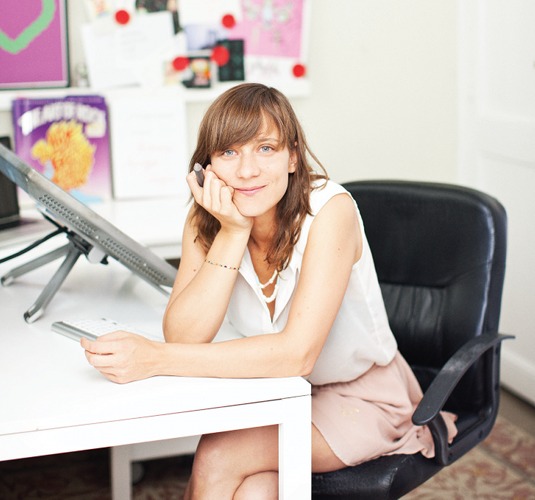
"We are Mediterranean," Marta Cerdà says. "We are Latin. Our character is open and exuberant. We are colourful. We are emotional."
The Catalonian graphic designer and illustrator says the city she lives in informs the way she works - well-crafted, typography-led designs that have found clients in the likes of Nike, Coca-Cola, the Guardian, Ray Ban and Penguin Books.
"Barcelona is an exciting place in terms of creativity, and, despite globalisation, it has its own visual language. Barcelona is a visual translation of its culture."
Article continues below 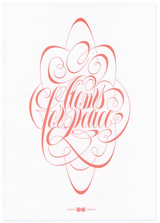
We caught up with the winner of the Art Director's Club 'Young Guns' sixth edition award to talk unexpected influences, calligraphy and food poisoning...
What's the piece of work that best embodies what you do?
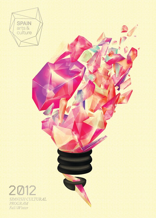
There are two. One is an illustration and the other one is lettering. I think the cover I did for the Spain Arts and Culture guide is a good example of how I use illustration. I tend to use it in a very graphic way. Conceptually I'm not very narrative, I'm quite direct, but in the execution I tend to be more baroque, like an artisan.
In lettering I have a huge amount of respect for everything that's done behind our time, even if it's in typography or in calligraphy. In my design for Atoms for Peace, I had references such as Raymond Morrone, and Gun Larson Brunsbo, who did great Spenserian letterings in the '70s, and George Bickham the Elder, the English-language calligraphy master and engraver from the 18th century. Then I put my own spin on it.
This lettering has a really extreme condensation, and the ornament is quite rigid. I was looking for this kind of weird feeling - between something done by hand and something done by a computer, and more adapted to today's technological moment.
Sign up to Creative Bloq's daily newsletter, which brings you the latest news and inspiration from the worlds of art, design and technology.
Your work often features calligraphic elements. How did you get into it?
I think the understanding of calligraphy in order to understand typography is basic. They're two sides of the same coin. That's what my teacher at university, Oriol Miró, told me when I first got into the discipline. I still attend his fabulous workshops whenever I can.
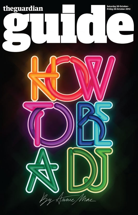
Looking at calligraphy helps me understand the logic of typographic shapes, how they behave depending on the style, how shapes were born and why. But then I go on to translate them digitally, because I'm really bad at calligraphy. On the cover for the Guardian Guide supplement, I designed a lettering construction that reminds me of how the letters are connected in many alphabet sets in calligraphy.
These workshops also allow me to escape my daily routine. They're usually held in places where there's silence – no digital tools, no emails, no Facebook, no phones ringing. It helps me to improve concentration and to accept errors as part of the process, as there's no Ctrl+Z. This feels really healthy.
You've spoken about unexpected influences. Can you give an example?
The one I thought would have a negative impact on me, as a designer, is having been lost for two years at university, studying for a degree in psychology. I decided I didn't want to be a psychologist and felt the need to move into a more creative path - graphic design.
All the studies I read about - visual perception, illusions, Gestalt theories - were very inspiring. Ironically, those were central to my decision to quit.
There are many visual tricks we can see and use in graphic design. The FedEx logo uses the Figure-ground Gestalt law: you first read the letters, because they are the most recognisable shapes in the logo, then, in a conscious effort, you see the arrow between the letters ‘E' and ‘x'.
You can either see the letters or the arrow. That's because while you're viewing a single part of the logo (the figure), the other remaining visual information (the ground), becomes the background and is ignored. It's like having two separate visual layers that become invisible when the other one is visible. I find this amazing.
In typography, calligraphy or lettering, this is really important. You must look at the negative space as one of these layers - because we also read them, even if the shapes they create are total nonsense to us. In the end, there's a part of psychology that has a strong connection with graphic design. And this connection was kind of helpful for me to understand.
How important is music to your creativity? What, for you, is the connection between music and design?
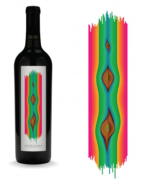
Music is like a medicine for my creativity: it can help me stay positive, and it can also help me to stay focused. Sometimes music has worked for me as a stimulus. I remember I was listening a lot to Biophilia by Björk when I did the wine label for Artelados, and also watching her beautiful Mutual Core music video.
Music can be very visual, too. If I have to do a poster for a music group, I listen to it from the beginning until the end of the work, non-stop. I try to be the music's visual translator.
With such impressive clients, is self-initiated work still important to you?
I've worked on self-initiated projects since university. It's a good way to try things out without having a client. Self-initiated projects became more important to me when I began freelancing. I didn't have a lot of work coming in, so this was a way of keeping my website updated.
I created pieces geared towards the kind of projects I wanted to be hired for: illustration and typography. It worked. Every time I got more briefs asking for this kind of style or those kind of letters. That was really key to my professional development.
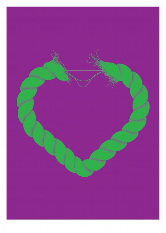
Now it works the same way, but it also helps me to try different paths on my own. On my Ship of Fools design, which I did last year, I wanted to create a very conceptual piece. In the words of Stefan Sagmeister: "If I want to explore a new direction professionally, it is helpful to try it out for myself first."
Can you tell us about the weirdest project you've ever worked on?
It was a poster Alex Trochut and I did in 2007, by hand with clay for Arjo Wiggins. We both had food poisoning and, while working on it, we had to go to the bathroom… every once in a while. That was weird. And, unconsciously, it may have become part of the piece with the colouring and the melting.
But, apart from that, I learned it's possible and fun to work on a collaborative, three-dimensional piece. Also, don't eat fresh mayonnaise in the summer.
Words: Gary Evans Photography: Caterina Barjau
Liked this? Read these!
- Free graphic design software available to you right now!
- The ultimate guide to logo design
- Amazing Adobe Illustrator tutorials
What's the weirdest project you've ever worked on? Comments, yo!

The Creative Bloq team is made up of a group of art and design enthusiasts, and has changed and evolved since Creative Bloq began back in 2012. The current website team consists of eight full-time members of staff: Editor Georgia Coggan, Deputy Editor Rosie Hilder, Ecommerce Editor Beren Neale, Senior News Editor Daniel Piper, Editor, Digital Art and 3D Ian Dean, Tech Reviews Editor Erlingur Einarsson, Ecommerce Writer Beth Nicholls and Staff Writer Natalie Fear, as well as a roster of freelancers from around the world. The ImagineFX magazine team also pitch in, ensuring that content from leading digital art publication ImagineFX is represented on Creative Bloq.
