3D text tutorial for graphic designers
How to use Cinema 4D to add 3D elements to your designs.

Sign up to Creative Bloq's daily newsletter, which brings you the latest news and inspiration from the worlds of art, design and technology.
You are now subscribed
Your newsletter sign-up was successful
Want to add more newsletters?
If you’re a graphic designer looking to start adding some 3D elements to your designs, you may have dabbled with the 3D capabilities of Photoshop CC or Illustrator. But neither of these compare to the power of using a true 3D application to get the job done.
Learning a new software, though, is intimidating. While there are many 3D applications out there, Cinema 4D is great for graphic designers as it's closely tied with the Adobe products. In fact, if you have Adobe Creative Cloud, you have totally free access to Cinema 4D Lite with your CC subscription. Let's get started.
01. Fire up Cinema 4D
To open Cinema 4D Lite you have to first open After Effects. If you’re not an After Effects user that’s OK, you don’t need to know much. We will, however, use AE for a few steps at the end, to take care of rendering.
Article continues belowIn After Effects, go to File > New > Maxon. You'll be asked where you want to save your new project, and then Cinema 4D will open.
02. Add some text
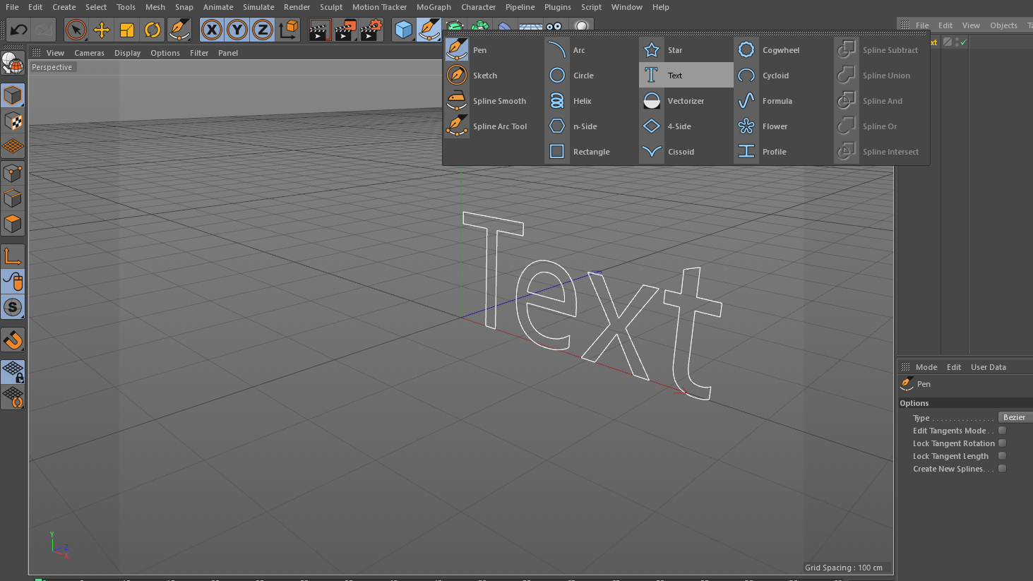
Let’s start easy with some simple text. At the top of the interface, you’ll see what looks like the Pen tool you’re used to. If you left-click and hold you’ll see many other options available; these are called splines. In Cinema 4D a spline is just like a path you’d create with the Pen tool or some other shape tool, but they can exist in three dimensions rather than just two. Click the spline option labelled Text.
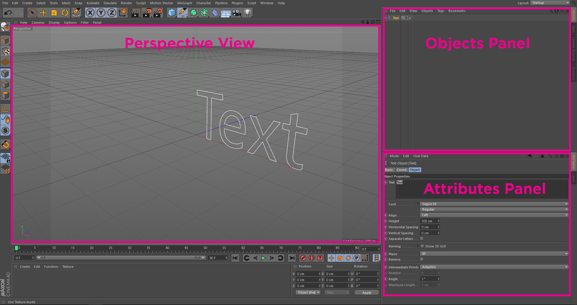
Three things will happen next. In your perspective view with the floor grid, you’ll see a Text spline appear.
If you look over to top-right panel (the objects panel), you’ll see an object that kind of looks like a layer in the Adobe applications. That’s basically what it is, although there is more to the objects panel than just that.
Sign up to Creative Bloq's daily newsletter, which brings you the latest news and inspiration from the worlds of art, design and technology.
And lastly, if you look in the bottom-right panel (the Attributes panel), you’ll see the word 'Text' and have lots of controls to play with.
03. Adjust your text
Click where you see the word Text in the larger field at the top of the Attributes panel, and type in whatever you'd like the text to say. Click outside of that field to update the text. Right under that field you’ll see where you can choose your font.
If you’d like to rotate around your text in 3D space, hold Alt/Option and then left-click and drag around in the perspective view. You’ll notice there isn’t any depth to the type at this point, it’s just the outline of the text. To give it depth, we need another type of object.
04. Give your word depth
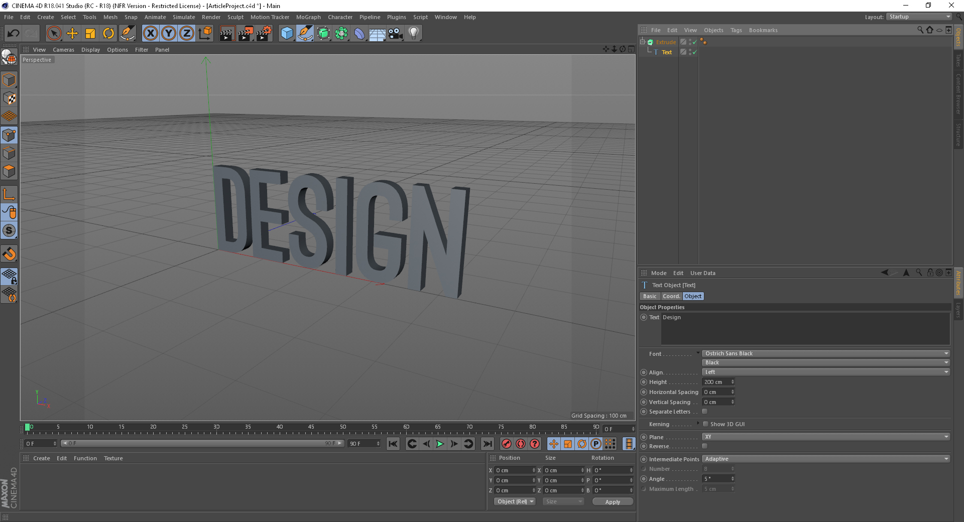
Just to the right of the Spline tools you’ll see a green box. Left-click and hold on that box and you’ll see more options. Select the extrude object. You’ll now have an extrude object just above the text object in the Objects panel.
The way the objects panel differs from many other traditional layer approaches is that it is hierarchical. We can make the text the child of the extrude object to give the text depth.
Left-click and hold the text object and drag your mouse so it hovers over the extrude object. Only release the mouse when an arrow pointing down appears.
Now click the Extrude object. In the Attributes panel you’ll notice a few tabs just under where it says 'Extrude Object'. Click the 'Caps' tab. You’ll see a start and end fields that both say 'Cap'. Change them to 'Fillet Cap'.
A Fillet is like a bevel – it’s a great way to liven up your text.
05. Add some text features
Let's customise the look further by adjusting the Steps and Radius. Just above the perspective view, you’ll see a little menu list that says: View, Camera, Display, Options, Filter, Panel. Click Display > Gouraud Shading [Lines]. This will allow you to see the subdivisions in the type.
Now go back to the Attributes panel for the text. The 'Steps' option here means how many subdivisions the fillet contains. The default is 1, but you want to change yours to 4 for both the Start and End Caps.
Then turn the Radius down from the default of 5 to 3. You can also now turn 'Gouraud Shading [Lines]' off now if you wish, and go back to plain 'Gouraud Shading'.
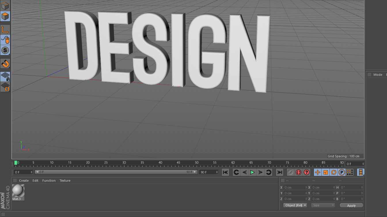
Notice how the text catches the light much more subtly on the slightly rounded edges. This customisation is one small reason why Cinema 4D is a superior choice to the 3D capabilities of the other Adobe apps.
06. Give your text a material
Now let’s add a material to our text. You’ll see at the bottom underneath the playback area a long narrow blank panel with a little menu above it that reads: Create, Edit, Function, Texture. Click Create > New material.
There’s a lot we could do in Materials, but that's more advanced. Simply drag that new white material onto the type.
07. Include a backdrop
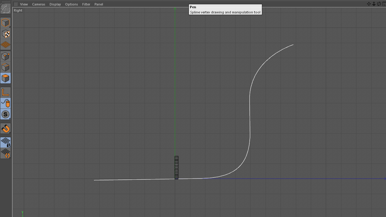
We need a backdrop. Middle-mouse-wheel-click the perspective view and you’ll see four boxes. Pick the box that says Right in the upper left-hand corner. Grab the Pen tool from where we earlier got the text spline and draw a sort of S-shaped curve, side-one to the text (as shown in the image above).
This is a perfect spline for a backdrop. Middle-click again in the Perspective view and middle-click in the upper-left box to go back to your typical view.
08. Adjust extrusion movement
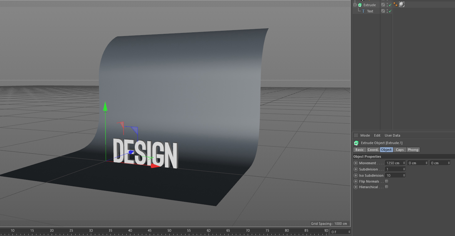
Add another extrude object with the newly drawn spline as the child. Select the extrude object in the Object panel, then go into the Object tab within the Attributes panel. You’ll see a Movement property with three fields reading 0cm, 0cm, 20cm. The 20cm value is there by default and denotes extrusion movement within the Z axis.
We want our movement in the X axis, so set the 20 to a 0 and set the first field to about 1250cm. It should look like the image above.
09. Add lights
Drag the same material we used on the text to the background. Now it's time to add lights. At the top, where we’ve been getting all our objects, you’ll see a lightbulb icon. Left-click and hold that, then choose Area Light.
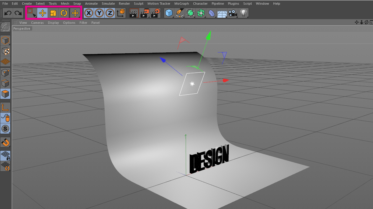
You’ll get a light that looks like a square with a little starburst in the middle. Use the Select, Move, Scale and Rotate tools to position the light in space.
10. Duplicate the light
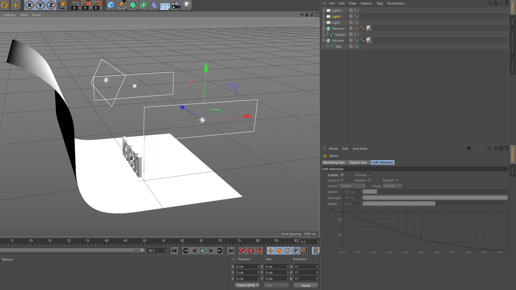
Click on the light in the Object panel and go to the Details tab in the Attributes panel. Increase the Size X from the default of 200cm to something around 700, which will make it more rectangular.
Duplicate the light in the Objects panel by selecting it and copy-pasting it (cmd+C and cmd+V). You want to make two copies. Position your lights to look like the image above.
Next page: Add shadows, position your camera and render out the image
- 1
- 2
Current page: Getting started with Cinema 4D
Next Page Finishing 3D text and rendering in Cinema 4D
Laura is a passionate visual effects and motion graphics author at Pluralsight. Her favourite projects are her two in-depth After Effects introductory courses on Pluralsight, which were each built around training motion artists and VFX artists, respectively. Using her vast skill set, Laura has taught thousands of artists everything from shot-tracking and rotoscoping to motion design.
