
My obsession with film has had a strong influence on the work I do nowadays. I learned most of what I know about visual language, atmosphere and composition from film.
Pan's Labyrinth director Guillermo del Toro, with his world of eerily beautiful monsters, haunting atmosphere and poetry in both image and narration, showed me what it can look like when you weave your own web of personal mythology and symbolism. So you can imagine my excitement when I was asked to create an homage to his work.
I decided to create a collage of four of del Toro's films: Cronos, The Devil's Backbone, Pan's Labyrinth and Crimson Peak. I'll be working with a mix of acrylic paint, coloured pencils and charcoal, to create an almost monochromatic picture.
Download the resources for this tutorial.
01. Start with research

I watch the films, and take notes on recurrent and defining imagery and ideas. This leads to a messy array of words, phrases and scribbles – the foundation of my concepts. I also take screenshots of scenes that I might need for reference later on.
02. Create thumbnail sketches

I condense my notes into compositions, aiming to include elements from several films and to keep the dark atmosphere. Working digitally at this stage makes it easy for me to get a good idea of the overall shapes and tonal values I need to create a strong image.
03. Lay out your drawing

Before I start working on the final artwork I want to make sure I won't run into any unexpected problems. By sketching both portraits separately and combining them in Photoshop, I get a good idea of how the artwork will look. Additionally, I can adjust proportions and add a few details to the concept.
04. Transfer the drawing

I print the final layout and roughly transfer it to watercolour paper using an old lightbox. For this I'm using a charcoal pencil that will blend in nicely with the later painting. I also make sure not to apply too much pressure to the paper, so this initial drawing can be reworked easily.
05. Complete the underdrawing

At this stage I establish the foundation for my painting by creating a detailed drawing with a black pastel pencil. To avoid mistakes that would be difficult to correct afterwards, I use screenshots of the film, photos of hands and faces in the required poses and lighting, and the print of my layout drawing for reference.
06. Start painting

I roughly block in the tonal values and continue to build up depth and volume using black acrylic paint that's been diluted with water. During this stage accidental splashes or smudges can and should happen. My goal is to create an organic, loose texture – precision will come later in the process.
07. Push contrasts

Getting the contrasts right is a key part of making my illustration work. Because pitch black can quickly seem dead and boring, it's important to be sure about where it's needed.
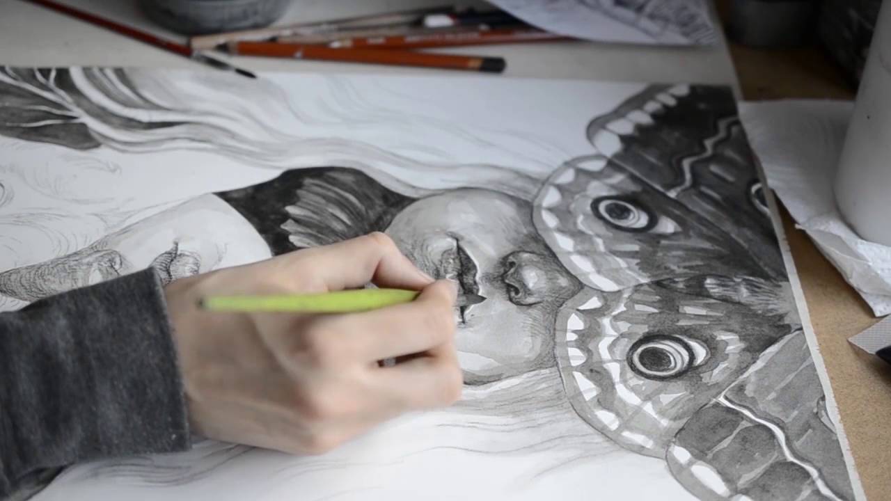
08. Focus on the details

Now is the time for precise brush work. For this I switch to a smaller-sized brush (0) and use it to introduce details to faces and hair, and texture the wings of the moth. I also define edges where necessary and work over pastel and charcoal markings to make them blend in more evenly with my painting.
Next page: how to finish your design with shadows, splashes and highlights
