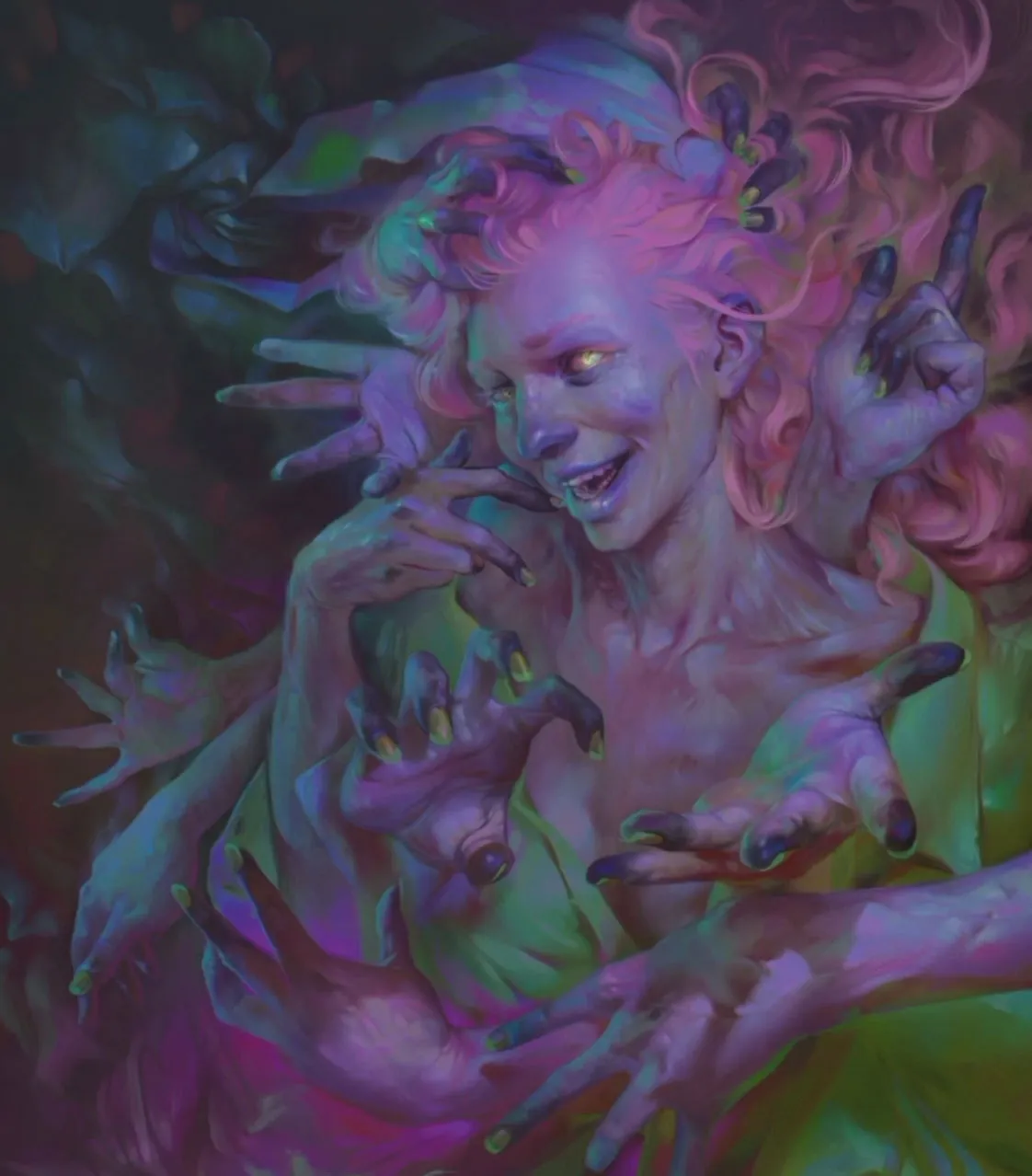
I’ve always liked the undead, and will often root for the ragged underdog who’s so often reduced to a moving target. Many of my works feature characters who have a ghoulish appearance, and here I’ve used an unnatural cold skin tone, with gangrenous fingers to depict that age-old trope of outstretched zombie arms.
However, I’ve decided to look at the bright side of death and paint them as colourful, friendly, magical people, expressing glee and enjoying their new lifestyle choice. Colour is a dominant aspect in many of my works, and I like to experiment with it. Of course, one needs to understand the basics of colour theory before attempting to explore it further.
I think that a combination of what should happen according to the laws of physics, the artist’s expectations, the glitches in one’s vision, and the fuzziness of the brain’s interpretation of what it thinks it sees, is the best way to express colour in a painting.
The ‘deep dream’ images created by an AI program have opalescent overlay that appeals to me, and so I’ve tried to clumsily implement this effect into my art. I’ve realised that using a colour which has no business being used can be a lot of fun.
To understand my process, and use it to create your own vividly gruesome creatures, watch the video and follow the steps below. You can also download my custom brushes here.
01. Have a vision (or not)

I readily admit that it’s incredibly inefficient to start with only a vague vision of the main character, but that's the way I work best. I have no idea what I want the picture to look like, but I tend to produce better results when I just skip most of the planning and get straight to it, leaving many aspects to fate. This approach happens to work for me, but I advise against it!
02. Choose your brush

I'm using my Custom Chalk brush. This is the brush I use for almost everything, regardless of the software. It’s a rectangle with natural edges and with a faint texture. I usually set my brushes to simulate soft chalk as much as the program makes it possible. Click on the image above to download my custom brush.
03. Study human anatomy

Human anatomy, especially hands and faces, are so familiar to us that even without any formal knowledge, we can easily spot mistakes. Therefore, reference is extremely important for my work. I try to include something previously unexplored into each new illustration, to avoid getting stuck in a rut. I’ll study the subject matter and immediately put my knowledge into practice.
For help and advice on depicting human anatomy, see how to draw people.
04. Define the scene

Now I’ve got a good grasp of my composition, and have come up with some ideas on what should be added to make it work. I further define the scene, choose my colours and add secondary elements. In this case it’s a collection of arms that support the main figure, while also adding more movement and a hint of a story.
05. Play with UV light

I start with conservative purple-grey tones and gradually mix them with random hues until a stronger palette begins to emerge. When I’m satisfied with what I see, I push the palette towards the toxic-looking, unnatural tones that can be seen under a UV light using soft colour overlays.
06. Add visual padding

I often use swirling rich drapery for areas that have otherwise very little to offer, to balance the overall composition. My aim is to create a scene that’s staged and tightly packed.
07. Bring in more light

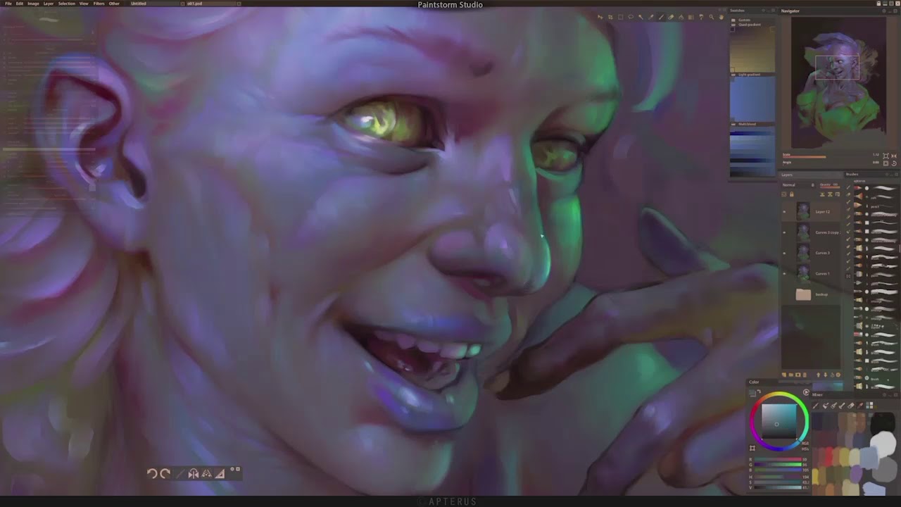
Late on in the process I add a new, bright light source to introduce more drama and draw attention to the character’s face. I use a masked Curves adjustment layer and a soft brush in Photoshop to preserve the details of my almost-finished painting.
08. Use textures

I always aim for a painterly look in my work, so towards the end of my process I import a photo texture of a painted surface, set it to Overlay mode and adjust it to match the shapes and main strokes of my painting with a strong smudge brush. I use the High Pass filter and a little bit of chromatic aberration to make the painterly structure pop even more.
09. Make rendering adjustments

My lack of planning means I have to make tweaks to many elements in the scene. Since I discovered programs like Corel Painter and Paintstorm Studio, I use them for brushwork, because their brush engines are more intuitive and better suited to my style of painting. Photoshop remains my first choice for large-scale adjustments.
This article was originally published in issue 161 of ImagineFX, the world's leading magazine for digital artists. Buy issue 161 or subscribe here.
Read more:
