Top tips to refine your hand-drawn illustration techniques
Sign up to Creative Bloq's daily newsletter, which brings you the latest news and inspiration from the worlds of art, design and technology.
You are now subscribed
Your newsletter sign-up was successful
Want to add more newsletters?
I've been doing pencil art since my childhood, when I would carry a pencil and paper around with me. Colouring and painting, however, are skills I've developed more slowly. When I started creating work under the name of Miss Led in 2006, I was too petrified to colour it. With a basic scanner, I used to create digital versions using my limited Photoshop knowledge and colour them using the Paint Bucket and Lasso tools.
Even though I got a digital tablet in 2011, it wasn't until working on advertising campaigns with Braun and then Wacom in 2014 that I started to create illustrations that were exclusively digital. With live painting and delivering workshops with Liquitex paints, as one of their global ambassadors, I wasn't able to slack off on the traditional and often difficult side of illustration work. Instead, I learned to develop the two, sometimes opposing, forms to complement each other. And my traditional digital style was born.
The importance of materials
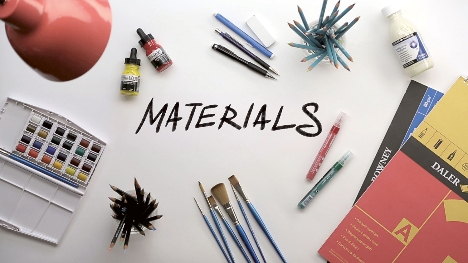
If you want to achieve a crisp feel and tight finish, it's vital to have the proper tools for the job, including the right paper, pencils and tools for adding colour. Beautiful line work can be ruined by streaky or blotchy colour, and drawing work that's absolutely spot on can look grey and flat without the right attention to detail.
Article continues belowWhen creating Nina as part of my Illustration for Fashion tutorial, I exclusively used Daler-Rowney paper. I like to work to A3 size, so I can spread out and also have a load of negative space, which tends to frame the work.
I use Bristol board or even Xerox paper when I want the cleanest lines. When using a super soft 0.03 lead, it's nice to be texture free. However, for the tutorial, I wanted a little bit of texture to offset the digital finish to the final piece, so I went with A3 cartridge, which I buy as part of a spiral bound sketchbook. Tracing paper is hugely important for me. It's easy to buy and store, and wonderful to use. I use it when I'm planning the next steps and can create shapes around a drawing. For this piece, I wanted to make sure my angles were right. Placing the tracing paper over the reference, I was able to create the basic guidelines. With the trace paper and its limited guidelines on top of clean paper, I can clearly see the shape of the face or body.
I love to use retractable pencils and have a large range of brands, sizes and a box full of graphite leads. If you're going to buy a range, I recommend getting the Pentel, Faber-Castell and Zebra brands, especially the ones with the graphite grading on them – it's easy to mix up your Fs and your 3Bs when you use them a lot.
For adding colour, you can't go wrong with any of the Liquitex acrylic products. I like a clean, fresh finish and the acrylic inks are great for this. As they have such strong pigments, you just need a small amount for creating bold and seamless fills or marks. These inks are also really great for line work, with either a fine brush (I tend to use Winsor & Newton Cotman watercolour brushes) or even ink dipping pens, which you can get in a pack with a variety of nibs at most art stores.
Sign up to Creative Bloq's daily newsletter, which brings you the latest news and inspiration from the worlds of art, design and technology.
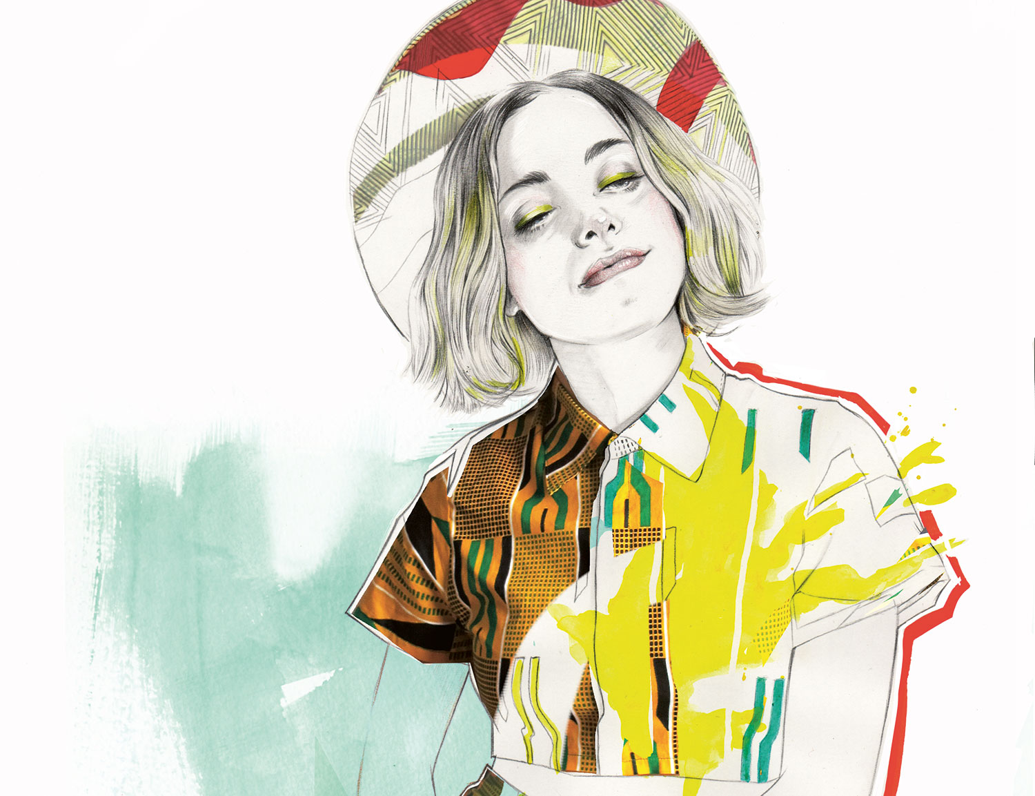
What's great about ink finish is that you can work on top really nicely with either fine line work or with the Liquitex paint pens. I've used the paint pen in my tutorial to illustrate the geometric shape on the fabric, as it has a sharp nib that creates a clean line, which is contrasted against my splashy yellow colour base.
Whenever you add a new colour or strong mark, you set a new balance and order of things. So it's good to understand beforehand which areas and features you want to highlight.
Line quality and weight
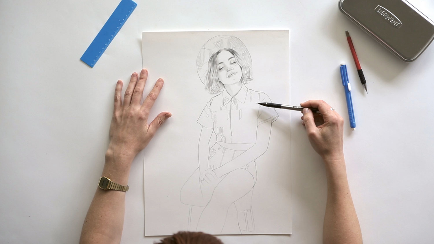
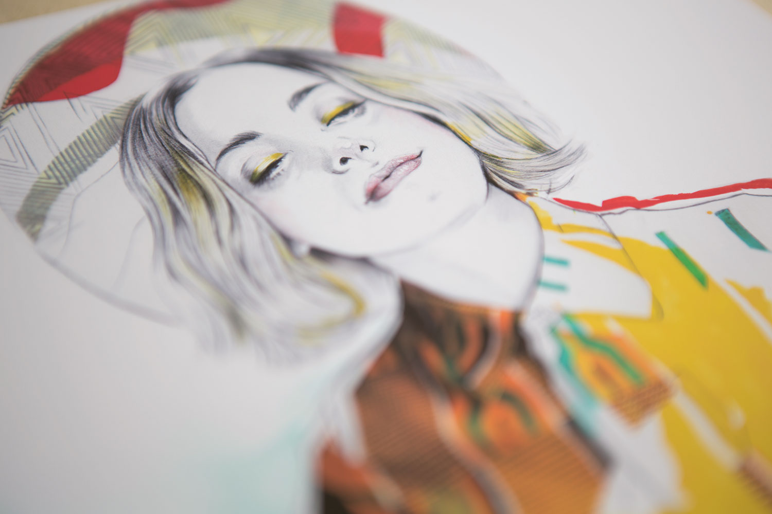
It's important to explore different ways to use your pencil to create marks. I start with using a very soft line, then I build up in layers – not so different to when painting. I create the main lines first, starting quite softly to make guides, then building up in density to create complete lines, which can be erased. There are many of what I call 'breaks' in my line work. These missing lines create the illusion of light. For me, the lines I add are as important as the lines I choose to take away. I wanted this piece to feel bright and have a strong sense of light, and this technique has helped me achieve that.
The way you hold your pencil in your hand creates different marks. I hold the pencil further up and at a low angle when creating the super-soft lines that make up the shading around the face. These are carefully layered and contrast heavily with the strong dark lines that describe the jawbone. This contrast is characteristic of my work, I like pairing crisp line work against more splashy chaos, or dense or dark line work against negative space.
The lines that meet and extend out show the depth and shadow of the hair around the neck and under the ear, which elevates the lightness in the face even more. Rather than drawing all the lines, I create a suggestion – especially on the pattern of the hat. I want the lines that I'd created using a small ruler (very softly), to acknowledge the shaped hair curves and complex line weights. Deciding to draw all the lines would have changed the balance in this area. So the hat lines support but don't detract from the hair lines.
Experimenting with mediums
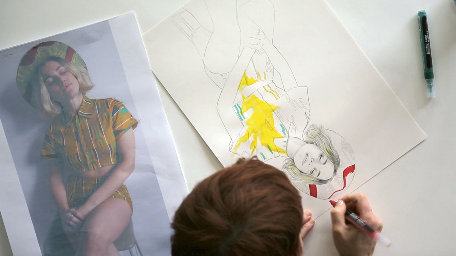
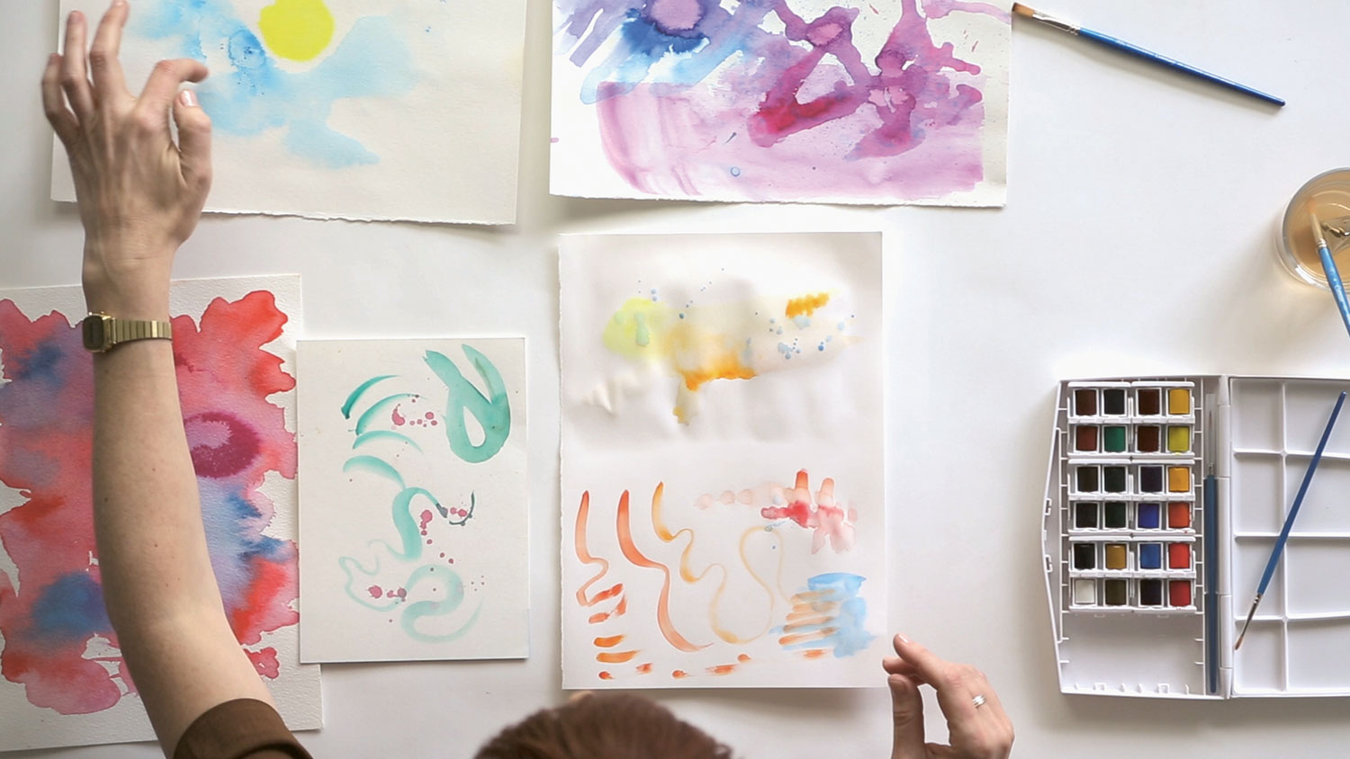
I'm going to concentrate on watercolour techniques here. It's a medium that's used a lot in illustration work at the moment, especially in advertising, storyboarding and editorial work. The majority of my students are keen to work with watercolours, not because it's new to them, but because they want to learn how to be more expressive with it. In my video tutorial, I start the watercolour section by suggesting the viewer turns off their phone, disconnects from email and all other distractions, to tune out and have space to play with the material.
Using another sheet of your paper (it's important that it's the same paper you're using for your piece, as you're also testing how your paper responds to the medium), get a large paintbrush and use water to wet cover half of your 'experiment' paper. Leave the rest to dry. Look at what marks you can make with a smaller brush putting on watercolour paint both on the wet half and then the dry. Create lines and curves, put pressure on the brush and then ease the pressure and use a light touch. Look at the paper with splashes, drop colour and drop water. What kinds of textures and marks can be achieved if you pick up the paper and move it around in different angles? Do colours drip and mix? Play around with your paint and paper until you find a style you like.
Remember, these experiment sheets aren't all scraps. I don't throw any of them away. Keep these sheets for next month, when I will show you how to use them in your illustration work. It's always a good idea to have a range of different colours, marks and expressions for this job. So don't stop now, keep playing!
SAVE £10 on Miss Led's 2-hour video tutorial content
Miss Led's video tutorial, produced by the Train To Create team, takes you through this illustration project from the first pencil lines through to a range of traditional mixed media colour stages, including digital clean ups and dynamic photographic collage. The £59.99 tutorial includes full Photoshop layered artwork files and digital brushes, plus exclusive access to webinars and workshops as part of the I4F Creative Community, and you can save £10 by using this code: I4F_CA.
This article originally appeared in Computer Arts issue 260; buy it here.
Related articles:
