20 top tips for great logo design
Avoid motif monstrosities! Follow these great pieces of advice from award-winning designer Paul Wyatt and you'll be on the way to creating the perfect logo for your brand.
Sign up to Creative Bloq's daily newsletter, which brings you the latest news and inspiration from the worlds of art, design and technology.
You are now subscribed
Your newsletter sign-up was successful
Want to add more newsletters?
11. Show your logo around
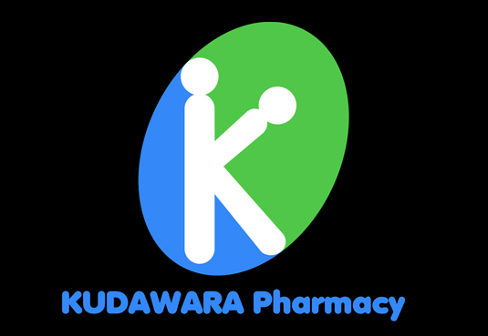
Quite a few of us will remember the Japanese pharmacy a few years ago whose logo received worldwide recognition for being unintentionally rather saucy. You of course could argue that the logo is fine and there are a lot of people in the world with dirty minds. But let's get real: how this got through final client approval is anyone's guess.
After you've designed your logo, send it round to your mates and family for a bit of feedback. Look at it sideways, look at it upside down and reverse it. Look at it every which way you can. Then send it to the client. You wouldn't want another Kudawara on your hands would you?
12. Stick to your convictions
Sheffield-based graphic and UI designer Ben Powell suggests: "It's so important to get regular feedback from your client, but equally important that you make it clear you are the designer and that’s why you've been employed.
Article continues below"As soon as a client begins suggesting things like, 'Let's make that text a bit bigger, and try this typeface', your mark becomes diluted. It's your job as the designer to make this clear from the start."
13. Resist the lure of the mouse
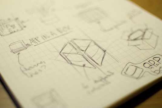
Another good logo tip from Ben Powell is to resist the temptation to move straight onto the computer first.
"What did you learn to do first, use a computer or a pencil and paper?" he asks rhetorically. "Sketching is a much faster way to produce initial ideas before you even touch Photoshop. It doesn't matter if it's complete chicken-scratch sketching as long as it conveys your ideas correctly and you understand it."
14. Fight the temptation to imitate
We all have our design heroes and sometimes we love them so much we want to imitate their styles. Well, they do say imitation is the sincerest form of flattery. However, in the real world it's just a lazy way to solve a creative problem.
Sign up to Creative Bloq's daily newsletter, which brings you the latest news and inspiration from the worlds of art, design and technology.
Ask yourself whether the style you're using is appropriate for the client's needs. Do they really want a logo that has the same typeface Saul Bass used for Quaker Oats in the 70s?
15. Use vectors

After starting with a sketch the best way to save any pain and frustration with later iterations of your logo is to produce it using vectors. Here Illustrator is your friend as you'll be able to rescale your creation without losing any quality. You can copy and paste your logo into Photoshop as a 'smart object' (again with no loss of scalable quality), if you need to combine it with other elements.
16. Be experimental
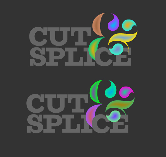
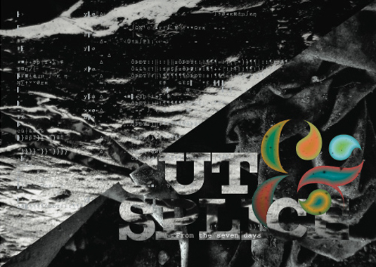
Don't feel you have to be constricted by formal notions of what a logo is or does. For example, designer Luke Prowse came up with a highly original use of logo and brand identity for music event Cut & Splice, celebrating experimental composer's Karlheinz Stockhausen's Aus dem Seben Tagen.
Playing with the experimental composer's lifetime obsession with 'controlled chance', Luke created a logo that is never the same twice, both online and digitally printed. In online form the logo continually morphs and pulsates like an ever-evolving compositional soundscape.
17. Don't ask the client if they like it
When your logo is finished, try not to ask vague questions to your client such as, "Do you like it?", or, "What do you think?". You may as well ask if they like apples or oranges.
Questions you should ask include: "Does it meet the brief?" amd "Does this represent your core brand values?". If they avoid the question and just say they don't like it, ask for specifics. After all it's their brand and they should know.
18. Create a board and rip it up
You could research logos all day as there are books and websites by the score containing examples of them. Only make mood boards out of ones that share similar values. Look at your mood board and analyse what isn't successful about these logos. Then rip those boards up and use these rules as a guide for your own unique creation.
19. Online research

Two great starting points for online logo research are Logo Moose and Logo Gala. One thing to be mindful of is knowing when to stop your logo research. It's best to look at what did and didn't work out of 10 relevant logos than swamp yourself with 50 extraneous ones.
20. The name CAN be the logo

You may want to produce a simple execution of a logo for your client that uses the strength of the typography alone as the logo.
Fonts come in all shapes and sizes that resonate differently with strength (slab type fonts, big and powerful); class and style (fonts with elegant scripts or serifs); movement and forward thinking (type that is slanted). Provided the qualities of the font - be it bespoke or off-the-shelf - match the qualities of the brand, you're onto a winner.
- Award winning creative director, author and film maker Paul Wyatt is a part of the production collective '3 Men & a camera' and regular columnist for .net magazine.
For more logo design tips and inspiration, see:
- Improve your logo design
- Celebrating the majesty of the London 2012 Olympics logo
- Microsoft unveils new logo
Got any logo design tips of your own? Share them, and any other thoughts, with us in the Comments below.

The Creative Bloq team is made up of a group of art and design enthusiasts, and has changed and evolved since Creative Bloq began back in 2012. The current website team consists of eight full-time members of staff: Editor Georgia Coggan, Deputy Editor Rosie Hilder, Ecommerce Editor Beren Neale, Senior News Editor Daniel Piper, Editor, Digital Art and 3D Ian Dean, Tech Reviews Editor Erlingur Einarsson, Ecommerce Writer Beth Nicholls and Staff Writer Natalie Fear, as well as a roster of freelancers from around the world. The ImagineFX magazine team also pitch in, ensuring that content from leading digital art publication ImagineFX is represented on Creative Bloq.
