Famous car logos get flat design reworking
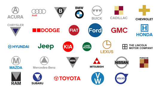
Do simplified logos look better? Designer Philadlj investigates with these iconic auto logo designs.
Sign up to Creative Bloq's daily newsletter, which brings you the latest news and inspiration from the worlds of art, design and technology.
You are now subscribed
Your newsletter sign-up was successful
Want to add more newsletters?

Some of the world's best logo designs are of a simple, stripped back nature. Instantly recognisable and iconic, these particular logo designs have gone on to stand the test of time; influencing many a logo design in recent years.
Inspired by the failure of clothing giant Gap's simplier logo, designer Philadlj decided to turn his hand to the world's favourite car logos. Simplifying the likes of BMW, Fiat and Honda, he has taken the fuss out of the original logo designs and reimagined this series of stripped-back offerings.
Philadlj gave himself some ground rules when embarking on the project, such as using only basic geometric shapes, solid colors, and sans serif fonts. So, do you think they look better than the originals?
Article continues below[via Design Taxi]
Like this? Read these!
- Free tattoo fonts for designers
- Create a perfect mood board with these pro tips
- The ultimate guide to logo design
What do you think of the stripped back reimaginings? Let us know in the comments box below!
Sign up to Creative Bloq's daily newsletter, which brings you the latest news and inspiration from the worlds of art, design and technology.

The Creative Bloq team is made up of a group of art and design enthusiasts, and has changed and evolved since Creative Bloq began back in 2012. The current website team consists of eight full-time members of staff: Editor Georgia Coggan, Deputy Editor Rosie Hilder, Ecommerce Editor Beren Neale, Senior News Editor Daniel Piper, Editor, Digital Art and 3D Ian Dean, Tech Reviews Editor Erlingur Einarsson, Ecommerce Writer Beth Nicholls and Staff Writer Natalie Fear, as well as a roster of freelancers from around the world. The ImagineFX magazine team also pitch in, ensuring that content from leading digital art publication ImagineFX is represented on Creative Bloq.
