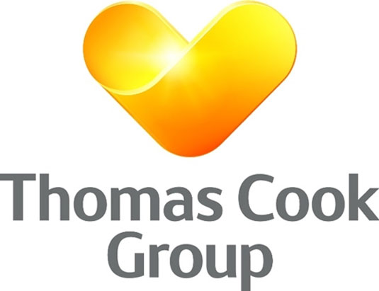
Thomas Cook unveils hearty new logo
Tour operator Thomas Cook have unveiled a brand new logo. What do you think of the new look?
Sign up to Creative Bloq's daily newsletter, which brings you the latest news and inspiration from the worlds of art, design and technology.
You are now subscribed
Your newsletter sign-up was successful
Want to add more newsletters?

As a world-leading tour operator, Thomas Cook is one of the top brands around, and its globe logo design and strapline 'Don't book it. Thomas Cook it' have become iconic since their launch in 2001.
Now the company has released a new logo - a representation of a 'sunny heart', with a new strap line "Let's Go!" reinforcing the new branding direction.
"This isn’t just a rollout of a new logo, it’s about a promise," explained chief executive Harriet Green, who said. "What we’re announcing today is a renewed promise to our customers, our people and suppliers".
Article continues below 
The sunny heart graphic was originally designed last year by Swedish consultancy Happy for the company's Northern European businesses, in a rebrand project that unified three Nordic brands under the Thomas Cook Group umbrella.
The new logo was then refined in-house by the team of designers at Thomas Cook. It will be used across all platforms including online, print, stores, airlines and offices.


Find out more about the logo over on the Thomas Cook website.
Like this? Read these!
- The ultimate guide to logo design
- Our favourite web fonts - and they don't cost a penny
- Useful and inspiring flyer templates
What do you make of the new look? Let us know in the comments box below!
Sign up to Creative Bloq's daily newsletter, which brings you the latest news and inspiration from the worlds of art, design and technology.

The Creative Bloq team is made up of a group of art and design enthusiasts, and has changed and evolved since Creative Bloq began back in 2012. The current website team consists of eight full-time members of staff: Editor Georgia Coggan, Deputy Editor Rosie Hilder, Ecommerce Editor Beren Neale, Senior News Editor Daniel Piper, Editor, Digital Art and 3D Ian Dean, Tech Reviews Editor Erlingur Einarsson, Ecommerce Writer Beth Nicholls and Staff Writer Natalie Fear, as well as a roster of freelancers from around the world. The ImagineFX magazine team also pitch in, ensuring that content from leading digital art publication ImagineFX is represented on Creative Bloq.
