Design a cross-platform mobile app: 12 pro tips
Justin Ferrell, mobile strategist and developer at Digital Relativity, explains how developers can build cross-platform applications without neglecting the user experience.
Sign up to Creative Bloq's daily newsletter, which brings you the latest news and inspiration from the worlds of art, design and technology.
You are now subscribed
Your newsletter sign-up was successful
Want to add more newsletters?
The words “cross-platform development” have a somewhat negative connotation within the mobile development community. When we think cross-platform, we immediately think of compromising designs and user experiences, with poor performance that caters to the lowest common denominator of device. There are so many people doing cross-platform development badly that we’ve started to assume that all cross-platform development is bad.
Like all things, there are bad examples of cross-platform development and design. But there are also some very good examples of applications that use cross-platform technologies and techniques.

Before we can understand going across platforms, it’s important that we understand the platforms themselves, the fundamental differences and what sort of experience they create for the end user.
Article continues below01. iOS
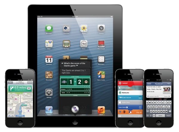
The iOS that we see today is quite different from the original iPhone OS that we saw ship in 2008. With the introduction of the iPad Mini and iPhone 5, Apple broke away from its tradition of strictly adhering to single sizes and aspect ratios. Factor in the two different pixel densities created by retina and non-retina devices, and you end up with a considerably more diverse ecosystem.

When you examine the user experience of iOS, and the way that the user interacts with the device, you will quickly see that the operating system is very much app-driven. Almost all functionality and information is housed within apps: the primary function of the operating system is to help the user move in and out of applications. This experience-driver is something that has to be taken into account when designing for iOS, because it's the core of the experience of the platform. Users expect their devices to function this way.
02. Android
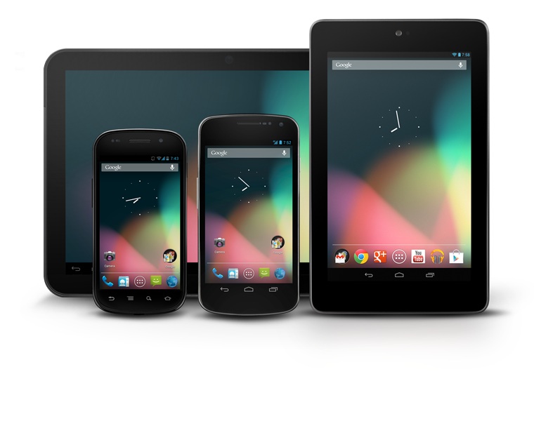
Android is, by nature, a more open and diverse beast than iOS. Because of its open source nature, Android is not limited to specific device classes or manufacturers. It is because of this that, when we design applications for Android, we do so with scalability and responsive layouts in mind.

Because Android is fundamentally more open and diverse, it stands to reason that the experience-driver of Android is also different. Within the Android ecosystem, the device manufacturers play a very large role in designing the user experience of the particular devices. Because they are able to tweak and alter Android as they wish, what we are left with is a platform that is very much device-driven, where the device is marketed first and foremost, and the operating system is more of a feature.
Sign up to Creative Bloq's daily newsletter, which brings you the latest news and inspiration from the worlds of art, design and technology.
03. Windows Phone
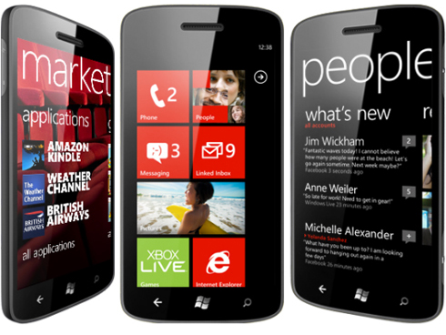
The interesting thing about Windows Phone is that, in some ways, it sits halfway between Android and iOS. While there are multiple companies shipping different Windows Phone devices (with and without keyboards, etc.), Microsoft has still drawn some guidelines around the Windows Phone operating system that prevent the ecosystem from becoming a free-for-all, while still providing users with options and choices at varying price points.

Just as Android’s experience-driver differs from that of iOS, Windows Phone’s experience-driver is also different. Because of the way that Microsoft creates a sort of controlled freedom within the Windows Phone ecosystem, device manufacturers are left to differentiate themselves with hardware instead of operating system tweaks.
Windows Phone’s interface and Live Tiles create an environment that is very data-driven. Because the OS handles so much of the sharing and displaying of data, it more or less just gets out of the way of the user.
So we have platforms, and those platforms have users. But, can we just start firing off into the wild blue? Of course not!
This is where the Do's and Don'ts of Cross-Platform Mobile Design come in.
04. Do share
The entire purpose of cross-platform development is to be able to share code and resources between platforms. Not every company has the resources to hire a developer for each platform. With more and more companies allowing employees to bring their own devices (BYOD) and build internal applications, the need for more efficient mobile development is growing all the time. Sharing code and graphical resources, where appropriate, is a great way to reduce financial and developmental overhead.
05. Don't share for the sake of sharing
While sharing is the foundation of cross-platform development, it’s important that we don’t get share-fever. Share-fever is an ailment that will cause developers and designers to disregard things likes the user experience, application performance and even overall application quality in favor of sharing as much code and graphical elements as possible.
Sharing of any kind is a tool above all else, not a goal. What we strive for should be a consistent, native experience on every platform that provides the user with some sort of engaging utility or content.
06. Do stick to branding
When developing mobile applications for existing brands, it’s important that developers use existing branding resources wherever possible. No amount of graphical or cross-platform experience design can replace user familiarity. In a situation where the application is a representation of a larger entity (think CNN, as opposed to something like Cut the Rope), a sure-fire way to make the user feel at home is to use things like logos, fonts and colours wherever possible. This is especially true in iconography, particularly launcher icons and home screen icons. Launcher icons are doorways into applications, which are essentially doorways to brands. It’s vital to let the user know what lies behind the doors ahead.
07. Don't overdo branding
Like sharing, there's a dark side to branding. There's a side to branding where, like the dark side of sharing, the balance between the user experience, design and functionality is neglected and cast aside in favour of misguided marketing and desperate branding. In the mobile space, user experiences and features are just as powerful as fonts and colours. Release a bad app and see what has the more powerful impact (positive or negative) on your brand - that one shining example of negligence or the fact that the app used the same font as the logo and website? Show the user who you are, but let the experience and functionality speak for the brand.
08. Do REST
REST API, that is. I have long preached the gospel that API design is cross-platform design in its purest form. REST API’s are platform agnostic, and native to any platform (mobile or otherwise) as long as it can send and receive HTTP requests. When we build out server-side functionality, we allow for infinite growth in any direction because we are not tied to any particular platform or technology. Merge with that the ability to make cross-platform libraries and modules that work with multiple platforms, and the reasons not to develop server-side functionality quickly vanish.
09. Don't neglect the presentation
While designing world-class server-side functionality is one of the most important things that a developer can do to ensure a consistent cross-platform experience, it’s important that we don’t forget about the presentation. No user is going to be seeing the inner workings of the API during regular application use, so we need to be sure to focus as much energy on our presentation of the APIs functionality as we do on the API itself.
10. Do stay true
When we build software, it’s easy for us to forget that we build it for real people to use on real devices in the real world. Not every use case is going to be perfect, and someone somewhere is going to break the app and respond in a very vocal manner. The best thing we can do to avoid this is to always keep the end user in mind when designing and building applications.
Not only should we stay true to the user, but to the platform as well. As we saw above, different platforms have different driving factors (experience-drivers) that fundamentally alter the core user experience of the device. By sticking to platform conventions and providing users with experiences native to their platforms, we not only meet their expectations, but often exceed them.
11. Don't back down
Often developers and designers will be put into situations that require them to think a little more outside of the box than they usually would. For example, there are situations that may call for breaking existing interfaces or platform conventions to serve some greater purpose. When an idea calls for a bending or full-on breaking of the rules, developers and designers should always stand their ground. Don’t let someone else kill your idea.
A great example of this is Instagram. When their Android app launched, I was insanely excited. Not because I used an Android device (I own an iPhone 4S and two Android phones, both for testing) but because I wanted to see how such a major player handled cross-platform design. When I saw Instagram for Android for the first time, I was hit with a huge wave of disappointment. Though the accepted convention on Android is to place tabs at the top, Instagram had placed them at the bottom, the way they appear in iOS. I felt like Instagram had made a mistake. But, they proved me wrong. Not only did its idea work, but it worked well enough for them to be acquired by Facebook less than a month after the release of their Android client. They didn't back down, and in the end succeeded.
12. Platform-specific apps
With so many tools available today to make applications run across multiple platforms, it's easy to think that a user experience can translate well to all platforms. The fact of the matter is, users on different platforms have different expectations. What works on Android may not work on iOS, and what works on iOS probably won't transfer well to Windows Phone 7. Apps should make use of features and interface elements specific to their platform, and make the user feel right at home on every possible device.
Liked this? Read these!
- How to make an app
- Free graphic design software available to you right now!
- Our favourite web fonts - and they don't cost a penny

The Creative Bloq team is made up of a group of art and design enthusiasts, and has changed and evolved since Creative Bloq began back in 2012. The current website team consists of eight full-time members of staff: Editor Georgia Coggan, Deputy Editor Rosie Hilder, Ecommerce Editor Beren Neale, Senior News Editor Daniel Piper, Editor, Digital Art and 3D Ian Dean, Tech Reviews Editor Erlingur Einarsson, Ecommerce Writer Beth Nicholls and Staff Writer Natalie Fear, as well as a roster of freelancers from around the world. The ImagineFX magazine team also pitch in, ensuring that content from leading digital art publication ImagineFX is represented on Creative Bloq.
