The dangers of scroll hijacking in web design
Gene Crawford changes his mind about scroll hijacking and discusses protecting the UX for long scrolling pages.
Trent Walton's article 'Scroll Hijacking' says that a user's expectation of a website's scrolling interaction shouldn't be destroyed for the sake of narrative experience.
He cites the case of Apple's recent product pages, which stop the scrolling in targeted places on the page. I previously wrote about how I liked that, but I've changed my mind about it.
Creating an immersive experience with a strong narrative is something to behold when it's done right. There is also a trend happening right now where long scrolling pages with specific sections have animations or more deeply engineered interactions designed into them.
Article continues belowThese are great and I love discovering those same websites and taking in the content. But we must be careful with this approach since one small miscue can cause the whole experience to fall apart.
When you undermine users' expectations of how a particular control for a web page works, it can break down their experience and create a negative reaction.
If you're overtaking the scroll rate of a page, you're taking away the user's controls to get through the content of the page in their own time.
Making links open in a new browser window, non-underlined links that blend in with the body copy, not linking the logo on a page back to the homepage: all these small details that lack hard and fast rules against them are all things that can detract from a user's experience. Interactions are tiny, but mighty.
Sign up to Creative Bloq's daily newsletter, which brings you the latest news and inspiration from the worlds of art, design and technology.
Check out these examples of bad scrolling interaction:
01. iPad Air

The page design for the Apple iPad Air is a huge offender in stopping the rate at which you can scroll the page on your own. It's a nice effect until you want to skip through some of the content.
02. Kit Kat

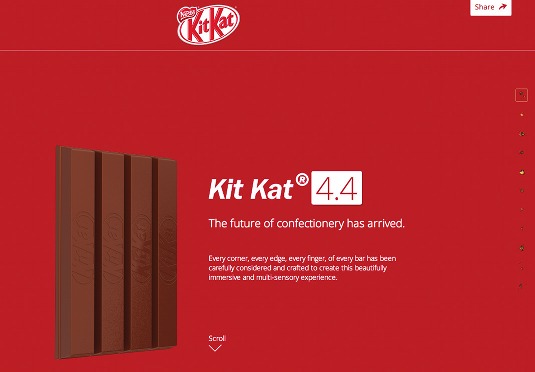
The website for Kit Kat delivers a narrative via a long scrolling page with tons of interactions and large images. It lets the user control how to take in the content: fast or slow, or even by using the provided navigation on the side of the page.
03. ConvergeRVA

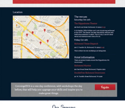
Be careful of stopping a user in their tracks. When a user gets to the map using a mobile device on our old ConvergeRVA conference site, the map's scroll overtooks the user's scroll capability and stopped the page dead. We fixed this on the new version of the site.
Words: Gene Crawford
Gene's mission is to work tirelessly at providing inspiration and insight for developers. This article originally appeared in net magazine issue 249.

The Creative Bloq team is made up of a group of art and design enthusiasts, and has changed and evolved since Creative Bloq began back in 2012. The current website team consists of eight full-time members of staff: Editor Georgia Coggan, Deputy Editor Rosie Hilder, Ecommerce Editor Beren Neale, Senior News Editor Daniel Piper, Editor, Digital Art and 3D Ian Dean, Tech Reviews Editor Erlingur Einarsson, Ecommerce Writer Beth Nicholls and Staff Writer Natalie Fear, as well as a roster of freelancers from around the world. The ImagineFX magazine team also pitch in, ensuring that content from leading digital art publication ImagineFX is represented on Creative Bloq.
