5G mobile network reveals new logo
The next generation of mobile networks are just around the corner, but they've already got their branding sorted.

Sign up to Creative Bloq's daily newsletter, which brings you the latest news and inspiration from the worlds of art, design and technology.
You are now subscribed
Your newsletter sign-up was successful
Want to add more newsletters?
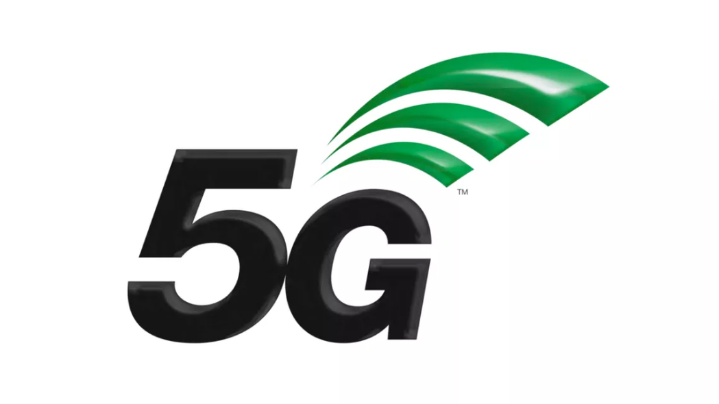
The next wave of mobile phones might be a few years away, but at least the organisation that governs cellular standards has had the foresight to sort its branding early. Say hello to the minty fresh logo design for 5G, the data network that is, logically, set to supersede 4G in 2018.
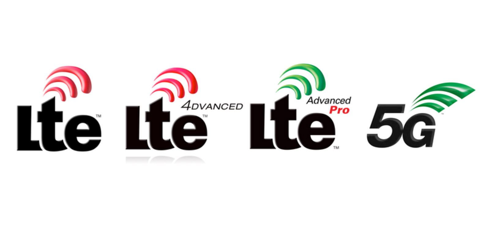
Approved by telecoms standards organisation 3GPP, the new logo is distinct from previous 4G branding thanks to its colour scheme and unique square edged wave symbol. The new logo is also instantly recognisable, whereas the old symbols became bogged down under wording that was rather clumsily added to the design.
"The idea is to keep a familiar design aspect with the use of plain black text and textured waves, but to make the logo stronger and sharper – ready for use on the new radio and next generation core specifications for 5G," the 3GPP site explains.
Article continues below 
Related articles:
Sign up to Creative Bloq's daily newsletter, which brings you the latest news and inspiration from the worlds of art, design and technology.

Dom Carter is a freelance writer who specialises in art and design. Formerly a staff writer for Creative Bloq, his work has also appeared on Creative Boom and in the pages of ImagineFX, Computer Arts, 3D World, and .net. He has been a D&AD New Blood judge, and has a particular interest in picture books.
