Amazon is NOT happy with this new charity shop logo
The tech giant certainly isn't smiling.
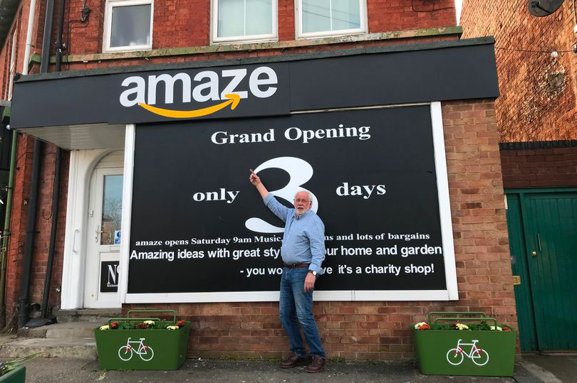
Amazon has objected to the logo of a charity shop set up to fight homelessness. The new venture was about to open its doors when it received notice from Amazon that the shopping giant had concerns over the familiarity of its logo. Allow us to describe the shop sign so you can draw your own conclusion.
A black background sits behind a lower-case, white, rounded font spelling out the shop name: amaze. And crucially, running under the word amaze (from the letters a to z) is an orange 'smile' with an arrow on the end. We see where the problem might lie (well, let's be honest – it's the whole thing, isn't it?). Since Amazon has an icon to rival the best logos out there, we're not surprised folk want to emulate it – but given the might of the Amazon machine, this was never going to fly.

We hate to take the side of a giant over a noble cause such as this charity shop, but it's hard to understand how the small guys didn't see the problem in this instance. Not only have they replicated Amazon's font, colours and signature smile graphic, but the name amaze is also super close to that of Amazon (as it needed to be to make the smile's arrow work, we guess).
Article continues belowIn a 35-page document, Amazon has expressed concern that consumers might experience brand confusion due to the similarity of the branding. And unlike when Apple took on Prepear's logo (it was a pear, you guys), we understand how Amazon might feel that way. If you saw that shopfront on a high street, you would be forgiven for thinking it was some sort of offshoot of Amazon itself – even if the charity aspect didn't match up.
Apparently, Amazon has since offered to help the charity shop with a donation, and pledged to get in touch to assist further (we bet it has – it's not a great look to threaten a charity, whatever the circumstance).

Though some voices are shocked that Amazon would go after a charity shop, the overwhelming consensus is that the shop should have known better – unless of course, it's all done for publicity (which has also been suggested). However brilliant the intention of a business, copyright laws will still apply. As one Twitter user commented, it's a 'recipe for disaster':
Gonna be honest, if you’re looking to set up a shop, why on earth would you use the exact same font and logo, and half of the same name as one of the biggest companies in the world? Recipe for disaster... https://t.co/D4rzH9RMVQApril 24, 2021
Others have reminded the world of similar cases, including the cheeky Singhsbury's Local and Sell Fridges:
Sign up to Creative Bloq's daily newsletter, which brings you the latest news and inspiration from the worlds of art, design and technology.
Never forgethttps://t.co/KI3MLJWj7SApril 23, 2021
Chanel would have been hoping for such a clear case last week when it tried to sue Huawei for a copycat logo. It was certainly one of the most ridiculous legal battles we've seen, and it didn't end well for the fashion titan. Looking for your own inspiration? Try our guide to logo design.
Read more:

Georgia has worked on Creative Bloq since 2018, and has been the site's Editor since 2023. With a specialism in branding and design, Georgia is also Programme Director of CB's award scheme – the Brand Impact Awards. As well as immersing herself with the industry through attending events like Adobe Max and the D&AD Awards and steering the site's content streams, Georgia has an eye on new commercial opportunities and ensuring they reflect the needs and interests of creatives.
