
If there's one company that's known for its design chops, its Apple. But while many immediately think of the brand's aesthetic as a series of whites, silvers and greys, that's only part of the story. And as a viral tweet has revealed, even in the last five years, lots has changed.
Placing a series of Apple products from 2016 alongside their 2021 counterparts, one Twitter user reveals just how much the brand's look has changed. Spoiler alert: it seems rose gold is very much over. (In the market for new gear? Check out the best early Apple Black Friday deals).
Apple 2016 v. Apple 2021 pic.twitter.com/O1yu2c9kYeNovember 3, 2021
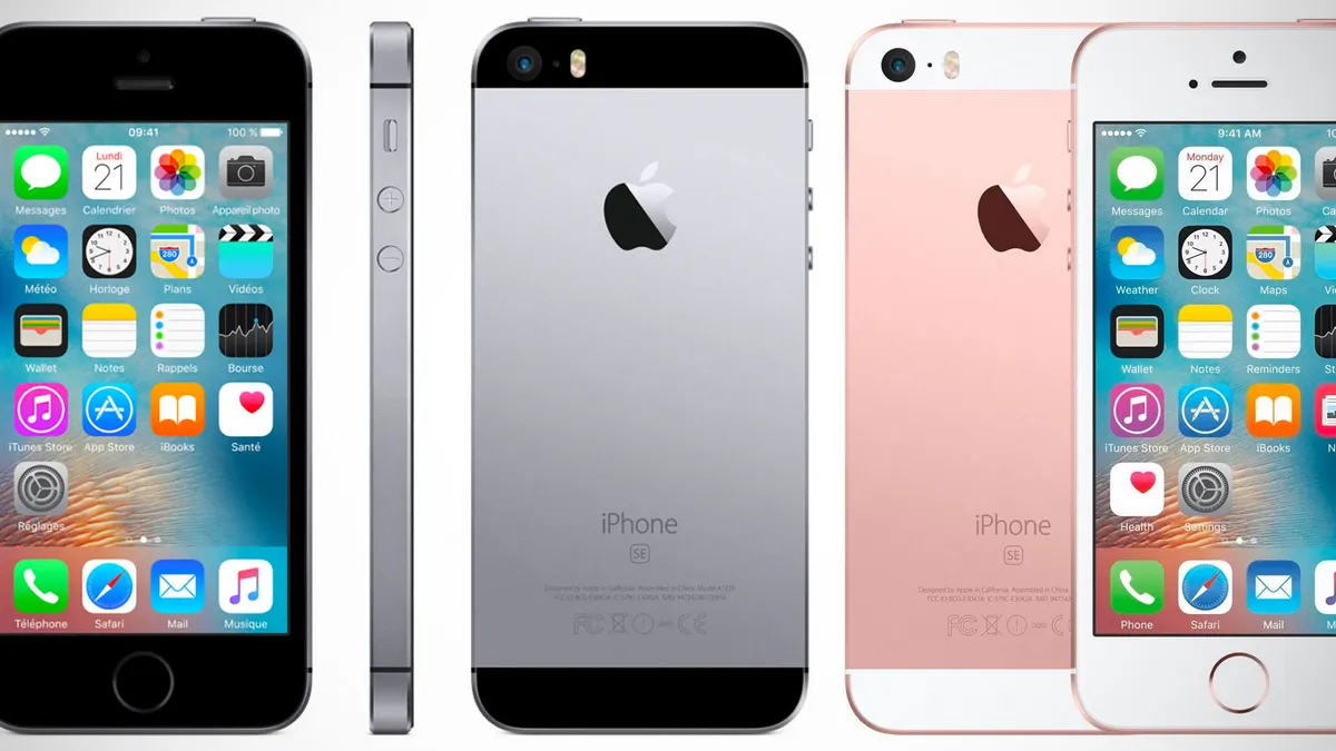
With the sheer amount of colourful options available in 2021, it can be easy to forget that 2016 was a much more muted world. In the words of Henry Ford, you could have any colour you wanted, as long as it was silver, space grey, gold or rose gold. Indeed, that army of uniformly sleek colours across various products almost looks a little intimidating ("If the 2016 Apple products were a group of people, they would definitely have bullied me at school," one Creative Bloq writer observed).
Fast forward to 2021, and it's pretty much impossible to find two products in the same colour. Over the last couple of years, Apple has introduced colour to everything from the iPhone to the iMac (and is rumoured to be doing the same with the MacBook Air soon). If you told us these images showed the product lines of two different companies, we'd probably believe you.
So which is better? It's all a matter of personal taste, of course, but that grey/gold/silver fest is looking rather stale to us. Once you've experienced the pops of colour available now, it's hard to imagine going back to all that millennial pink. That said, 2021's lineup seems to feature an almost wilful lack of consistency, offering fifty shades of blue, green and, yes, grey. Like matching your phone to your watch to your laptop to your tablet? You'd better set your time machine to 2016.
I love all the color options we have now from Apple but I do miss the ability to match colors between Apple products. Hopefully they fix that next year. https://t.co/XL2RuspevLNovember 4, 2021
so much better now they’ve embraced colour again 🤩 https://t.co/SaCdiAd4NNNovember 5, 2021
2016 is still the best, especially with iPhone 5 https://t.co/fkAdBf2ZB9November 4, 2021
Still, it's not like Apple has quite returned to its "Y2K" aesthetic of old – even today's splash of colour is more pastel than the bubblegum days of yore (that said, we'd love to see that hot pink iPhone rumour become a reality). If you feel like embracing your colourful side, check out today's best iPhone 13 deals below – and be sure to check out the best Apple deals available now.
Read more:

